I’ve been following the excellent Cooper Typography Blog for a little while now, and recently Sasha pointed me to his article on Alfred Mahlau, with a short biography and a large collection of images of his work. Of course I’ve traced a few of them below. The lettering is distinctive and highly geometric - the curves are all based on circles - and has some attractive ligatures. As Sasha said in his article, the treatment of some of the umlauts is attractive - replacing the diacritic with a digraph when writing Lübeck. Check out the rest of the site; it’s got great articles, fascinating examples and links (you may lose a day or three with this one), and is definitely well adding to your RSS/bookmarks.
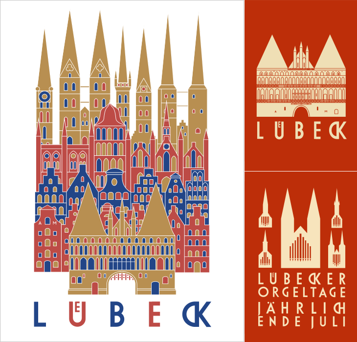
Have a look at this article about Lübeck to see the original of what’s represented in these posters. The distinctive cityscape is also used in the still-used brand identities for Niederegger and Schwartauer Werke, also created by Mahlau.
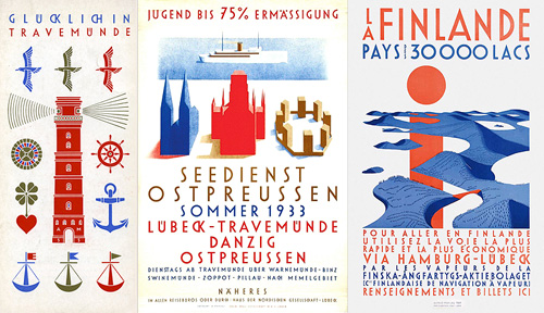
A few more, so you can see the lettering. More here.