Here’s a great collection of science and techology adverts from the 50s and 60s, full of wonderful illustration, type treatments, vintage logos and some pretty inspirational layouts. I’ve got a few details of some of my favourites below, but be sure to have a good look through the set as there’s a load more in there that are great, such as this, and this. There are a few other interesting Flickr sets by bustbright too, including this collection of Bebrauchsgraphik covers which I’m going to have a look through. This one is great.


Click each image to go to the Flickr page for it.
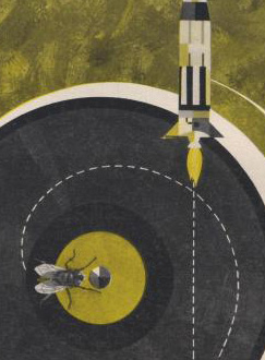
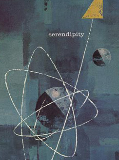
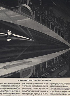
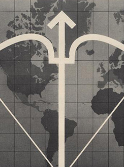
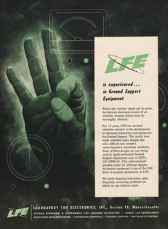
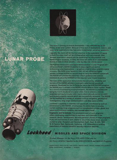
So there are some of my favourites. The top row is that combination of rough-textured painting and precise drawing that characterises mid-century graphic design. I love it. Below those are some nice type and logo treatments: that ampersand, for example, is made from an orbiting particle, yet sits halfway between the classic and commercial ampersands. Interesting! After that there’s six illustration styles: a dramatic JPL illustration which looks like a Victorian steampunk device for testing space-age technology; a cold-war classic world map with presumably The Crossbow of Progress overlaid on it; then a ghostly green hand of A-OK (don’t try this gesture in Turkey)
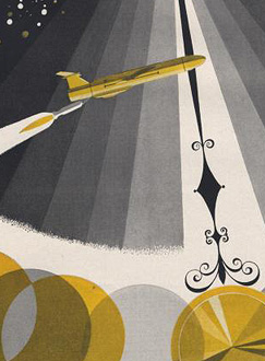
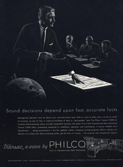
; a lovely space scene which I think could do without the little globe inset above the text; a spare and sharp layout and illustration for Philco - though the outline drawing of the computer looks like something demanded by the client rather than part of the original design; then an advert promising a level of defence from incoming missiles that even today we don’t have. Old adverts are great.