This site, Responsive Logos, is something I've had in my bookmarks for a while. I normally browse sites on an iPad and this one really needs a browser you can resize to get the full effect. Most brands (especially the big ones) will have variations on their logos for use in various contexts; logos for giant billboards will be different from those used on tiny black and white guarantee cards, say. Online, the story can be a bit different, with any adjustment to the browser size or context just left to resizing the one logo graphic. Some are done differently, and I've made a few sites that switch to a simpler logo, but it's not that widespread from what I can see.
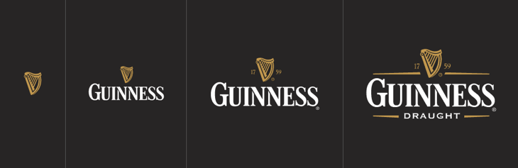
Just in case you can't resize your browser, these are the Guinness variations
What Joe Harrison has done is take some big-name brands and simply and beautifully show how each can respond to a smaller browser size (or viewport, in the parlance). They all look like the real thing so I'm not sure whether he's created new images or got the smaller and simpler versions direct from the brand guidelines for each. It's a nice little site and a great demo if you ever have to explain it, to a client, say.
Image from Joe Harrison's site
More fun are these Responsive Icons (or Rspnsv Icns) he's done, that you might remember from earlier in 2014.
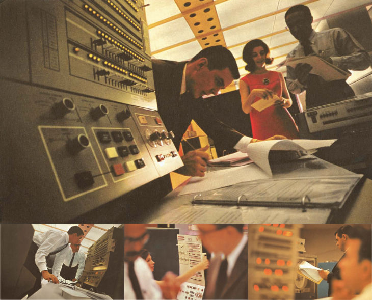
IBM have produced and commissioned some lovely stuff over the years, and their mid-century brochures and advertising are well-admired today. It’s the kind of quality they’re clearly aiming to recapture with their recent hiring and investment in design. There’s some gorgeous photography in this late ’60s brochure of theirs for the System/360 I found via Dinosaur’s Pen (which is a fantastic site for historical UI and product design).
I took these images from the PDF linked here and below
The warm lighting and careful use of a shallow depth of field is more used today for domestic products and holiday advertising, to see it used for a corporate context feels fresh and inviting. Odd, I know, given the age of it. There’s a bit much of the blue-toned high-key stuff around for ‘business’ imagery and I’m wondering whether we’ll see a retro fashion here too.
There’s a bit more info available on IBM’s promotion of the System/360 too. Following the trail of links finds this Flickr set by Colorcubic. They don’t want you downloading the photos they scanned in, but a quick search not only finds a PDF of the brochure but IBM’s own history of the system with more info and photos. To answer Shelby White’s question here, IBM’s designers didn’t overlay the photos with text, the design is quite reserved.
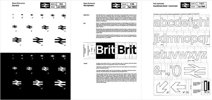
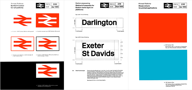
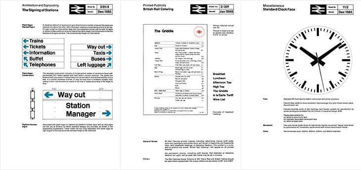
Here’s a glorious bit of design nostalgia for the New Year. It’s hardly a new find on the web; designer Nick Job first started this archive of the British Rail identity manuals in 2011, but I’ve just been reminded of it. Somehow I’ve never written about it either, which is a bit of an oversight given the entirely-unofficial and tongue in cheek name of this site: the British Rail alphabet and signage guidelines were also used by the British Airports Authority and National Health Service, making them as much a government standard as Britain ever usually manages.
The alphabet had two variants, one for dark-on-light type and one for light-on-dark. Light (and illuminated) type on dark backgrounds creates an optical effect known as ‘halation’ - i.e. it develops a halo, a slight sense of the letterforms being thicker than they are. To cope with this, the letterforms are reduced by the width of an outline for the lighter type, shown in the last panel above — while retaining the same spacing and other details of the type. It’s worth pointing out that a revival of the typeface is now available to license and as a web font from FontDeck.
For the non-British (or the very young) British Rail was the nationalised entity that ran the vast majority of railways (and a few ferry routes and other transport-related things) in the UK, beginning in 1948¹. It was rarely out of the news (more so on slow news days) for ‘record losses’, ‘strikes’, ‘failures’, ‘delays’ and so on. Starting in 1994 the network was dismantled and sold off, with the last few bits sold in 1997. Instead of a nationally-owned monopoly, we have regional monopolies owned by a variety of companies and (perhaps amusingly), the nationalised rail corporations of other countries. The headlines are now about ‘record price rises’, ‘record profits’ (also: greedy executives and shareholders), ‘overcrowding’, and yes, ‘delays’. According to the polls², privatisation is generally considered to have been a Very Bad Idea and Can It Go Back To How It Was, Please. Whatever your view or politics on the matter are, running an at-capacity rail network will never make you popular with the people who have to use it. I’m being charitable there.
Despite each of the rail operating companies having their own brands, for most British people the British Rail identity is still a familiar part of the landscape, with the logo being the road sign symbol for any rail station, and much of the signage (especially at smaller stations) unchanged from pre-privatisation days. But what an identity! The whole thing is such a brilliantly consistent and well-designed system, owing much of its strength to its crisp, stark simplicity, to its minimalism and almost-total reliance on typography alone. There’s so little to it that there’s very little (virtually nothing) that can ever really look out of date or old fashioned — sure in the 80s everyone³ had a thing for Rotis (for heaven’s sake) and there was that grunge stuff in the 90s and we’ve had the web and all that⁴, but nothing that was really so outstandingly superior or more modern. What made the identity look bad was the usual thing that ruins most good things: neglect and apathy. A faded peeling sign in a shabby, half-ruined station with leaky roofs and deathtrap toilets is never going to look great, and by the time privatisation came along that was the caricature we were being presented with, and so out it went.
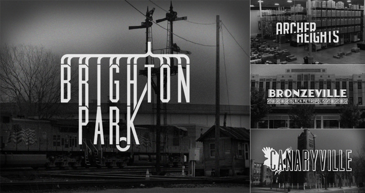
Kelly from Design Crush linked to this last week, a project by designer and Chicagoan Steve Shanabruch to create a logo for each of the Chicago neighbourhoods. Some, he says, are based on personal experience, and others on research. He’s created a lovely set of graphics so far, all of them remind me of old movie title cards (or end cards, like these), some look like they could actually be names of movies set in the neighbourhood.
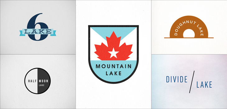
There’s something particularly compelling about design projects like these, they trigger a sort of completist tendency in me, an appreciation of the collection as object. I like sets of things, and interpretations (and reinterpretations) of things particularly so. Thinking of this, I was reminded of the Branding 10,000 Lakes project by Nicole Meyer, to design an identity for each of the lakes in Minnesota (which is indeed known as The Land of 10,000 Lakes). There are some lovely ones in the collection. Some recent ones here:
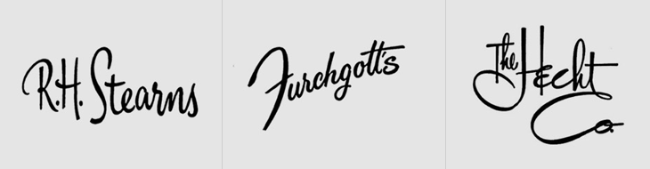
This is something I’ve had open in a browser tab for months, and I’m sure it’s officially ‘old’ in internet parlance, but I’m still drawing inspiration from the images. Christian Annyas has isolated (and traced?) these old department store logos and made quite a collection of them. He makes the point that very few stores today use similar lettered styles to these, and that they go for a logo style that “won’t offend” — I wonder though, if all these logos were created with a similar sentiment in mind? After all, brands in a sector do tend to cluster, so as fashions change, they all change together.
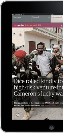
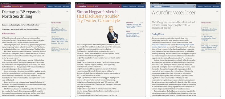
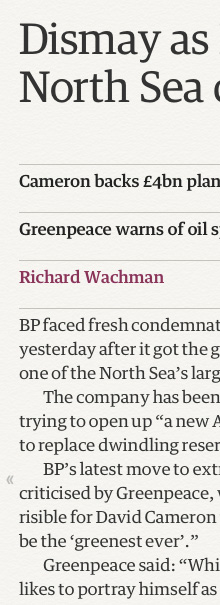
The Guardian now has an iPad app. Previously if you wanted to read Guardian content on an iPad you could read the website, use the iPhone app or attempt the Digital Edition. I used to subscribe to the Digital Edition, a downloadable PDF of the paper (now with an online viewer) in exactly the same form as it was printed. By the looks of it, it’s much improved these days. I cancelled my subscription fairly quickly, because while it was good for reading some articles, seeing things like “continued on page 5” with no hyperlink felt weird, and some of the diagrams in articles had text on them which at the resolution the PDF was created at was unreadable. I complained about one issue like this and was sent a jpeg of the graphic at a higher resolution. Great customer service but it never seemed a scalable or sustainable solution.
So last year the Guardian did a survey of its iPhone (and presumably web) users asking what they’d think of an iPad app, and how much (if anything) they’d be willing to pay for it and/or a subscription. I figured that if they did it well, it could be revolutionary. The iPhone app was (and is) so good it still stands as a reference guide for how to do a content-driven app well. If the iPad app was as good, then it’d be great.
I’ve used a fair few magazine and news apps for the device and they’ve all been a bit of a let-down. As it’s the first mass-market tablet the iPad presented a new and unfamiliar environment to design apps for. Some went down the fill-it-with-crazy-interaction route, others down the scan-our-printed-edition route, most sort of somewhere in between, but nothing really felt natural to the device. It takes time to learn about the new medium rather than simply adapting what went before.
I think the Guardian app is mostly there. There are a few things that I think ‘hmm’ at (well one thing, the issues list), but it does what it’s designed for and is a pleasure to use. The design principles for the app (from this article by the project lead, Jonathon Moore) are beautifully focussed and simple:
Reflect the strength of the form
Create an interface that is always responsive and consistent
Design simple user journeys
Design for the majority (what are the 3 or 4 features that everyone will enjoy?)
Realise we can’t do everything
Appreciate simple is best
These are principles that can and should apply to the design of pretty much everything.
Strength of the form (of content)
A full feature.
It struck me that in all reviews of apps like these, much attention is given to the surface features of the software, but the content is largely ignored. It’s typical feature-itis, and ignores the user’s experience of a thing. The entire reason for someone using this app is to read the Guardian, and let’s be fair, reading a printed broadsheet (or even a Berliner) in almost any situation is rarely a comfortable experience. But you put up with it, it’s worth it for the content, and after a while the medium of crumpled, flapping paper tends to fade away. To do the same (or better) in an app requires a deep understanding of what the content is and how people regard it.
“But to me it was always about how to capture the essence of the print experience and translate that into forms and behaviours that felt right on the iPad.” Mark Porter
I know from experience of developing websites that content is often regarded as the ‘word filler’, viewed as the own-brand mystery sauce to be poured into the shell of the app, not really to be considered as an aspect of the design itself. This is a massive mistake.
Browsing the printed Guardian you see articles from a broad range of subjects, short snippets of fact here and there, and huge page-spanning features and editorials. Newspapers are varied. News websites, even the Guardian’s, are rather more uniform. The pressures of news-now, of getting the story ‘up there’ before anyone else changes the style and format of journalism. There seems to be less room for editorial and analysis - a story is happening now, and this is how it is, …but what does it mean? Most of that type of content remains in the printed paper.
“When we look at the pages of a printed newspaper we take in a range of stories at once. Some are big, some small; some are obviously more important than others. The decisions about space, position and treatment are the product of the experience and values of the editors, and when you buy a printed newspaper you’re not just buying the words and pictures, you’re also buying those values and judgments.” Mark Porter
Bringing that to an app requires a solid understanding of how it works in the paper - how to signal to the reader the relative importance and scale of an article. Is it news reporting? Is it opinion? Is it editorial? Analysis? In any paper it’s the typography and layout of the page that gives you this information.
“I worked closely with Barry Ainslie, our Art director for Sport, to define a range of typeface styles that suited our headlines from print. We defined the minimum required and slowly built them out as the app developed. It’s the first time we’ve used our (extensive) range of fonts to such effect in any of our digital products.” Andy Brockie
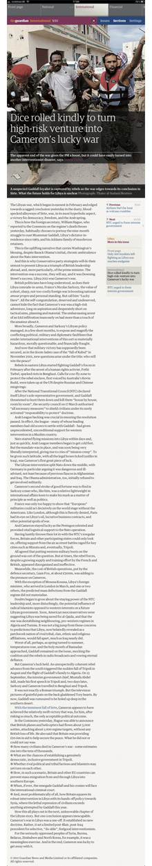
It’s quite clear from reading the app that a great deal of thought and effort has gone into the typography, making it work perfectly on the iPad (which isn’t a perfect medium for great typography in itself). Looking through the images detailing the design process shows just how many iterations of type and layout were tried. I must admit to feeling a bit envious of them to have such time and resources to spend on it.
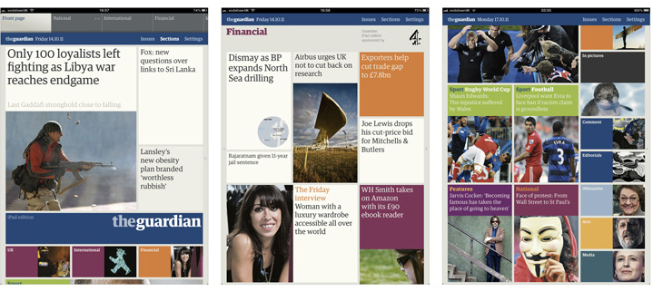
The details of the typography are often subtle - body text is perfectly readable, sidebars with links to related articles don’t intrude, colours are carefully used to illuminate interactive elements and bring variety to front pages, and headline styles change depending on the type of article. Most articles get a regular weight headline, so that when you get to one with a lighter weight, you know it’s a different kind of content, comment, editorial, obituaries and so on. Features and very long articles get a big screen-filling photo with text overlaid on it, with the article starting below.
It all creates a beautiful effect, inviting you into the content, and letting you read it without intrusion or obstruction.
The treatment of adverts is interesting, and welcome. They do exist in the app, but are restricted to interstitials and section front pages. So by design, while reading an article you don’t see adverts. By design! No hacks, no reformatters, no plugins, no extra services, this is how the content is presented, by the Guardian. Only a few other news apps (like the Channel 4 News one) do anything similar.
Strength of the form (of device)
The iPad is a determinedly multifunctional thing, but it relies on the two universal gestures we can do with our fingers, the stroke and the tap. Stroke vertically to scroll, horizontally to swipe. Stroke with more than one finger - more functions. Tap to select, to activate things and to type. Tap and hold for a contextual functions. But how to design and build an app that responds to these things in a natural way? Apple apps provide clues, but obviously didn’t solve all the problems - there never was an Apple app with loads of content that updates frequently, unless you count the browser itself. But that web/app debate is a whole other kettle of worms, and I’m not going there.
The Guardian app solves this simply, in a way that we’ve come to learn feels natural for the device. There are very few interactions possible; Text scrolls vertically, and you swipe sideways to change articles or sections. You can tap on links to other articles and sections. There are a couple of settings and you can share some articles, but that’s it. Which leads to:
We can’t do everything
What’s interesting is what’s missing. There’s no double-tap to expand the text. You can’t tap and hold to select (and copy) text. Many articles can’t be shared - only the ones that are also on the website can be. There’s no pinch zoom. Navigation is pared-down to just a few common functions and links.
There’s no option to have larger text sizes, accessibility support (such as VoiceOver) is OK, but fails on the front pages (where it reads out the ID for that type of headline).
Some of these things could certainly be added, and the accessibility could be improved, but I know from experience that the desire to get all features into the shipped product usually leads to the product not shipping at all. This is version one of an exceptionally solid app, and I’m glad they’ve polished it as they have. They may not be able to do everything, but what they’ve done is very well done.
Design for the majority
And this leads nicely onto the features the app does have. I strongly suspect it’s aimed at readers of the paper who are looking for something more convenient than the print edition but find the website content lacking and maybe the small form-factor of the phone apps constraining, i.e., commuters. Commuters on trains, specifically. Phone signal on trains is notoriously variable, and train operators often charge stupid money for Wi-Fi, even when it works, so the Guardian app pre-downloads its content in the background in the very, very early morning.
But aha, you say, what if something newsworthy happens at 7AM? The app is out of date! Martin Belam nails it:
“To me, that is like arguing that there is no point the BBC broadcasting the Today programme or putting Newsnight on iPlayer, because the news might be “out of date” the instant the programme is finished.” Martin Belam
To my mind that’s where newspapers still have a unique and valuable offering. You can get live feeds of news from multiple sources, but it’s newspapers, books and documentaries that (on their different timescales) tie the stories together and provide context and meaning. As a result it actually doesn’t matter if a newspaper is a little out of date, provided the journalists have done their jobs properly.
I suspect that the majority of the app’s users want a better, more convenient newspaper, not a prettier newsfeed. It sounds like that’s what the Guardian thinks they want, too. I know I do.
Design simple journeys
Printed newspapers offer very simple user journeys. There are articles on pages, and the paper is divided into broad subject categories, as sections, and you simply flip through them, stopping to read whatever catches your eye. The app uses the same scheme, but also creates a front page for each section. The design of a front page like this isn’t a trivial matter, and it’s particularly interesting the technology the Guardian uses to build these from the content of the newspaper automatically. When I read about it I was amazed at what they’d done.
“This was to be the world’s most beautiful, elegant, interpretation of the print experience - with a few digital twists. It was also to be tied intelligently into our print production systems. That was big task – a task that we underestimated. From get-go.” Jonathon Moore
That’s an enormous task, and I bet immensely satisfying to work on. Looking again at the design evolution Andy Brockie presents, I wonder how the system works out where to put everything. I’m slightly relieved that there is some human input to fine tune things, because if all of that was automatically generated we’d better get ready for welcoming our new robotic overlords.
“Unlike the iPhone and Android apps, which are built on feeds from the website, this one actually recycles the already-formatted newspaper pages. A script analyses the InDesign files from the printed paper and uses various parameters (page number, physical area and position that a story occupies, headline size, image size etc) to assign a value to the story. The content is then automatically rebuilt according to those values in a new InDesign template for the app.” Mark Porter
And then from InDesign to HTML. Automagically. That’s the future right there.
Appreciate simple is best
The simplicity and straightforwardness of the Guardian app is (like its iPhone version before it) going to stand for quite a while as the acme of how these things should be done. It’s also a good reminder that simplicity is actually quite hard.
A note on the business model
Much has been said (by oh so many people) claiming that ‘print is dead’ and that newspapers are whipping a dead horse of a business model. If you look at the distribution of printed newspapers people pay for with money, vs. the assumed-free access to news on websites, you’d be right. There’s more to the story than that though. As I pointed out, there’s a special type of content that newspapers have, and despite everything, not much of that content is actually available online. The few newspapers that have made a success of paywalls, such as the Financial Times, do put their analytical and editorial content online, and it shows that plenty of people are willing to pay for it.
For a more general audience the received wisdom has been that people are highly resistant to paying for news, and the Guardian’s own survey showed that many people are. However, not all are, and many people (I include myself in this) actually want to if it means getting a higher quality product. I can’t put it better than Martin Belam, again:
“It strikes me that it is considered quite normal for car manufacturers to have a range of products that are designed and priced to suit different sectors of the market. When a news provider does it, from some sections of the web community there is an almost instant knee-jerk reaction that this proves news organisations “don’t get” digital.
Just because you can have an always on app that crams in updates and breathlessly fast breaking news from live blogs, doesn’t necessarily mean that you have to.” Martin Belam
There’s no doubt that the business models of delivering news to people are changing, but it’s quite clear that people still want news, and people still want journalism. I doubt the constantly-updating feeds of largely analysis-free news updates will provide much of a business model to anyone (except in aggregate) but actual journalism, that is most definitely worth something. Whether this app is what nails it we don’t know yet, but I think it’s got a damn good chance at making that breakthrough.
As I catch up with things I’ve marked to ‘look at later’, I see a recent post on Graphic Exchange about the new identity for Mad Brew Productions, by Adam Hill. It’s not really a type related thing but I’m very much partial to a nicely executed bit of engraving and linework, so here it is. The premise of the identity is that of ‘wearing many hats’, in that the company does ‘media’ and ‘interiors’ as well as its music production business.
I would link to the page on Graphic Exchange, but to my frequent frustration it’s a site without unique pages, if you can imagine such a bizarre thing.
You may have noticed a slight change in the design of the site. I didn’t want to make big changes, as I rather like the way it all looks, but wanted to clean up a few things and remove a few things that felt tired — it’s a design iteration if you will. So, the pages are opened up and I’ve lost the dark grey surrounding background. I’ve kept the right hand margin visible though — I like being able to ‘bleed’ images off the edge, and it helps to have an edge there to start with. A more significant change is the new typeface; I’ve switched to Bliss by Jeremy Tankard, provided by Fontdeck. It’s a face I’ve used on a few client projects recently and I’ve really enjoyed working with it, so I found myself playing around with the templates here, and yes, I just had to use it.
Then, there’s a change that I almost forgot I’d made — the logo. I’ve trimmed the black bar, but also simplified the crown yet further.
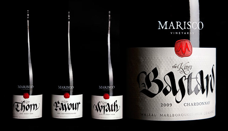
These wine labels, featured on The Dieline, by Marisco Vinyards are beautiful. They’re from “The King’s Series”, a range of wines produced to celebrate the family’s heritage — they’re descended from the tyrannical Marisco family who, during the 12th Century, owned and operated from Lundy Island, just off the coast of Devon. It turns out the family were periodically in and out of (but mostly out of) favour with the monarchy, inspiring the names of the wines, from The King’s Favour to The King’s Wrath. The labels were designed by Hook’s Christopher David Thompson and the beautiful, historically-appropriate calligraphy was done by Peter Gilderdale. I love the finishing on the labels — the textures are reminiscent of lacework and embroidered fabrics, and the strong varnish and deboss on the calligraphy makes it look like bright fresh ink. It’s all really rather lovely.