Here’s a glorious bit of design nostalgia for the New Year. It’s hardly a new find on the web; designer Nick Job first started this archive of the British Rail identity manuals in 2011, but I’ve just been reminded of it. Somehow I’ve never written about it either, which is a bit of an oversight given the entirely-unofficial and tongue in cheek name of this site: the British Rail alphabet and signage guidelines were also used by the British Airports Authority and National Health Service, making them as much a government standard as Britain ever usually manages.
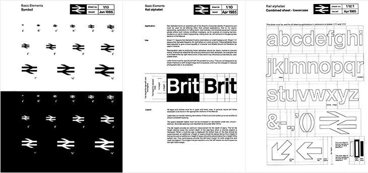
The alphabet had two variants, one for dark-on-light type and one for light-on-dark. Light (and illuminated) type on dark backgrounds creates an optical effect known as ‘halation’ - i.e. it develops a halo, a slight sense of the letterforms being thicker than they are. To cope with this, the letterforms are reduced by the width of an outline for the lighter type, shown in the last panel above — while retaining the same spacing and other details of the type. It’s worth pointing out that a revival of the typeface is now available to license and as a web font from FontDeck.
For the non-British (or the very young) British Rail was the nationalised entity that ran the vast majority of railways (and a few ferry routes and other transport-related things) in the UK, beginning in 1948¹. It was rarely out of the news (more so on slow news days) for ‘record losses’, ‘strikes’, ‘failures’, ‘delays’ and so on. Starting in 1994 the network was dismantled and sold off, with the last few bits sold in 1997. Instead of a nationally-owned monopoly, we have regional monopolies owned by a variety of companies and (perhaps amusingly), the nationalised rail corporations of other countries. The headlines are now about ‘record price rises’, ‘record profits’ (also: greedy executives and shareholders), ‘overcrowding’, and yes, ‘delays’. According to the polls², privatisation is generally considered to have been a Very Bad Idea and Can It Go Back To How It Was, Please. Whatever your view or politics on the matter are, running an at-capacity rail network will never make you popular with the people who have to use it. I’m being charitable there.
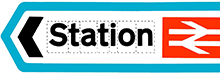
Despite each of the rail operating companies having their own brands, for most British people the British Rail identity is still a familiar part of the landscape, with the logo being the road sign symbol for any rail station, and much of the signage (especially at smaller stations) unchanged from pre-privatisation days. But what an identity! The whole thing is such a brilliantly consistent and well-designed system, owing much of its strength to its crisp, stark simplicity, to its minimalism and almost-total reliance on typography alone. There’s so little to it that there’s very little (virtually nothing) that can ever really look out of date or old fashioned — sure in the 80s everyone³ had a thing for Rotis (for heaven’s sake) and there was that grunge stuff in the 90s and we’ve had the web and all that⁴, but nothing that was really so outstandingly superior or more modern. What made the identity look bad was the usual thing that ruins most good things: neglect and apathy. A faded peeling sign in a shabby, half-ruined station with leaky roofs and deathtrap toilets is never going to look great, and by the time privatisation came along that was the caricature we were being presented with, and so out it went.
And that’s a real shame, for so many reasons.