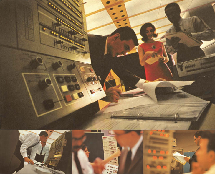
IBM have produced and commissioned some lovely stuff over the years, and their mid-century brochures and advertising are well-admired today. It’s the kind of quality they’re clearly aiming to recapture with their recent hiring and investment in design. There’s some gorgeous photography in this late ’60s brochure of theirs for the System/360 I found via Dinosaur’s Pen (which is a fantastic site for historical UI and product design).

The warm lighting and careful use of a shallow depth of field is more used today for domestic products and holiday advertising, to see it used for a corporate context feels fresh and inviting. Odd, I know, given the age of it. There’s a bit much of the blue-toned high-key stuff around for ‘business’ imagery and I’m wondering whether we’ll see a retro fashion here too.
There’s a bit more info available on IBM’s promotion of the System/360 too. Following the trail of links finds this Flickr set by Colorcubic. They don’t want you downloading the photos they scanned in, but a quick search not only finds a PDF of the brochure but IBM’s own history of the system with more info and photos. To answer Shelby White’s question here, IBM’s designers didn’t overlay the photos with text, the design is quite reserved.
