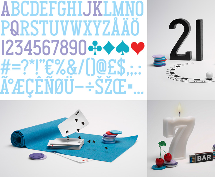
One of the design sites I read regularly is Fubiz, and on there I recently read this post on Daniel Carlsten’s work for the new gambling site, Gnuf. I’m rather fond of the type and iconography of playing cards (as I’ve posted before), so a new identity using many of those themes is going to get my attention, especially as Carlsten has designed a typeface for Gnuf based on them. Looking at how the whole identity works on gnuf.com, I like how he’s not tried to ‘smooth out’ the type, keeping the instead the odd widths and shapes of the letters and numerals and their exaggerated, oddly-placed serifs. I guess there are free fonts out there that do the playing card thing well enough, since the theme hardly requires fine kerning or balance, but it’s unusual and worthy of comment to see it as part of a nicely integrated identity like this. It’s worth checking out the rest of Carlsten’s work too, there’s some lovely work in his portfolio.