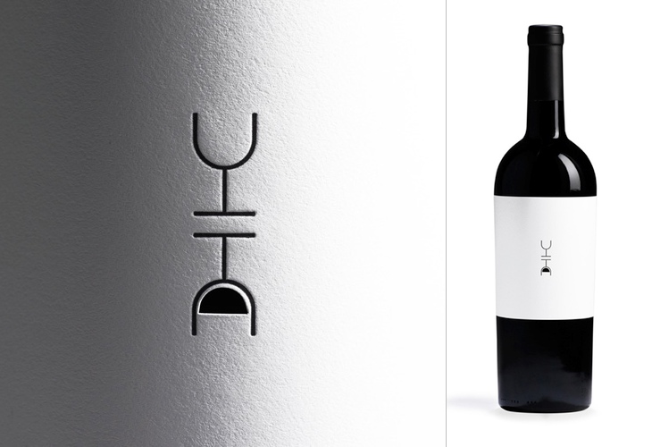
There’s quite a few things I’ve been meaning to post about lately. One of them is this post by FPO on Siquis’ annual gift to their clients — a bottle of wine — but more specifically, the label. It’s a nice idea, every year a different designer gets to design the wine label, and this year’s designer, Greg Bennett, focussed on optimism — the old question, is the glass half full or half empty? Of course, with the ‘full’ side of the glass being a cutout that you can (theoretically) see the wine through, and reversed, if you want to see it you’ll end up pouring out some wine, thereby filling your glass. Of course, that assumes you’ve opened the bottle (and have a glass), which I guess is the point — it’s a subtle way of saying, “drink me”.

