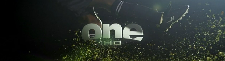
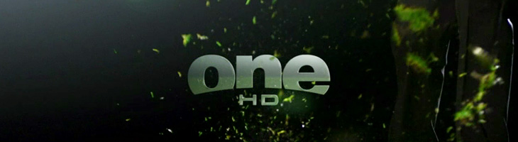
John Beohm of Idents.tv posted the six new idents for Australia’s ONE HD tv channel — I don’t have much to say on them other than they’re lovely and simple and I really like the logo. As John points out, it’s good that they avoid the crass overdone clichés of floodlit stadia and huge billboards, generally I don’t find myself watching sports channels but of what I’ve seen their idents (and identities) are all pretty much of a muchness. Lots of glassy, glossy, glittery effects, dramatic perspectives across giant dystopian stadia-cities shrouded in perpetual night; the impression you’re supposed to get is that this is epic, this is a clash of titans, a great battle to end all battles, an extraordinary experience that will resonate through time and space, this is it, and then, just as you’re (theoretically) driven to the very peak of excitement and anticipation, here’s the golf. Woo.
So yes, it’s nice to have a set of idents that have some of the actual sporting action in them. The logo looks to be a very slightly tweaked Helvetica Black — the version I have has a slightly wider aperture in the lowercase e (but it could just be the 3D rendering creating the illusion). The curve cut out of the bottom hints slightly of the epic view-over-the-horizon style of usual sports channel logos, but it’s subtly executed and provides a perfect frame for the HD suffix. Anyway, slightly more than I was intending to write on this one. It’s nice. Go and watch the videos on Idents.tv.