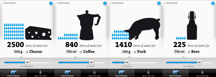
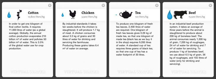
I remember seeing, and liking, the first edition of the Virtual Water poster, and I see now there’s not only a new version but an iPhone app, which has even more information in it. I particularly like the visual style of the project — the simple black silhouettes and the blue accent colour work beautifully (a combo you may notice I rather like already), and the bold, slab-serif typeface (see below) just looks perfect. The little info cards behind each item are nicely laid out too, reminding me of classic recipe cards (or cocktail bar cards), and the short sharp explanations and consistent use of units back up the infographics nicely.


I’m guessing the face is TheSerif Classic by Luc de Groot), though for unknown reasons I’ve never used it, it looks so incredibly familiar that I was convinced I must have. But, I hadn’t. How very odd! I may have to remedy the situation soon.
