November 4th

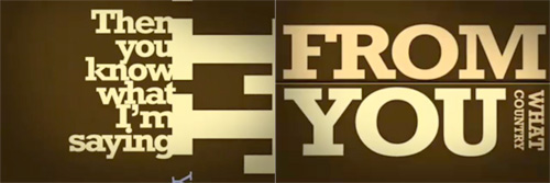
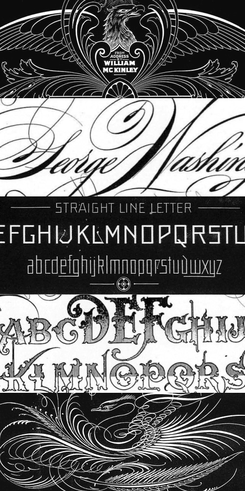
Well it’s finally here. The actual day of the US election. I don’t really want to write about it, it’s been on TV, in the press, online, everywhere, for two years and I can’t wait for it to be over - I’m sure it’s got more coverage on British TV than any of our own elections ever has. It’s been at such a level of saturation that I, as someone who lives outside the US, a British citizen, someone who hasn’t been actively following the election, can look at this (rather nice - snippet at right) bit of typography and recognise pretty much all the stories it represents*. However, there are some compensations; there’s been a big focus on graphic design this time around, though seemingly only on the Obama side of things - to the extent that that Shepard Fairey poster is the subject of much parody.

The Obama campaign branding is of such incredibly high quality and consistency I’m hoping there’ll be a book about it - they must have had to use so many suppliers over the campaign, if not for artwork then printing, set building, copywriting and typesetting. To ensure a consistent quality and tone for such a long time over such a wide distribution is quite an achievement.

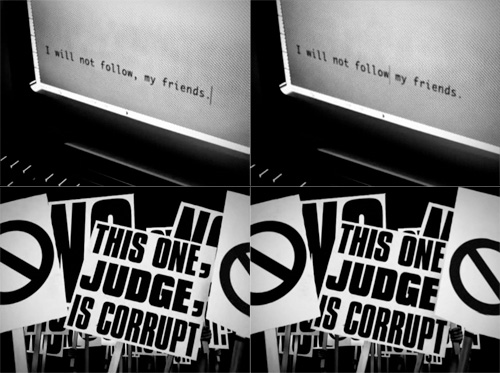
Anyway, now that the day is finally here, and with the full knowledge from my site stats that about 40% of my readership is from the US, I urge those of you from that country to get out and vote. The biggest threat to democracy is people thinking that the election is already won - it isn’t. So vote. I hear the turnout may be record breaking - let’s hope it is, and it inspires lazy British voters to get out there when it’s our turn. And to make this post a bit more related to type, some lovely posters to get you in the mood:
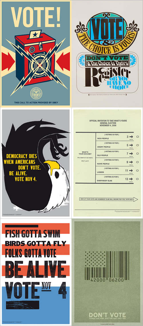
Posters from Monoscope, Supermarket, Things Are Fine and Tomorrow Partners.

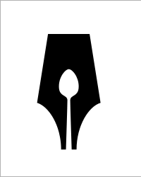
Underappreciated Logos

I came across these two logos recently, the Guild of Food Writers one via NOTCOT, and the Victor one via an Engadget link to this deadly device. The Food Writers one is beautiful; simple, clean and clever - something any organisation would be proud to call its own. The Victor one has a few issues, like the strangely discordant ct, but the V is entertaining and nicely done. So there we go, two nice logos.

So what’s the problem? Well, to look at the websites of these two organisations you’d think they were ashamed of them.

On the Food Writers site I didn’t immediately recognise the logo as being the same one - it’s disguised with that nasty gradient, the cheap glow and the atrocious lettering next to it. I can’t quite reconcile the motivation that commissioned such a great logo from 300million with that of allowing the website to end up looking (and working) like that. Maybe it’s a supplier issue. Maybe they’re working on a new site? Maybe I should pitch a new site to them.

The Victor logo isn’t treated quite as badly, so while it has completely unnecessary bevels and shadows applied at various sizes and angles on the site and other materials, on the product itself it’s used cleanly and simply. If you look closely at the Victor® Multi-Kill™ Electronic Mouse Trap (!) the power indicator is a glowing green version of the V from the logo, so there’s hope. It’s such a shame that in every other application, it’s smothered with cheap, lazy effects.

Portsmouth By Its Slang

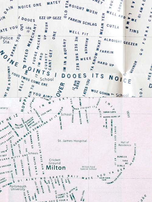
Found this on the CR Blog: “Do you speak Pompey?” - a map of Portsmouth with the streets relabelled with examples of apparently local slang. I wouldn’t say very much of this slang is unique to Portsmouth - I hear much of the same phrases and accents in Brighton, and around Sussex and Surrey too - but the map is pretty interesting nonetheless. As CR Blog points out, it’s similar in execution to the NB Studio map of London. It’d be interesting to do a map of a larger region (or country!) showing accents in a similar fashion. It’d be of aesthetic interest more than scientific, but I’d be tempted to buy one.

The Unfinished Swan

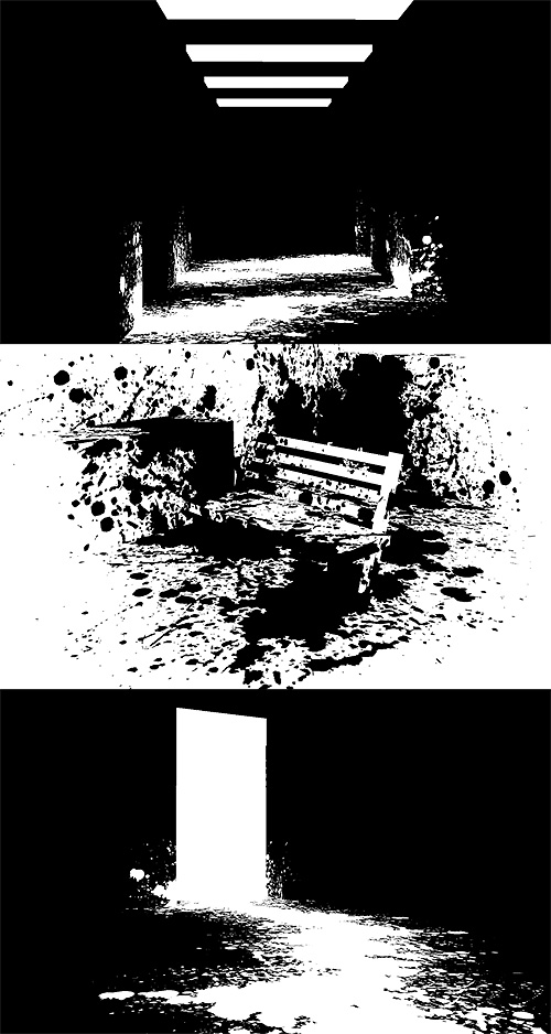
A beautiful name, and a beautiful concept for a game. The idea feels rather illustrative - finding your way across a blank white world with a load of black ink to delineate edges and discover hidden objects, it’s like creating the world of a graphic novel on the fly. To add to the effect, the game seems to have some reversed areas too, and the white paint on black really reminds me of Sin City.

Our Friend The Atom

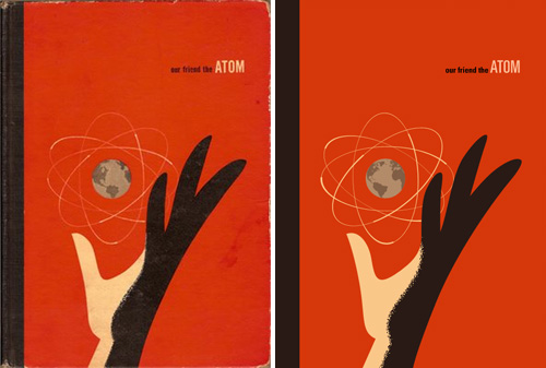
Found on ffffound a little while ago, this beautiful book cover. It reminds me of some books I used to have from the same era - I had a National Geographic book about all the massive engineering works being done in America in the early/mid 20th Century, from straightening and deepening the Mississippi to the building of the Hoover Dam. It was a bronze-coloured hardback with a big cross-section of the dam in white, and a plan of a canal cut across a loop of a river, in black, both embossed into the surface. I wish I still had it. Still, I’d only trace it as a vector like Our Friend The Atom, here:

The Comma

This pair of videos by the Brazilian Press Association is pretty interesting to watch. I’ve had the link bookmarked for a while as I like the animation style. In Portuguese and English, the animation demonstrates how the placement of a single comma can alter or reverse the meaning of a sentence, and makes the point that no one should be allowed to make any changes to what’s written in the press, no matter how ‘small’ the edit:

With the animation style for this piece being rather good, I can’t help but think that while there’s a lot of ‘typographic animation’ around, most of it is pretty samey and unoriginal, repeating over and over the idea of attaching each new word to the previous one, rotating the viewpoint, zooming in or out and then attaching the next word. The style can work wonderfully, but a lot of animations leave a lot to be desired - using typefaces that simply don’t work at such a range of scales and angles, are badly kerned, use too tight or too loose leading, and sometimes look just plain rushed. Sometimes they come so close to a great result, but a lack of polish (and checking for typos) limits the effect.

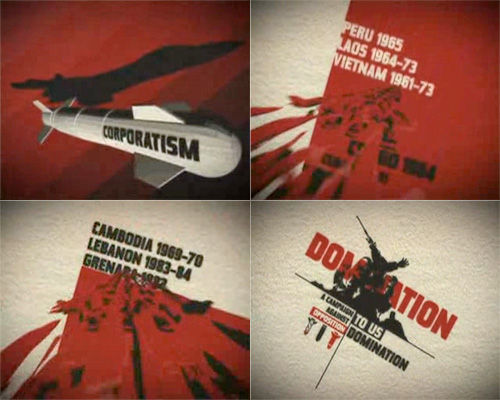
The style demands a great deal of attention to detail, which is why the really good ones are so impressive. The Pulp Fiction one is, to me, the acme of this style - being made up almost entirely of text, but I think that the animation on The Project for the New American Century deserves a lot of credit for using it with more traditional 2D and 3D animation to convey a powerful and provocative message.

Studies in Pen Art

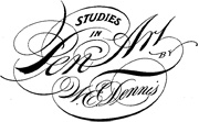
Drawn linked to this fantastic PDF, “Studies in Pen Art”, a scan of a 1914 pamphlet by William Dennis. It has loads of examples of penmanship and advice on techniques and equipment which is pretty much all relevant today - although not perhaps the emphasis on speed; even a commercial letterer today wouldn’t have to produce work as quickly - producing this kind of lettering by hand would be a project in itself these days and so more time would be devoted to it. Still, we all have deadlines and knowing how to work quickly is never a bad idea. The PDF is available for download from the Drawn page - worth a look.

T-Mobile, Vodafone and Santander

Johnson Banks posted this quick (but effective) re-do of the T-Mobile logo on their Thought for the Week site. Despite a deep and abiding fondness for the colour pink, I’ve never liked the T-Mobile logo - the whole thing looks like something an ’80s financial recruitment firm might have used - changing the typeface to, say, Rotis would only complete the effect.

Before and after, by Johnson Banks.

Now for a thought of my own: I was wondering about the other major (UK) mobile operator logos, and released that I was starting to confuse the Vodafone logo with the Santander one. Maybe it’s because I’ve got a bit of a cold at the moment and my brain is addled but what with Santander advertising heavily (and buying UK banks at rock-bottom prices) and Vodafone not having any strong campaign on at the moment, is the central-white-symbol-on-red-ground space at risk of being usurped?

OK, I’m not being entirely serious, but there is a point where a company gets so large that it is no longer associated in people’s minds with its original economic sector, but more the category known as Huge Multinational Mega-Corporations, and this is where brands can really start to get confused in the marketplace. The logos are of course different, but in this case (in Europe) we’re used to banks bought by Santander having their brand (but not their name) changed to fit the parent company, so the potential for confusion grows, “Oh, it must be another company Santander bought…”

Memory Cloud

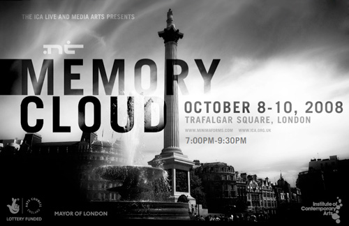
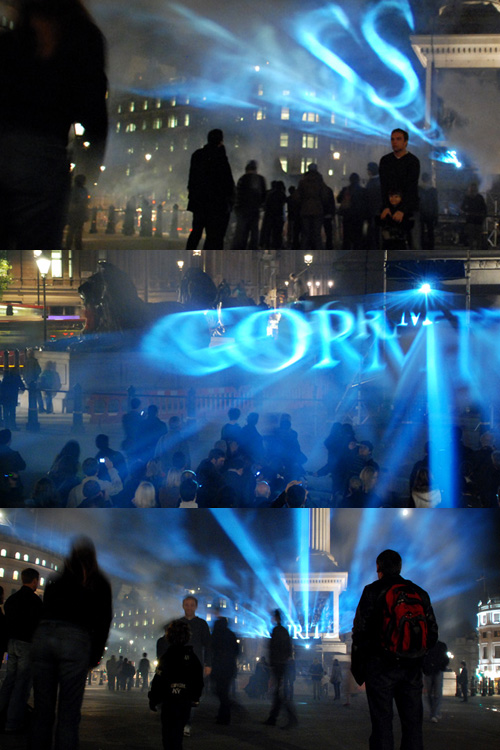
Alas, I found out about this way too late to visit it in person, but there are some pictures of the event on Flickr. I love the way the words float, apparently in multiple planes; a rich, multilayered and compelling effect; the silhouettes of the crowd, the dramatically lit lush architecture with the bright, translucent clouds of glowing words in the centre. Maybe the photos make it seem more impressive than it was, but I’d certainly like to have been there… with my own camera.