Pascal Blanchet has some great illustrations and artworks on his site, well worth a look. Follow a few links and you get to Drawn & Quarterly, with more of his (and many others) graphic novel work, which is definitely worth a look.
Pascal Blanchet has some great illustrations and artworks on his site, well worth a look. Follow a few links and you get to Drawn & Quarterly, with more of his (and many others) graphic novel work, which is definitely worth a look.
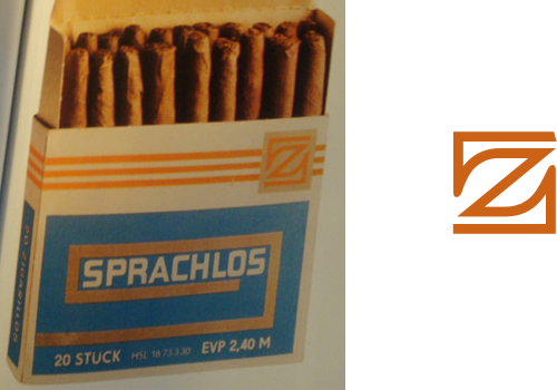
ISO 50 posted about the Taschen book, “East German Design from 1949 - 1989”, with some photos of the inside. There’s a fantastic ‘z’ logo on the cigar box, which of course I had to trace. I’m thinking of getting the book, as East German design shows how creativity can flourish even when resources are limited, and as I found when writing this piece, the resources were often very limited indeed.
Antonio Carusone mailed me to announce his new project, The Grid System, a site (obviously enough) about grid systems. Now, I don’t normally post about things from mailouts or press releases, but since I’m particularly partial to a good grid and I’ve already found a couple of useful things on this site that I’ve found interesting and even bookmarked, I reckon I’d end up writing about this anyway. So, go and have a look.
What did I bookmark though? Well, Syncotype for one. It’s a bookmarklet, i.e. a bit of javascript you can bookmark and then run on any page you’re viewing, that overlays a baseline grid on your page. I have an 18px baseline grid on this site, which often ends up being broken by images I post not having a multiple of that as their height. It’s certainly something I could solve with a bit of extra javascript of my own (or even something server side) to ensure the height of a containing element of an image is indeed a multiple of 18px or a round number of ems, but I’ve not got around to it yet.

Also, there’s the problem of whether such automatic measures are even appropriate. For a while I cropped and trimmed all images to a set of heights to match the baseline, but sometimes it just doesn’t fit the image and I found adding extra padding to the container (a paragraph tag in this case) actually spoiled the vertical rhythm of the page. I decided that as this site is a single column that it would be the apparent vertical rhythm that was important, rather than the real one. I wonder how other people solve the problem? Or even if they do…
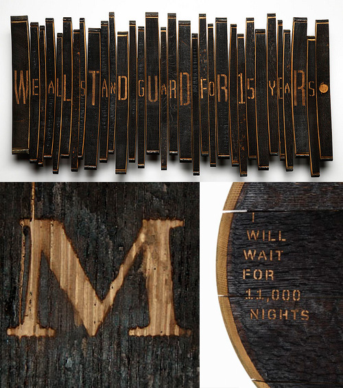
I’ve been following this series of articles by Johnson Banks about their Art from Barrels project for Glenfiddich. The aim of the project was to get across the length of time it takes to make a barrel of Glenfiddich Single Malt, and the end results are pretty interesting. I haven’t got all that much to say about it, especially as the articles explain it all pretty well, other than to say I’ve discovered I like sandblasted letters in charred wood:
Funny how coincidences arise. I found both Mario Feese’s Air Lines and Chris Harrison’s Internet Maps at about the same time and was struck by how recognisable the continents are, and, as I’m fond of maps I thought I’d compare the two images. On the Air Lines map, most of the continents are rendered as a ghostly but fairly accurate outlines, with South America rendered as a beautiful abstraction, right to its tip. The Internet Map is obviously somewhat different, with almost all the connections between cities in rich countries; Africa barely exists and the tip of South America is shown with a single faint line, whereas North America and Europe are smothered in a riot of lines. I overlaid the two maps onto each other and I noticed an interesting thing about the Internet Map, which I describe below.
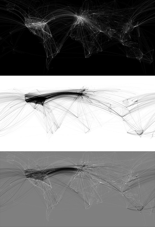
So, to align the maps I needed to use various groups of cities that appeared in both maps; using the southern hemisphere to get the horizontal scale right - there are sharp points for cities in South America, southern Africa and Australia, and in the northern hemisphere I used San Francisco, LA and Tokyo to get the vertical scale. Thankfully, both maps are using the same projection.
Everything pretty much lines up nicely, except there’s that node in the Gulf of Guinea which I originally thought might be some satellite uplink affair at Sao Tomé, maybe a huge data haven I’d never heard about. However, after lining up a map of Africa with both maps it turns out to be nowhere near any land at all. In fact, when I was trying to mark the point on Google Maps, I realise this big data interchange point (the biggest in Africa!) is at 0.0°N, 0.0°W, which is a suspiciously default sounding location. Maybe in the data that Chris Harrison used there are a few unknowns, with their locations set to null, and these connections should be shown elsewhere? If they were removed, Africa would be even more ghostly.
Two of my favourite animations of all time are the advert H5 did for Areva, and their Royksopp video. I can watch them over and over again; they’re so good. So I went to the H5 website recently to see if there was anything else they’d done like that, and found the video for Alex Gopher. I’m sure I’ve seen it before somewhere, but it was a long time ago and I hadn’t made the connection it was done by H5 too. It’s available to view on YouTube, but you can see it on H5‘s (all flash) website by clicking ‘films’, then ‘clips’, then ‘alex gopher’.
Anyway, I like things like this, where the label is the thing itself, and it reminds me of the National Geographic trailers for Seconds from Disaster that I linked to before. I’m thinking it would be amusing to remake Powers of Ten in this style - zooming into the word ‘galaxy’ to see it made up of widely spaced words like ‘star’ and ‘nebula’, and so on, down to the sub-atomic level, with everything its own label.
Screens from the Areva advert, the Royksopp video, and this rather good public information film by Japan’s Ministry of Agriculture, Fisheries and Food.
Talking of labels becoming the object itself, there was a short film, I think on the Sci-Fi channel, about a post-apocalyptic future where the apparently normal, happy, consumerist lifestyle everyone leads is in fact an illusion. There are many layers of unpleasant illusions underneath the ‘nice’ one to stop people trying to break free and see the real world. I particularly remember the ‘real world’ in the film as being made up of cardboard boxes labelled with the name of the object it was supposed to be, and a big barcode (the name set in Helvetica, natch), with one scene showing a load of cardboard boxes labelled as ‘Black Leather Briefcase’ going through some device (gotta love sci-fi) and emerging fully-clad in the illusion of black leather briefcases. I’m sure the film is nowhere near as good or as profound as I remember it, but does anyone know what it was?
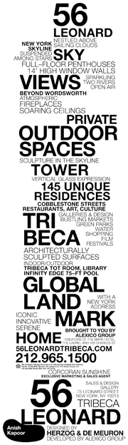
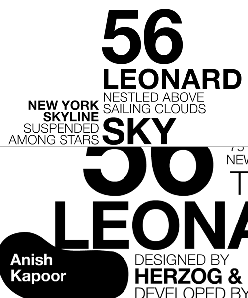
I was clearing up a load of saved links on my desktop and rediscovered this site about 56 Leonard. I saved it last week because of the rather nice typographic representation of the building on the site, which unfortunately flies past pretty fast and doesn’t appear to exist in any of the literature. Still, a few screengrabs and many refreshes later (horribly distorting their stats I’ve no doubt) I put together a decent resolution image of the whole thing. It’s not the prettiest building out there, but it does look like a fun, futuristic place to live, some of the apartments have remarkably large outdoor spaces, and it has an Anish Kapoor sculpture wedged under a corner of the building too. It’s a nice idea, and something that the initial animation does explain very well (the rendered videos on the site explain it too).
(Via cityofsound)
Just saw a link to this site on Coudal about the rebranding of Polaroid, written by Paul Giambarba, who did the rebrand. It’s a fascinating read, and I might post more about it, but the bit about the pre-1957 logo caught my attention. I was looking at the old logo, and wondering why they’d done the ‘a’ like that, and that with the kerning on the other letters it made it look like two words: “Pola roid”. The ‘r’ is a bit odd too. Seems that those weren’t the only problems with the logo identified by Giambarba:
Polaroid is reversed, or dropped-out, from a red patch in a mangled version of a typeface called Memphis. The true Memphis lower case “a” has an upper serif to distinguish it from an “o,” but close inspection will reveal that the upper serif has been removed from the Polaroid “a.” Thus the brand name could be easily misread at quick glance as Poloroid. Of all the counterproductive things one can do in commerce, this was outrageously stupid, especially when spending considerably to launch a new line of products. Paul Giambarba
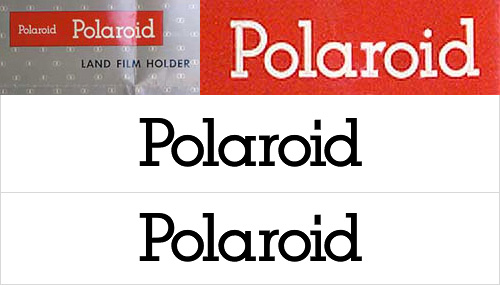
I think that the word looks a load better with the serif. Still, Giambarba had already dismissed the typeface as ‘unreadable’, so the logo was clearly up for bigger changes than the reinstatement of a serif and the demangling of the ‘r’. Go and read the rest of it, it’s worth it.
The FontFeed linked last week to The Dieline’s exclusive on the Pentawards competition results. There are some lovely examples of packaging in there, with some really innovative packaging shapes and structures too, rather than just nice labels on standard packs.
I often wonder when looking at things like this where the incentive came from - it can be hard persuading a client to go with something custom, with all the implications of cost and lead-in times that implies. It (obviously) happens, though I wonder whether any of these agencies might have been simply lucky to have a client bounding in, scattering wads of cash hither and yon, full of enthusiasm for creating something new, exciting and different. I’d like a client like that. Or two. Or three.
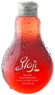
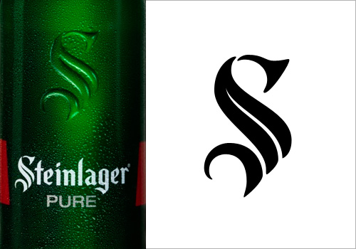
Back to the awards: The Gloji bottle at right is lovely, and different, and I imagine it would feel nice in the hand, like a cognac glass. I don’t care for the logo very much though, unlike the Steinlager logo below. More specifically, the ‘S’ in the Steinlager logo. Looking on the company’s site, I see that the version used on their other products is more traditional, and it’s just on this bottle that the blackletter has been pared down, trimmed and shaved to give it that clean, sleek, modern simplicity. I love it. Hard to trace from a picture of a bottle though, but I think I have it about right.
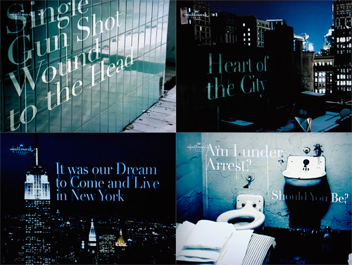
Hallmark has some very nice trailers for its programmes, usually with great typography, and always with perfect grading. They’re very fond of them too, so you tend to see them several times throughout a programme - something that can easily drive you nuts if you’re not quick with the mute button. Still, they look nice.
This particular one, for Law and Order, uses the nice technique of placing text set in Didot into various scenes in New York. The point of view changes as the text builds up and enhances the 3D in-world effect, and as it does, dribbles of grime (blood?) trickle down from the words. It’s all very nice, but what, I say what is this I see?
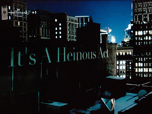
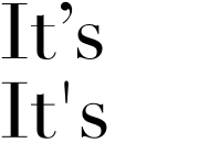
A prime*, used as an apostrophe? A heinous crime, if ever there was one! Someone call the cops! Thing is, you’d have to deliberately turn off “smart quotes” in After Effects to get that symbol to show, and not the correct one (at right). So why?
Perhaps, and here’s a thought, perhaps they did it like that to echo the dribbles in the animation? That would make it an artistic decision, and not an ignorant mistake. I do hope that’s what it is, as the rest of the sequence is rather pleasant: