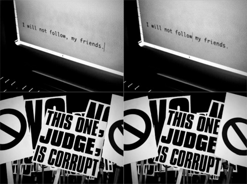
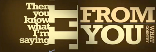
This pair of videos by the Brazilian Press Association is pretty interesting to watch. I’ve had the link bookmarked for a while as I like the animation style. In Portuguese and English, the animation demonstrates how the placement of a single comma can alter or reverse the meaning of a sentence, and makes the point that no one should be allowed to make any changes to what’s written in the press, no matter how ‘small’ the edit:

With the animation style for this piece being rather good, I can’t help but think that while there’s a lot of ‘typographic animation’ around, most of it is pretty samey and unoriginal, repeating over and over the idea of attaching each new word to the previous one, rotating the viewpoint, zooming in or out and then attaching the next word. The style can work wonderfully, but a lot of animations leave a lot to be desired - using typefaces that simply don’t work at such a range of scales and angles, are badly kerned, use too tight or too loose leading, and sometimes look just plain rushed. Sometimes they come so close to a great result, but a lack of polish (and checking for typos) limits the effect.

The style demands a great deal of attention to detail, which is why the really good ones are so impressive. The Pulp Fiction one is, to me, the acme of this style - being made up almost entirely of text, but I think that the animation on The Project for the New American Century deserves a lot of credit for using it with more traditional 2D and 3D animation to convey a powerful and provocative message.

