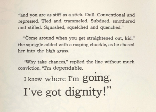
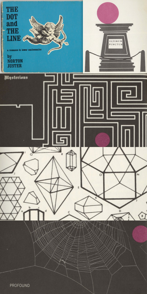
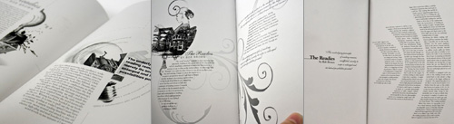
After I wrote about The Dot and the Line animation, Nigel Brachi contacted me to tell me about the book which came out a few years before the film. He kindly sent me some scans of the pages, which show just how faithfully the animators followed the drawing style. The typography of the text is often rather nice too:
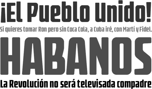
I found the Latinotype site the other day via NOTCOT, and I’m rather taken with some of their faces. I’m particularly fond of Fidel Black, which I think I’m going to suggest for a rebranding project coming up soon; Biotech, which with its chunky and square lowercase is like a print-suitable cousin of Verdana Bold; and Regia Sans, because, well, I just like it. Go and take a look at the rest of their faces, and perhaps click Comprar on a few of them.
This article on writing by James Patrick Kelly should be required reading for anyone involved in any creative activity. I read it years ago, and though I forgot the exact phrase, I’ve followed its basic principles ever since; whenever I’m stuck on a design I remove the thing I like the most and continue to develop the design without it. Almost every time it’s that thing, that darling, that is holding me back, distracting me from the design. I find that what I’m doing is trying to adapt the rest of the design to fit with this thing, rather than than developing the design as a whole. Even if it wasn’t that thing, the act of removing something from the design, that act of subtraction is what frees up my thinking again. The article addresses this nicely, and you can see how it applies to more than writing:
Some writers like to fix problems by addition rather than subtraction. First they layer in just a little more complexity to develop a rounder Aunt Penelope. And then they expand the garage scene, so it will foreshadow the car chase. Last they have Biff’s lawyer explain the rules of evidence to his secretary after the trial so that slow readers will get the end. If these writers worry about wordiness at all, they might tighten a few lines here and there. Drop a “he said,” on page two. Major surgery is for beginners, right?
Nowadays it’s become (almost) a natural process and I find myself peering suspiciously at something that’s just too shiny, too perfect, too lovely, too early in the process. This isn’t to say I remove everything that’s nice from my designs, far from it, but what I tend to do is to move through versions very quickly. Version 1 of a design might have some text treatment I’m fond of, version 2 might have some aspect of a layout I like, version 3 something else, until I think I’ve got the ideas recorded and I can develop the design without them distracting me. Since I’m moving to a new version whenever I get stuck, these early versions are rarely complete designs; they’re more like rough sketches. While I’m working I’ll return to these sketches and use the ideas from them if they’re suitable, which is a far more pleasing way to work, and ends up being much more successful. Usually, of course, after I’ve got the final design (or a clientworthy version) I’ll look back at the ‘darlings’ I’ve saved and decide that they’re not all that special anymore, that they’ve been surpassed by what I’ve done while free from distractions. The ones that I still like I keep around for future inspiration. Sometimes, I even remember to look at them.
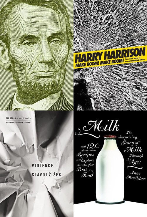
Joseph at the Book Design Review posted his favourite book cover designs of 2008. There’s some good ones in there, and makes me think I don’t read nearly enough long-form writing. I particularly like the one for “Abraham Lincoln: Great American Historians on Our Sixteenth President”, but that might just be because it’s from the five dollar note and I like banknotes… As for the others, I want to see the original of that aerial view of Manhattan, and the other two are just nice images. Go and look at the others.
This is a fantastic piece of illustration and lettering. Well worth watching. It’s all good, but some of the illustrations that I find noteworthy are the pavement-level view of walking feet (0:27), the yellow and black spread (1:04) and the multiple mouths (1:54).
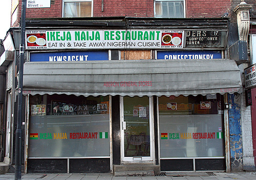
I think I saw this one on Coudal Partners, an ongoing photo study of London shop fronts. What fascinates me is the range of type and typography on the shop signs. Some are good, some are strange, some are very strange, and there are quite a lot that are pretty dreadful, all making up what I suppose you could call London Small Shop Vernacular.
Nice bit of signage archaeology on this one.
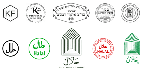
From time to time I’ve thought of doing this in Brighton, there’s quite a range of shop fronts, and they seem to change quite frequently too. I saw a lovely roundel on the window of a burger takeaway announcing the availability of halal meat, and it got me wondering whether there are any sort of recognised marks for halal and kosher, and it turns out there are. Quite a few of them in fact, and not really very consistent. I guess if you’re sure no-one is actually going to out-and-out lie, these are all consistent enough:
The idea of being ‘consistent enough’ reminds me of other logos for food labelling. There’s the ‘v’ for vegetarian, and sometimes vegan, food - something you see a lot in Brighton. There’s also the Vegetarian Society logo which often gets used by food suppliers whether they have permission to do so or not, but again, no consistent mark for the whole thing. Perhaps with some things there’s no need for consistency because the truth of what the symbol claims can be easily checked, but with other things there definitely is a need. For example, the demand for fairly traded products has led to the development of an official Fair Trade logo. However, there are lots of other ones that imply lovely, fair, environmentally and socially responsible origins, but have so few checks and balances as to be essentially meaningless - greenwashing in other words.
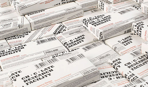
This caught my eye a while back, on NOTCOT, and it turns out there’s a whole range of packaging with it which is all pretty nice. I prefer these ones though, they’re like some cross between newspaper wrap and utilitarian shopkeeping units - it reminds me of how supermarkets sometimes design their own-brand ‘basics’ ranges, which (almost) always end up looking far better than the non-basics stuff. I’m not sure about the treatment of the two Os though, the counters look more like funky bullets somehow. Have a look at the rest of the Asylum site too, there’s plenty of interesting stuff on there.
I was having a look through Behance’s Typography Served website and found this. It looks like it’s in Jihad Lahham’s portfolio (well, I think it does) but on his site there’s a post with pics and nothing else about it. Need info!
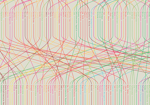
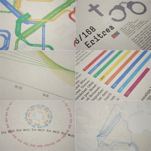
There are some great infographics here. There’s a video on gestalten.tv about their book project, Data Flow, and some documentation available here, in German. All good stuff.
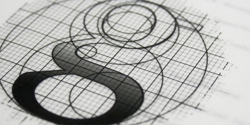
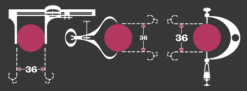
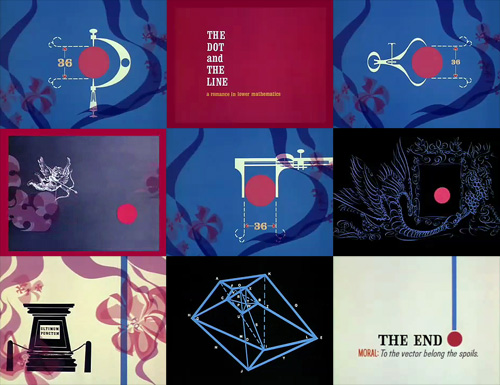
This is fantastic. I think I saw it here, linked from Design Observer first, though quite a few sites have linked to it too, but that’s no reason not to link to it again. It’s got some beautiful touches in it, with a gentle kind of humour and some reasonably groan-worthy puns. I love the little joke about the perfect proportions of the dot, playing off the classic ‘36-24-36’ hourglass proportions supposedly ideal at the time for women. The calipers are great, with the little hearts instead of arrows for the dimensions, and just demanded to be redrawn:
A few sites I’ve seen it on have lamented that things like this aren’t made anymore because it wouldn’t be popular, that people would be afraid of anything that mentions ‘hard stuff’ like mathematics. Perhaps they’re right, and maybe it is really anti-intellectualism preventing stuff like this being made today, but the animation is hardly a mathematical treatise. The only mentions of anything mathematical are the title and a few puns scattered here and there, ending in the rather nice, “To the vector go the spoils”.
The real point of this animation is the animation itself. It’s certainly not the story: a simple morality tale on the importance of hard work and discipline (and also, avoiding narrow thinking) to achieve your desire; in this case, a remarkably shallow and feckless sounding creature who is easily wowed by flashy glitz and glamour. Perhaps these days we might wonder whether that was worth all the poor line’s effort; “You can do better than that” we might say.
So the animation seems like a kind of showreel, a portfolio piece, beautifully done of course, but more remarkable in that it was released by the studio commercially. I have a little theory that it might have been released with the new technology of colour TV in mind - the audience at the time was very small and would have consisted of those who could afford it; professional, college-educated people? That might explain the choice of story too.