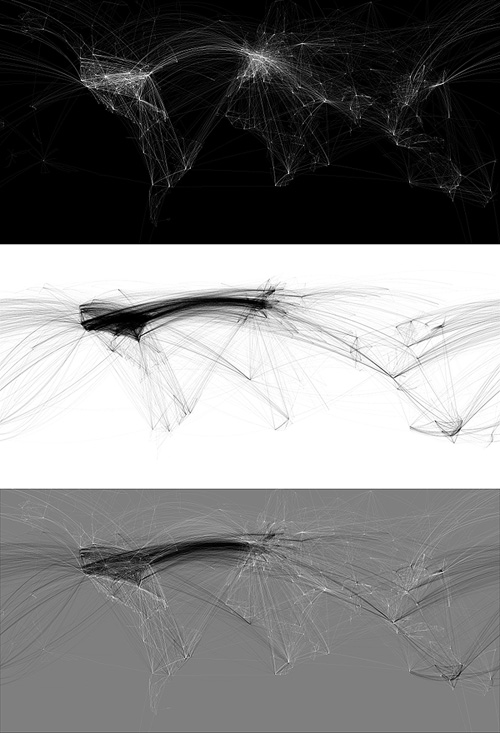
Funny how coincidences arise. I found both Mario Feese’s Air Lines and Chris Harrison’s Internet Maps at about the same time and was struck by how recognisable the continents are, and, as I’m fond of maps I thought I’d compare the two images. On the Air Lines map, most of the continents are rendered as a ghostly but fairly accurate outlines, with South America rendered as a beautiful abstraction, right to its tip. The Internet Map is obviously somewhat different, with almost all the connections between cities in rich countries; Africa barely exists and the tip of South America is shown with a single faint line, whereas North America and Europe are smothered in a riot of lines. I overlaid the two maps onto each other and I noticed an interesting thing about the Internet Map, which I describe below.

So, to align the maps I needed to use various groups of cities that appeared in both maps; using the southern hemisphere to get the horizontal scale right - there are sharp points for cities in South America, southern Africa and Australia, and in the northern hemisphere I used San Francisco, LA and Tokyo to get the vertical scale. Thankfully, both maps are using the same projection.
Everything pretty much lines up nicely, except there’s that node in the Gulf of Guinea which I originally thought might be some satellite uplink affair at Sao Tomé, maybe a huge data haven I’d never heard about. However, after lining up a map of Africa with both maps it turns out to be nowhere near any land at all. In fact, when I was trying to mark the point on Google Maps, I realise this big data interchange point (the biggest in Africa!) is at 0.0°N, 0.0°W, which is a suspiciously default sounding location. Maybe in the data that Chris Harrison used there are a few unknowns, with their locations set to null, and these connections should be shown elsewhere? If they were removed, Africa would be even more ghostly.
