Gravestone Lettering

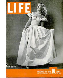
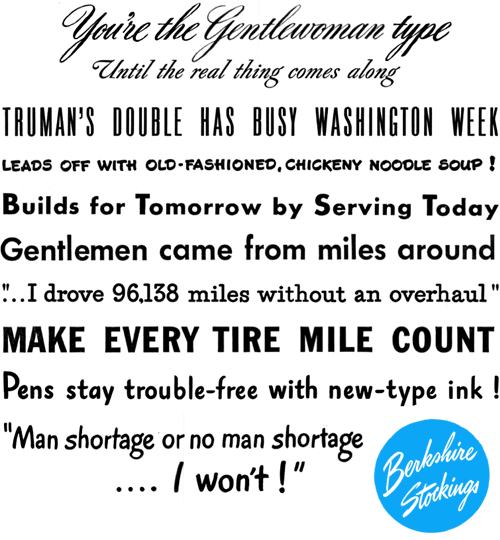
I’m fascinated by the (mostly) Ohioan gravestones in this Flickr set by Tom Davie. Take a look, then have a look at these ghost signs, and you’ll notice how similar the lettering is. I’ve never seen gravestones lettered like this —any flamboyance I’d seen was kept to Celtic patterning or hideously overblown Victorian sentimentalist statuary; the lettering was universally rendered in a sombre, understated style, or at least an archaic one. Still, most of these stones look to date from the mid-19th Century, when commercial lettering like this was all the rage, and I can imagine that for many towns the best-qualified letterer was the same person who did the signpainting and advertising, so much of the style would have carried across. I wonder also whether people simply preferred to have their relatives’ gravestones done like this — who’d want a dull, plain bit of lettering when even a tin of Cocoa gets something far more ornate? What, didn’t you love Grandpa? It’s a theory anyway. The three at the bottom are all ones I’ve taken myself, all from the north of England, so you can see the style I’ve been used to.

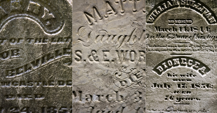
All images from this Flickr set by Tom Davie<

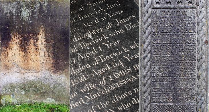
The left and centre ones are from St. Oswald’s church in Warton (my hometown!) and the one on the right is from Kendal’s parish church.

Making The Complex of All of These

I got the link to this video on YouTube via Jason Santa-Maria on Twitter. It’s compiled from around 3000 images taken over 2 months documenting the creation of 35 hand-made books at the Women’s Studio Workshop in Rosendale, NY. There’s a website with more info and clearer photos here. The whole thing is lovely and worth watching — note especially the attention to detail with the thread colour for the binding and the creation of the headband. These images are all from the video:

Star Patterns

I’ve had a few emails (so soon!) asking how I created my version of the star posters in an earlier article. I created mine using Photoshop vectors (out of habit) but Illustrator, or indeed any app that supports vectors, would be fine — just adapt the processes to your app.

So, without further ado…

You need to create two sizes of star. Mark Brooks used an additional star shape that was an outline, so you can create one of those as well if you want. The simplest way is to draw a square (mine was 40px × 40px) then create four circles of the same dimensions, offset them to the corners, then set them to subtract from the square, like above. I normally expand the shapes just to leave a nice clean star. Then it’s a process of duplicating and offsetting, like above. Create the large stars on one layer, and the small ones on another.

Keep going until you’ve filled whatever size you need.

Then, turn off the layer with the big stars and create a new one with your shape on it. If you’re using a photo, posterise it into black and white using whatever method you prefer, then put it below all the other layers — fiddle with the opacity so it doesn’t hurt your eyes.

Then it’s quite simple. Delete all the small stars that aren’t mostly on the black areas of your shape — zoom out now and again if unsure and use your judgement.

Then turn the other layer back on, and turn off or delete the one with your shape on it. You’ll end up with two layers - one completely covered in a pattern of big stars, and another with a pattern of small stars on the area of your shape. Print, and savour.

Of course there are tools available to simplify the process of creating patterns from images, and some of them seem to be good. However, I’m rather more than a bit obsessive about the fine details, and something like this really needs accuracy — doing it manually means I can make sure it’s just right.

Star Posters

These posters by Mark Brooks for Santa Monica are great. I’ve had the page on ISO50 open in a tab for a while — The idea here is interesting and worth looking at; using the Santa Monica logo to create the halftone pattern, but using a two and three-layer effect using different sizes and treatments of the star. I wanted to have a closer look and see whether it was hard to create the effect. Turns out it’s not really, it’s just a bit time consuming and needs some concentration. It also makes your eyes go squiffy so best to work with low contrast colours until you’re done. I did my own little version using a Baskerville Italic ampersand, below the posters by Brooks here. There’s some more images on Mark Brooks’ Behance portfolio.

Some of the Mark Brooks posters. Originals and more here.

Me playing around with the idea. I love the Baskerville Italic ampersand. When viewed close, the effect is extraordinarily pretty.

Playboy Magazine

Entirely coincidentally, I get to post about another archive of a long-running and well-known magazine; this time, Playboy. John of I Love Typography tweeted a link to this, just over 50 issues of Playboy from 1954 to 2006. The site will require you to install Silverlight, but is fairly well put together and easy to use, with a nice contents feature that also lists the ads and a search function that works well. To be clear, Playboy is a pornographic magazine that used to use good journalism and good design as a fig-leaf (as it were) to try to get some respectability. It's still a magazine for pornography, objectifying women. Of course, the images and type I’ve included below are not pornographic.

I’ve never looked at Playboy magazine before — its reputation preceded it and there are many better ways to read good journalism. There are some interesting-sounding articles in the earlier editions though; just a quick look through reveals interviews with Fidel Castro, Miles Davis, Sterling Moss, loads of fiction, journalism, pages and pages of dense, dense text. Then, so randomly you almost ask “What’s that doing there?” a picture of a young woman with not much on. I must admit I didn’t really look at the newer issues, as after the logotype changes in 1972 the whole thing looks a whole lot less appealing, and makes me think perhaps the magazine becomes a bit more straightforwardly pornographic from this point. The bits of type and spreads below are mostly from the late ’50s and early ’60s, and are just an example of some of the lovely bits of type and layouts in the magazine. So yes, go and have a look at the Playboy magazine archive, but keep in mind the attitudes and harms it represents.

The ‘$4.32’ bit is from an advert, all the rest is from editorial content. I haven’t verified these forensically, but the editorial text looks like a mix of Clarendon, Nimbus Sans, Caslon, Caslon Italic and Cheltenham.
I love the use of the rabbit device to end an article, and that it’s still in use today. Note also that the Playboy wordmark at the top left of the page has a serif on the A, which is missing on all other uses of it. I’ve reproduced it larger at the top of this article.

LIFE Magazine

I’ve been browsing through some of the copies of LIFE magazine in this wonderful archive on Google Books, and as well as the photography and journalism I’ve found some real type treasures, especially in the advertisments. Some of the slogans and phrases read just like bits of pangrams or the beautiful mini-stories that Font Bureau create for their type samplers, and some of the type and lettering is quite lovely. The ones below are mostly from this issue from May 1945. A few are also from this one, which also has a short article and some photos (from page 43) of the first Lewes Bonfire night after the end of World War Ⅱ - something of local interest at least to me (and other Sussex people).

I’m sure you could make many amusing stories with a bit of patient searching through the archive.

Red and Black

I’ve been marking so many things in my RSS feed either to read later or ‘post about this’ lately, and yet it seems I’ve had no time to do either of these things. This is one I’ve had marked for a while, from the ever-inspiring For Print Only, and perfectly demonstrates why red and black is such a great combination in print. I love the spreads in this report, and I’ll definitely be referring to this as inspiration for a while. Lovely stuff, go and take a look at the other images — a couple of my favourites are below.

The New York Times in Turkish

This week sees the launch of a new Turkish-language edition of the New York Times’ International Weekly, distributed for free with the Sunday edition of Turkey’s Sabah newspaper. To advertise the launch, the newspapers commissioned this incredible animation - a typographic tour starting from Liberty Island, across various bits of Manhattan, very nearly making it over to Brooklyn before arriving on the Bosphorus with a gorgeous view of Istanbul rendered in type.

I’ve seen a fair few animations of the places-rendered-as-words variety, and more than plenty of the ‘kinetic typography’ kind, but this one is very nicely done — it hangs together beautifully, and the level of subtle detail rewards re-watching. The waves, rippling banners and flags are a lovely touch, just noticeable enough to add to the sense of place without distracting you from the overall theme.

I’d love a desktop-resolution still of this scene. This is taken from the downloadable movie.

There’s one especially lovely bit when the camera turns to show you the Brooklyn Bridge being created from type — definitely go and watch this one. It’s quite lovely, and thanks to @typographerorg (of Typographer.org, naturally) for sending me it.

Not the scene I mention, I won’t spoil that for you.

Shenzhen International Energy Mansion

At first glance, The Shenzhen International Energy Mansion looks worth posting about only for the name alone, it sounds like some Metropolis-style sci-fi update of a concierge-equipped apartment block of the early 20th century. It looks, however, like any other office tower found anywhere in the world. Its rather standard shape is in fact deliberate and it does have some interesting features, explained in a way by these remarkable infographics on this Arch Daily article. I say in a way because they’re clearly made to be as much decorative as informational - with that huge pixellated type and simple iconography they bring to mind 8-bit game interfaces and thanks to the West/East labelling, recent revivals of the style like that in DEFCON. Anyway, have a closer look, and you can see how the building is designed to at least try and reduce energy use.