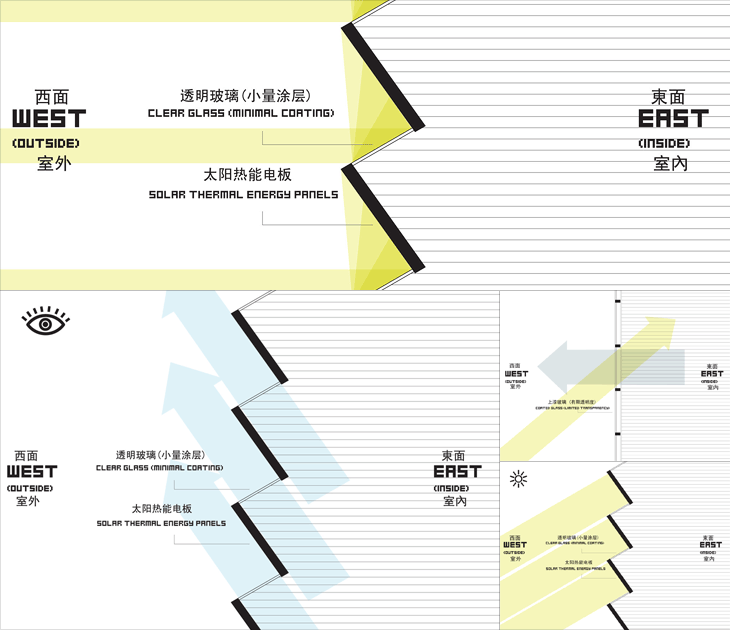
At first glance, The Shenzhen International Energy Mansion looks worth posting about only for the name alone, it sounds like some Metropolis-style sci-fi update of a concierge-equipped apartment block of the early 20th century. It looks, however, like any other office tower found anywhere in the world. Its rather standard shape is in fact deliberate and it does have some interesting features, explained in a way by these remarkable infographics on this Arch Daily article. I say in a way because they’re clearly made to be as much decorative as informational - with that huge pixellated type and simple iconography they bring to mind 8-bit game interfaces and thanks to the West/East labelling, recent revivals of the style like that in DEFCON. Anyway, have a closer look, and you can see how the building is designed to at least try and reduce energy use.

