Gravestone Lettering

I’m fascinated by the (mostly) Ohioan gravestones in this Flickr set by Tom Davie. Take a look, then have a look at these ghost signs, and you’ll notice how similar the lettering is. I’ve never seen gravestones lettered like this —any flamboyance I’d seen was kept to Celtic patterning or hideously overblown Victorian sentimentalist statuary; the lettering was universally rendered in a sombre, understated style, or at least an archaic one. Still, most of these stones look to date from the mid-19th Century, when commercial lettering like this was all the rage, and I can imagine that for many towns the best-qualified letterer was the same person who did the signpainting and advertising, so much of the style would have carried across. I wonder also whether people simply preferred to have their relatives’ gravestones done like this — who’d want a dull, plain bit of lettering when even a tin of Cocoa gets something far more ornate? What, didn’t you love Grandpa? It’s a theory anyway. The three at the bottom are all ones I’ve taken myself, all from the north of England, so you can see the style I’ve been used to.
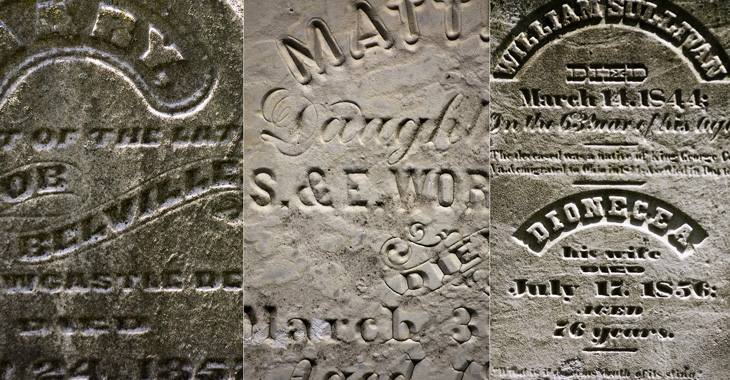
All images from this Flickr set by Tom Davie<
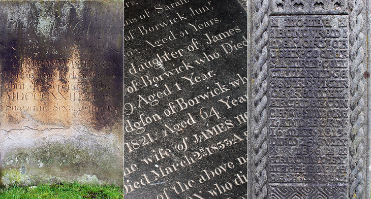
The left and centre ones are from St. Oswald’s church in Warton (my hometown!) and the one on the right is from Kendal’s parish church.

Measuring Type

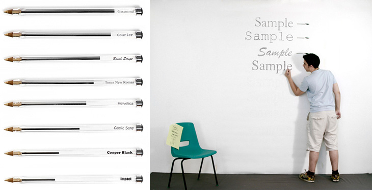
I’ve just seen this project on Swiss Miss and I really like the idea. Matt Robinson and Tom Wrigglesworth compared how much ink different common typefaces use at the same point size by drawing them out on a wall using biros. It’s not a scientific analysis or anything but it is a gloriously fun thing to do. I like the way they ended up with a graph made out of biros at the end of it, showing how much ink is left — the resulting evidence is its own data. It’s a great way of explaining typographic colour too. Love it.

Parking by Numbers

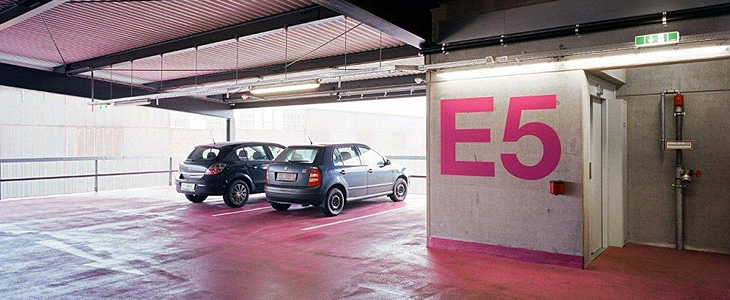
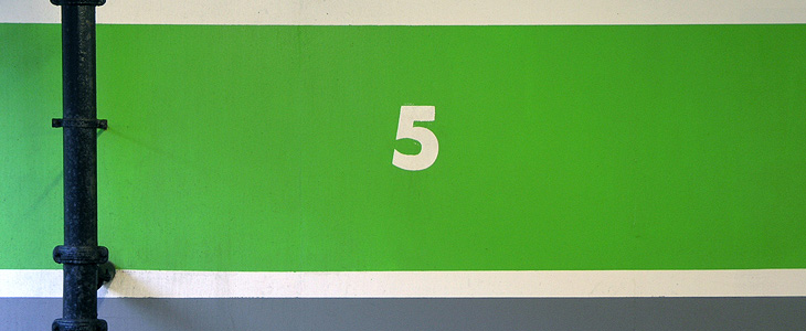
One of the sites I visit regularly (or at least, read the RSS feed of) is Arch Daily. I’ve always had a strong interest in architecture and I enjoy looking through the pictures of new building designs — even if they do often look unrealistically neat and perfect. It’s nice, then, to find actual photos of an actual built structure, and this one caught my eye for the rather predictable reason that it’s got giant floor numbers painted in bright pink Helvetica Neue on it. As so often happens I was reminded of something, this time another set of car park numbers that also caught my eye, the Futura-esque ones on the Brighton Marina car park just down the road from me. I also think I have a bit of a thing for the number 5.

Photo by David Schreyer, from this article on Arch Daily.

Picture taken near here by me. Still there on my old photoblog.

Dutch Covers

BibliOdyssey put up this great collection of Dutch picture-book covers from 1810 to 1950. There are some lovely illustrations, examples of lettering and type treatments on the covers, one of which I’ve traced below. I was thinking about tracing the illustration on this one, mainly for the overall effect it gives than for anything else, but I figure I’ll save that for a rainy day. Go and look at the rest of the covers, here.

‘Wat Hansje Zag’ by Dick Poortvliet, illustrated by van Douwe Nieuwenhuis, 1948

LIFE Magazine

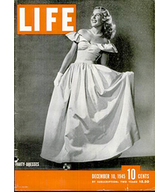
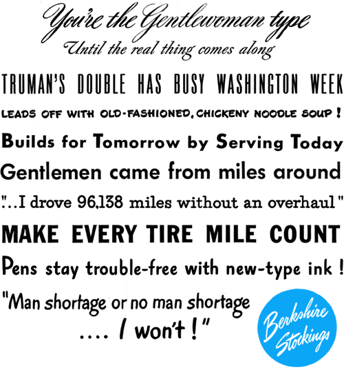
I’ve been browsing through some of the copies of LIFE magazine in this wonderful archive on Google Books, and as well as the photography and journalism I’ve found some real type treasures, especially in the advertisments. Some of the slogans and phrases read just like bits of pangrams or the beautiful mini-stories that Font Bureau create for their type samplers, and some of the type and lettering is quite lovely. The ones below are mostly from this issue from May 1945. A few are also from this one, which also has a short article and some photos (from page 43) of the first Lewes Bonfire night after the end of World War Ⅱ - something of local interest at least to me (and other Sussex people).

I’m sure you could make many amusing stories with a bit of patient searching through the archive.

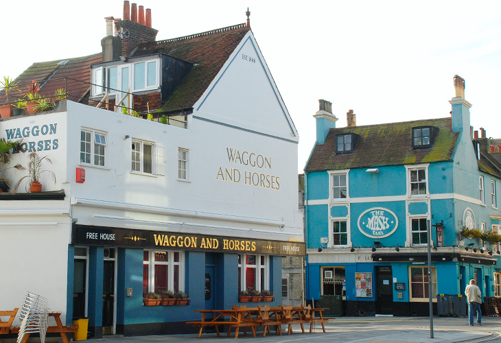
Waggon and Horses

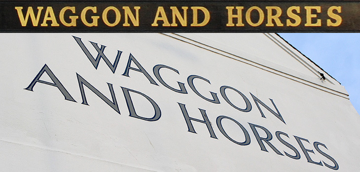
I thought I’d mentioned pub signs before here, but clearly not. For anyone interested in typography and lettering, pub signs are a great source of inspiration and ideas. I remember noticing the lettering on the side of the Waggon and Horses back in 2003 or so - the picture at the bottom was taken about then at least - and thinking how nice it was. Since then we’ve had a smoking ban in the UK, meaning outside seating is a pretty good thing for a pub to have, and there’ve been some great pedestrian-friendly developments here in Brighton, so any pub with one and near the other should be doing quite well. I hope.

So anyway, the Waggon and Horses has recently spruced up their seating area and repainted the outside and the fascia boards, which means new lettering, which I like very much, and which is why I’m putting a picture of it here. I was struggling a little bit to remember what it looked like before but Flickr came to the rescue; this one is probably the prettiest (nicely showing the front of the Brighton Dome there) but this one is probably the clearest. That café in the second Flickr pic is now a Japanese restaurant. Times change…

And no, that’s not a misspelling. Waggon is an older British spelling, but still perfectly fine.

CombineBox

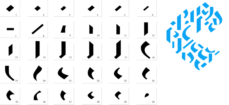
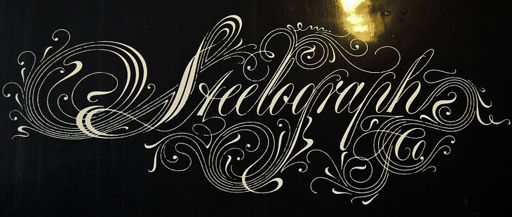
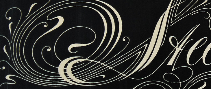
I came across this a week or so ago - another thing found on Behance if I remember correctly, and I’ve had a bit of a play around with it. I like the idea of a Fontstruct-style system for Blackletter, and I can see that Jan Schöttler has created some quite lovely things with it, but without looking at the PDF in Illustrator I would find it far, far easier to draw the letters with a pen and brush than make them with this kit. It reminds me of a Tangram puzzle game in a way. I had a play around with it and created the word below, which is tending a bit too much towards the death-metal band logo for my tastes, but hey, it has a bit of charm. Maybe you will have a better experience with it (warning, Flash site).

Ho hum. It would look more at home scratched in biro on a schoolbag, I think.
The parts.
The parts, assembled.

Serene Infoboards

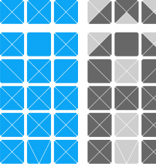
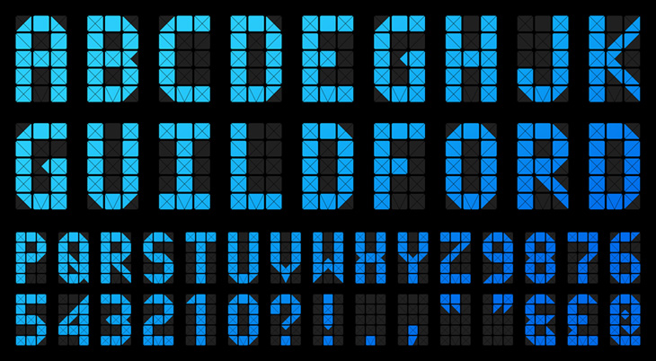
I was on a train from Guildford to Gatwick the other day, on some ancient First Great Western carriages, which had these beautifully simple infoboards at each end. Photos can’t quite capture the charm of these things, as the transition between messages was so languid, so gentle and fluid. It looks like there’s one light source behind the display and whatever power levels they’ve used for the LCD means that it changes slowly, line by line from top to bottom over the course of maybe just under a second, with the liquid crystal fading slowly between states. I got a few pictures, ignoring the funny looks from everyone else in the carriage (hey, I’m not a terrorist) and recreated the matrix used for the letters as an Illustrator file. I did think of how to create diacritics, so I added another row of boxes on the downloadable EPS - you can create all the characters here and, to a great or lesser degree of fidelity, quite a lot of diacritics - the common Western European ones at least.

I’ve mocked this up into an alphabet with a few punctuation marks, and while I had to guess at quite a few of the characters, I think it’s about right. The only reason I could see for the odd triangular bit at the bottom middle was to make a ‘V’ (and possibly a comma) — I guess using the downward-pointing triangle from the four part ‘x’ matrix would mean the letter wouldn’t sit on the baseline properly — a nice bit of attention to detail. The system is quite flexible and fairly high resolution; I like the way it extends the basic 3×5 grid, but only where necessary, and it supports a large range of characters. Lovely stuff.

Negative Space

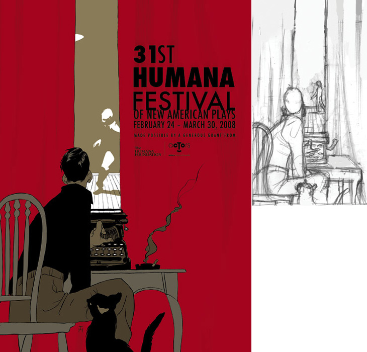
Drawn linked to this set of posters by Noma Bar that make clever use of negative space, and they reminded me of an image I’ve had saved on my computer since last year, this poster for the Humana Festival by Tomer Hanuka, below. It doesn’t need any explanation, I just love it — the image is beautifully conceived and rendered. You can read more about its development on Hanuka’s site, Tropical Toxic.

I would tweak the type a little bit thought, especially the ‘31st’ — for some reason the height of the 3 hasn’t been optically adjusted, making it look much smaller than the 1. It’s rather odd that was done like that.