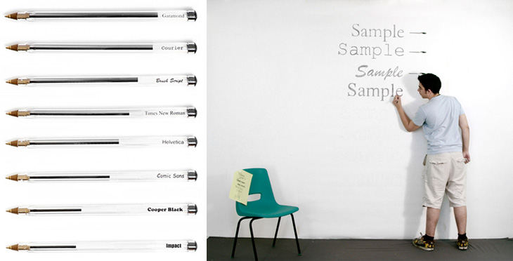
I’ve just seen this project on Swiss Miss and I really like the idea. Matt Robinson and Tom Wrigglesworth compared how much ink different common typefaces use at the same point size by drawing them out on a wall using biros. It’s not a scientific analysis or anything but it is a gloriously fun thing to do. I like the way they ended up with a graph made out of biros at the end of it, showing how much ink is left — the resulting evidence is its own data. It’s a great way of explaining typographic colour too. Love it.

