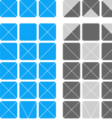
I was on a train from Guildford to Gatwick the other day, on some ancient First Great Western carriages, which had these beautifully simple infoboards at each end. Photos can’t quite capture the charm of these things, as the transition between messages was so languid, so gentle and fluid. It looks like there’s one light source behind the display and whatever power levels they’ve used for the LCD means that it changes slowly, line by line from top to bottom over the course of maybe just under a second, with the liquid crystal fading slowly between states. I got a few pictures, ignoring the funny looks from everyone else in the carriage (hey, I’m not a terrorist) and recreated the matrix used for the letters as an Illustrator file. I did think of how to create diacritics, so I added another row of boxes on the downloadable EPS - you can create all the characters here and, to a great or lesser degree of fidelity, quite a lot of diacritics - the common Western European ones at least.
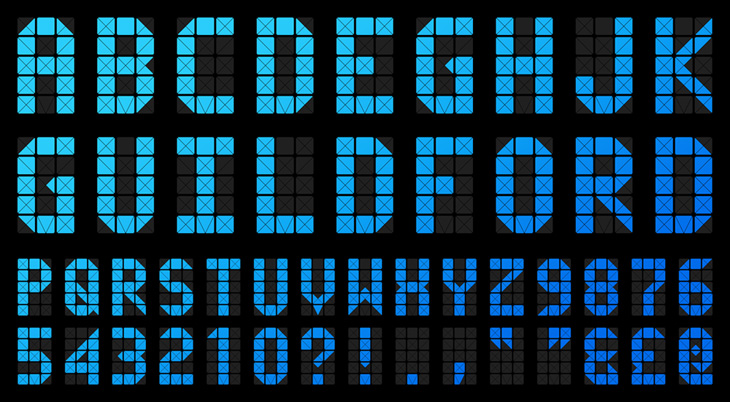
I’ve mocked this up into an alphabet with a few punctuation marks, and while I had to guess at quite a few of the characters, I think it’s about right. The only reason I could see for the odd triangular bit at the bottom middle was to make a ‘V’ (and possibly a comma) — I guess using the downward-pointing triangle from the four part ‘x’ matrix would mean the letter wouldn’t sit on the baseline properly — a nice bit of attention to detail. The system is quite flexible and fairly high resolution; I like the way it extends the basic 3×5 grid, but only where necessary, and it supports a large range of characters. Lovely stuff.

