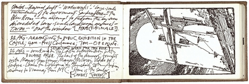
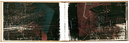
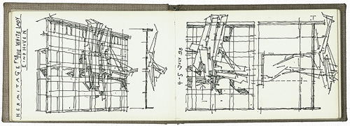
I’ve had these three pages on in tabs for a few days now and I just enjoy reading and looking at them, so I thought I should share the links. They’re three notebooks by Lebbeus Woods, the artist and architect. If you enjoy these (I certainly do), you should also have a look through the rest of his blog, and if you don’t mind all-Flash sites, perhaps look at his official site too.
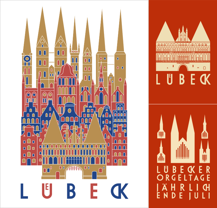
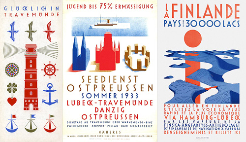
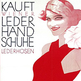
I’ve been following the excellent Cooper Typography Blog for a little while now, and recently Sasha pointed me to his article on Alfred Mahlau, with a short biography and a large collection of images of his work. Of course I’ve traced a few of them below. The lettering is distinctive and highly geometric - the curves are all based on circles - and has some attractive ligatures. As Sasha said in his article, the treatment of some of the umlauts is attractive - replacing the diacritic with a digraph when writing Lübeck. Check out the rest of the site; it’s got great articles, fascinating examples and links (you may lose a day or three with this one), and is definitely well adding to your RSS/bookmarks.
Have a look at this article about Lübeck to see the original of what’s represented in these posters. The distinctive cityscape is also used in the still-used brand identities for Niederegger and Schwartauer Werke, also created by Mahlau.
A few more, so you can see the lettering. More here.
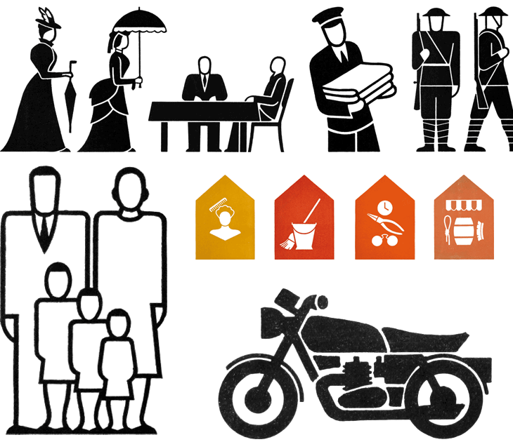
A couple of weeks ago I linked to the AIGA set of passenger and pedestrian symbols, and I find today (again, via Chris Glass) this set of icons by Gerd Arntz. These ones were created much earlier in the 20th Century; as part of the Isotype project set up by Otto Neurath to provide information to the often-illiterate proletariat, newly empancipated by socialism:
This knowledge should not be shrined in opaque scientific language, but directly illustrated in straightforward images and a clear structure, also for people who could not, or hardly, read. Another outspoken goal of this method of visual statistics was to overcome barriers of language and culture, and to be universally understood.gerdarntz.org
The set is worth having a look through, especially if you read this detailed essay on Isotype as well (thanks to Sasha for the link). Gerd Arntz’s earlier work, strongly informed by Otto Neurath, is near the top of the list, while his later work is near the bottom. A few of my favourites from the set here - some of them remind me of the opening titles of the TV series Jeeves and Wooster (set in the same decade most of these were designed):
Some symbols from the Isotype set. There’s much more information on Gerd Arntz, his other works and more about Isotype and Otto Neurath here.
Looking at these, seeing the symbols that were once universal, and those that still are, I can’t help but wonder which of today’s universal symbols will be understood in 50, 100, or 150 years time. Some will of course require updating as technology develops - for example you can see how the shape of cars (and therefore the related symbol) has changed from this vintage one, to this more modern one. Others, such as the family one (above) are still perfectly recognisable today and we can imagine will continue to work perfectly for centuries yet. However, could societal changes mean that future ‘family grouping’ symbols will need to be less gender specific or specify one adult, two, three or more; will extended families or multi-family groups be the norm? How can we design symbols that last when we don’t know what will change? Should we even try? It’s certainly something that occupies the minds of people trying to come up with an effective symbol for nuclear waste. If symbols can become out of date in 50 years, how to design one that still works for 10,000 years ahead?
All the news that’s fit to have yet another icon for.
It’s these changes to what we regard as universal and unchangable that interest me, along with this idea of developing a consistent visual language for a wide range of things. Using a personal example for a moment: like anyone who’s had to design a website or any kind of user interface in the past 10-15 years I’ve designed a fair few icons, and even in that short time there’ve been a lot of changes to once common symbols. There was a time when the prevailing wisdom for corporate websites, intranets and e-learning applications was icons with everything and if you can click it, icon it which meant vast libraries of confusingly similar icons for similar concepts - ones where words would be better. Think how to differentiate (on a small icon) between reloading a file, sending a file, moving a file, receiving a file, copying a file, downloading a file, uploading a file, and so on. Would you use arrows? Pointing which way? Left, right, down, up? Maybe you need curved arrows too. Colours?
Fortunately we’ve moved beyond that (mostly), but I remember that you just had to have an icon for ‘news’, which, so that you wouldn’t confuse it with any ‘documents’ icons, was for a while represented not by a newspaper but by an RKO-style radio mast - indeed, if you remember Pointcast, you may remember the application icon for that was that very thing. Now, our visual language of online icons is part of a rapidly maturing set of design patterns - we see icons, but only for a very small set of functions that are common across sites and often across devices; things such as shopping basket/cart, info, and the audio control icons such as play and pause. It seems that for online applications the idea of a universal visual language is at least seriously out of fashion, and I wonder how much of an influence that will have on the offline world.
Will airports of the future only have symbols for one or two things? I guess that depends less on fashion and more on the growth of literacy in the world, and the decline in the number of languages people will use.
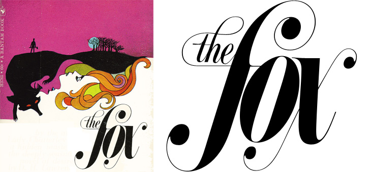
Just saw this book cover on Sci-Fi-O-Rama with some gorgeous lettering. If you’re interested in lots of great sci-fi and fantasy illustration the site is worth visiting, though type and lettering don’t feature there very often. I loved the exuberance of this script, it’s perfect late 60s stuff, and yes, of course I’ve traced it.
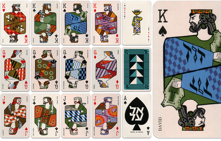
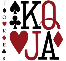
The other week Grain Edit posted some photos of these 1970s playing cards produced by El Al and beautifully illustrated by Jean David. They depict Kings, Queens and Heroes from Israel’s biblical past, and come as a boxed pair of sets with an illustrated cardboard sleeve. I had a look around for some clearer photos so I could get a better look, or even a good source of info on Jean David, but there’s not much out there at all. I did, however, find an eBay auction for a set of the cards, so I got my very own set - eventually, and they really are lovely:
El Al playing cards, Illustrated by Jean David
The cards are indeed beautiful and are also nice depictions of the biblical characters - wise Solomon with his scrolls, Jonathan with his arrows, Samson with his jawbone, etc., and reflect the tradition of representing the legendary or historical characters on cards. There is a nice nod to the Paris court tradition of playing card characters by keeping the depiction of David as the King of Spades. Of the other traditional biblical characters, Sheba replaces Rachel as Queen of Diamonds and (unsurprisingly) Judith is replaced with Esther as Queen of Hearts. Julius Caesar is an obvious one to leave off (far better to show Solomon), and instead of the sometimes-shown Judas Maccabeus as Jack of Clubs there’s another leader of a revolt, Bar Giora. I guess it’s hard to choose such a small number from all the people in Israeli history, but if you’re going to show Bar Kochba, you have to show Bar Giora too. Perhaps.
Beyond the history lesson, looking at them got me thinking about the type used to identify individual cards in general. The individual numbers and letters work very well on the card, and are pretty much standard for all cards, but put them together and you see that there’s not much consistency between them at all. As a set, they’re discordant, drawn on a whole different scale to each other, the curve of the J appears exaggerated and incredibly wide compared to the Q, and the K’s slab serifs are enormous, but individually, they each work just fine. I’ve seen playing cards motifs and designs implemented as branding and packaging (such as this rather nicely branded wine), and I notice now that they never used the actual type style from the cards themselves - obviously, designing characters to sit alone is a different art to designing them to sit together.
While I’m on the topic of characters sitting together, it’s a shame (and surprising) that the type for the names isn’t kerned, and more so that it’s the King David card where this is most obvious. Fortunately, apart from Bathsheba, the names of the others are pretty forgiving and the lack of kerning isn’t very noticeable. Still, it’s surprising that that was allowed through, given the overall quality of the cards.
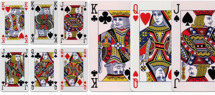
Modern standard card designs. These are from a House of Lords deck.
I dug out my standard set when I got the El Al ones so I could compare them. There’s something quite comforting about how they’re familiar they are, but I was wondering how standardised they really are. Looking at the set above, which is a fancy-schmancy House of Lords set and comparing them to a cheap £1 set from a newsagents, there is a fair bit of difference in the quality and the detail of the drawing, although many of the design elements are consistent; for comparison, I’ve put a queen card from each next to each other here. I had imagined there would be a bunch of royalty free EPS files that you could buy or download and slap on your cards, but perhaps not. One thing that seems to be important for standard cards is that all the characters have to look really, really tired and unhappy, a convention I’m glad to say wasn’t followed with the El Al cards.
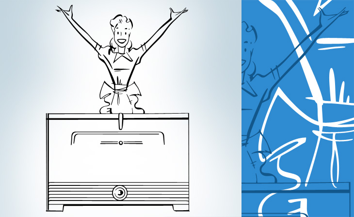
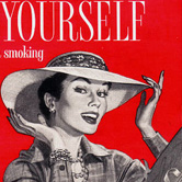
If you like mid-20th Century print advertising, and like a lot of it, then this page on diskursdisko may well be just for you. It’s a collection of links to various pools on Flickr containing hundreds of scans of old adverts and promotional materials (mostly, but not all, from the mid-20th Century), and is quite a trove of old type, lettering and illustration. I’ve found quite a few inspirational things on there, including this great General Electric illustration. It reminds me a bit of The Stepford Wives (the 1975 film, not the 2004 one) - they’re not selling freezers, they’re selling exultant joy here. I mean, if getting a GE freezer really made you that happy, wouldn’t you want one?
Gosh, doesn’t she look happy? I love the beautiful brush strokes, they’re so satisfying to trace.
I’ve linked each image to the photo page on Flickr - some have large originals, others not.
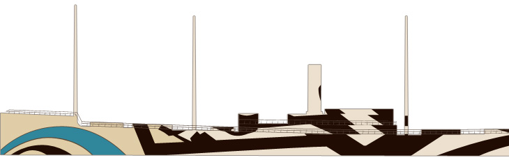
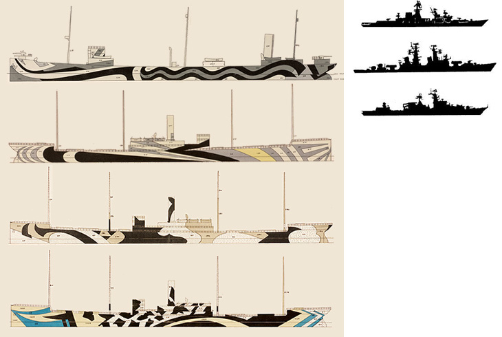
Coudal (I think) linked to this the other day. It’s a collection of designs for dazzle camouflage applied to ships during the First and Second World War to confuse the silhouette of the ship and make it less likely to be targetted by enemy subs. I got a few silhouette images (from this rather odd and boastful page) and put them next to some of the designs, and you can see why the technique gained a lot of support. The designs would at least make it hard to identify what kind of ship it is, which might help if everyone did it…
So yes, that raises the question of effectiveness. I imagine in full sun it would be quite good - literally dazzling the eye, but in an overcast, at dawn or dusk, the ship would still be silhouetted quite clearly against the sky. So what were the results? From the site:
Did it work? Dazzle and the convoy system were implemented about the same time, so it is hard to say. However, crews on dazzle ships were very proud of the bedazzled camouflage. It was definitely a morale booster. The British and the Americans fully adopted dazzle because at the time they found it to be effective and inexpensive.RISD
Tests should be done! Still, however well they worked, they’re pretty fabulous. More ships should be painted like this, just, you know, because.
Annoyingly, the RISD only has these tiny images, and I can’t find anywhere to buy prints either. There is, however, a poster from Transport for London advertising the Imperial War Museum that shows an illustration of a freshly bedazzled warship, here.
You can get a wall decal of this from the site - in the ‘Urban’ section. Linked from the image.
I see (via Chris Glass) that AIGA have put the complete set of passenger and pedestrian symbols online, free of charge, apparently for the first time. They can be downloaded from their site here, though beware of the ‘complete set’ zip file, as rather unhelpfully they don’t have file extensions. The story of how the symbols were developed is interesting:
To develop such a system, AIGA and D.O.T. compiled an inventory of symbol systems that had been used in various locations worldwide, from airports and train stations to the Olympic Games. AIGA appointed a committee of five leading designers of environmental graphics, who evaluated the symbols and made recommendations for adapting or redesigning them. Based on their conclusions, a team of AIGA member designers produced the symbols.
The fact we still see (most of) these symbols everywhere speaks of the quality of the design process they employed. The only sign that has changed significantly is the one for ‘shops’ - even without the change in attitudes to smoking, the pipe would appear dated these days anyway. The symbol was also impossibly dense and cluttered. You don’t see the ‘smoking’ sign anywhere these days either (well, not in the UK at least), it’s just that grammatical horror, “It is against the law to smoke in [sic] these premises” on every building, everywhere. It makes me want to vandalise in the name of good English.
Airport, escalator, smoking, shops and restaurant.Café, heliport, baggage claim and check-in, exit and left luggage.
Hang on a moment. Exit? I truly have never seen that symbol before. I can see the thinking behind it, but clearly it never caught on, and for good reason - it’s far too similar to the ‘no entry’ sign. In an emergency situation you can’t guarantee that either sign would remain perfectly level, just at the time you’d really want people to be able to tell the difference! The Wikipedia page on exit signs (yes, of course there’s one) makes no mention of it either.
Most of the rest of the icons. The one for baby facilities always strikes me as a bit horrid, like the poor child has been dismembered.
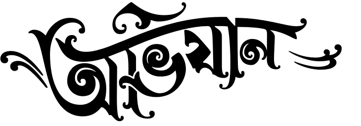
One of the sites on Sigurdur Armansson’s list that I’ve been following is Hindi Rinny, which is all about South Asian Typography, and posts gems like this. The title is quite beautiful and (of course) I’ve traced it to get a better look at it.
Original here. I did trace the other two bits of text, but I’m not enjoying those quite as much so didn’t include them here.
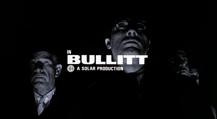
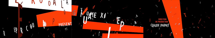
I recently rediscovered The Art of the Title Sequence site, which is a goldmine of inspiration for anyone who needs to animate type, and I’m surprised I’ve not posted about it before. Title sequences are remarkable in that they have to fulfil some important roles in a film - they’ve got to tell you who made it, who’s in it, who paid for it, in a way that complements and introduces the film (but is clearly not the film itself, so you can get all your arrangements with popcorn/noisy snacks/coughing/sneezing, etc. out of the way), and all in a short a time as possible. Those requirements provide a fertile ground for all sorts of creativity, to the extent that the title sequence becomes a genre in itself: a very specific kind of animated short; an animated infographic if you like. So we have sites like this one for people like me to trawl through and drool over lovely examples of typography, lettering and iconography. First up, one of my favourite films, Bullitt.
Isn’t that just perfect? See it as part of the full sequence, here.
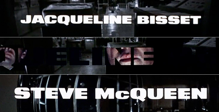
When I first saw this sequence I was scrabbling for my camera to try and get some shots of the lettering, but didn’t manage to get much worthwhile. The typeface is just beautiful, and I’ve always wanted a copy of it, but after a lot of investigation it turns out there isn’t an exact digital version of it. There’s a very, very similar one called XXII Black Block, but you’ll notice that it has slanted terminals on the E and T - almost there, but not quite.
I love the way the lettering leaves a ‘hole’ in the current scene, which expands to show the next one.
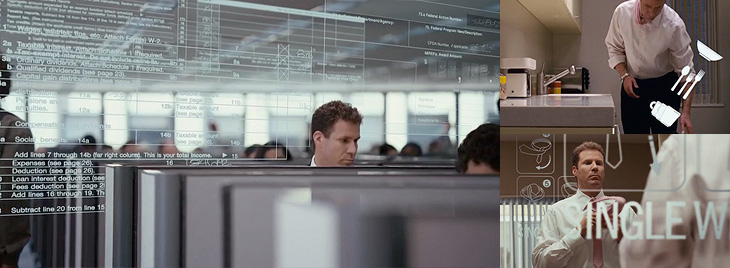
Next up is Stranger Than Fiction, a film I’ve never seen but might get around to watching one day just because the title sequence is interesting. It looks like it could be great or dreadful, and nowhere in between. Either way, the title sequnce is great and makes playful use of type, instructional iconography and labelling to enhance the story. I like the way the labels for everything definitely feel like part of the main character’s world, his obsessions, so real to him, made visible (and real) in the world for us to see.
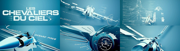
This next one is not so much about the type. It’s not really about the type at all. In fact, I hate the type in this one. The exploded diagrams are lovely and the way they tie in with the live footage of the Farnborough Air Show is highly compelling, so to have this clumsy uninspired type stuck over it is a real disappointment and a wasted opportunity. I’m including it in my favourites because you can imagine how nice it could be if a typographer had been given a chance to polish it up before delivery:
Nice graphics, shame about the type. Full sequence here.
Gradually coming back to nice type with this one - I remember, years ago, playing around with analogue electronics to draw letters and simple shapes on oscilloscope screens and though it was pretty painful it was satisfying when it worked. The animations in Tron were done this way, with the flat surfaces coloured in later by hand. The end sequence for Iron Man deliberately references these very first vector graphics with these CAD-style animations, with the type done perfectly to match:
A still from the Iron Man end sequence. Full animation here.
Next I’ve got this one which is just good solid no-frills typesetting, enlivened with great use of a close-up and, again, those vector graphics:
And last of all, a very satisfying and clever use of 3D to form the names and titles by constantly changing the camera angle. I imagine it would be a nice way to tell a short story, as I found myself watching it and reading the words quite comfortably. It’s paced very well, and the fascination you develop for how the letters come together makes it an entrancing experience:


