Effective Simplicity

A few people tweeted links to this brilliant collection of packaging redesigns by Antrepo — they’re done as an exercise to illustrate the idea of reducing the design of the labelling to its simplest form, while also showing an intermediary step of a ‘partially simplified’ design. It’s interesting the effect it has on the different products. Some gain a sense of being a premium, high-value product, while others start to resemble economy, basic versions. The Pringles packs look pretty basic; with the full-colour printing gone, the basic nature of the cardboard tube stands out, and with the simple black printing it looks like a supermarket own-brand or something bulk-bought by caterers. On the other end of the scale you have Nutella and the Schweppes drinks — both of them look like the kind of ‘artisanal’ packaging you’d see featured on the Dieline or similar targeted at people who want the same old stuff but to feel a bit special about buying it. And having said that, the Corn Flakes one is just great. It’s absolutely perfect — if I ate cereal then packaging like that would definitely have shelf appeal with that beautifully simple and stark lettering, and how. It reminds me a little of the General Mills Kix packaging, which I also like a lot.

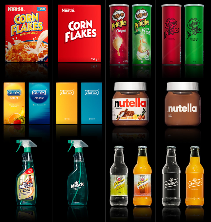
Visit Antrepo’s site for more info and links to the full set.

Of course, packaging for most fast moving consumer goods is brightly coloured and covered in imagery for a reason — it’s to draw the eye and make its purpose, contents or intended use immediately obvious to the shopper. Without going into some kind of pop-psychology analysis of consumer habits, it’s interesting to think what the manufacturers are intending with each package. The simplified Mr Muscle one looks great, but on the original you can easily tell it’s for windows and tiles even without reading any of the words. Similarly for the Durex boxes, I’d hazard a guess and say the orange box contains flavoured ones — the word ‘select’ hardly makes that clear — again, the original packaging wins out.

The food ones all have some kind of serving suggestion (albeit a ridiculous one in the case of the Corn Flakes, I mean, that’s quite a tempest going in the bowl) designed to put the image of the food in your mind, a simple association that makes you more likely to buy it. The only one I think where that doesn’t happen is with the Schweppes bottles. The type is pretty small on the simplified one, but it’s a hell of a lot more legible than the original. Given that you’re likely to see bottles like these in a fridge behind a bar, you’re going to be hard-pressed to read the label and form an idea in your mind that maybe you’d want mandarin as the mixer in your drink, as opposed to orange juice, say. You’re going to look and see confusing labels all done up with sparkles and images of bubbles, and not know if it’s soda and plain old OJ in them or something more special. You’d just end up asking for something generic, and end up (in a lot of British pubs at least) with some rank pre-mix out of a tap on the bar. I could mention at this point that Red Bull might be considered drinkable by some, and therefore a food. It’s not, but it is easily recognisable in a behind-the-bar fridge, which tells you something about British pubs and the drinking culture they encourage, but that’s an entirely different rant.

So yes, beautifully simple packaging is a wonderful idea, but I doubt we’ll see many big manufacturers opting for it, sadly.

Chemical Color Corporation

I wanted to trace this for the fun conceit of the C being used as a retort stand. It’s an interesting way of dealing with the open space created inside the Ch pair — I don’t think it quite works, the horizontal bar is a bit clumsy and the positioning of the retort glass itself could be more balanced, but it is all rather fun. I’ve traced it as best I can, not having any higher resolution example than what you see below, so yes, the script is quite clunky. At a certain point you realise you’re creating rather than copying. Who knows, maybe the original was even more wonky? I’d love to see a high-res example of it though. Originally seen here on CO₂Comics, via Drawn.

The Ames Lettering Guide

It’s so good to see Drawn (sort of) back again, I’d sorely missed its regular supply of illustrations and tutorials and feared it would never come back. But no, thankfully it’s back (as a Tumblr blog) with a beautiful new logo lettered by Chris Gardner. The grammar wonk in me is glad they’ve dropped the exclamation mark from their name too — makes referring to it a little easier, no?

So yes, the Ames Lettering Guide — Drawn linked to a nice tutorial on using one by Dustin Harbin, which brought back some memories of school for me. I remember we were shown how to use one and set some exercises, but since then the hand lettering I’ve done hasn’t had quite the constraints (or the volume) to need anything more than a ruler and a bit of patience, so I’d completely forgotten the thing existed. I’m sure there’s one back at my parents’ in a box somewhere. Maybe I’ll dig it out, because now it seems like a useful thing to have around.

The Royal Opera House

Definitely catching up with old news with this one; I’ve had this Brand New article on the new Royal Opera House identity by Someone bookmarked for a while. If you’ve not seen it already, the new identity centres on a fantastic new cut of the royal crest by Christopher Wormell and is supported by new type and image guidelines. The new typeface is Gotham Light, which is lovely and works wonderfully with the new brand, but I can’t help but feel a little sad to see the Caslon-esque old wordmark go. Still, if it had to go, it had to go, and given how Covent Garden looks and feels nowadays Gotham is a good choice — it’s a fresh clean and light companion to the dense complexity of the crest, and works perfectly with the more modern layouts and imagery they’re using, but was Gill really just too much of a cliché?

The new crest and logo

The new crest itself is wonderful. The old one had a certain old-time charm to it, but next to the new one it looks distinctly shabby. Like Armin Vit, I’m especially impressed that they produced two versions for use on light and dark backgrounds, rather than simply inverting the image. The work is so well done that it’s hard to work out what’s actually different between the two images — they’re not just outlined or trimmed, the thickness, detail and density of each image is different, but designed to give the impression they’re the same. Clever and skillful work by a true master of engraving:

Palindrome

This new sign for the V&A is wonderful. The museum commissioned Troika to make a sign for the tunnel connecting the museum and South Kensington tube station, and it’s bloody gorgeous. It’s a kinetic sculpture, rotating parts of the museum’s logo (in itself a wonderful thing, by Alan Fletcher in 1989) so that it reads at first from one side, and then from the other. I did wonder at first whether the V and A on Fletcher’s original logo were actually rotationally symmetric, and no, of course they aren’t, but for a sculpture like this the alteration to make them work like that isn’t at all noticeable. Go and watch the video (or of course, visit the museum) to see it in action. It’s so simple and yet so clever, whoever came up with the idea must have been quite pleased with themselves, and justifiably so.

Pictures from Troika’s site.

Not symmetric, but close enough for kinetic sculptural fun.

The Financial Services Authority

It looks like the UK’s Financial Services Authority, theoretically responsible for making sure financial institutions (like banks) stick to the law, don’t do stupid things and don’t rip people off, is to be shut down, or merged into the Bank of England, presumably because it didn’t do enough of those things well enough and often enough. This will make everything OK again, we are led to assume. Such is life. I guess this is the beginning of the end for the FSA logo though, which is a bit of a shame. The lettering is crushingly dull, but the scroll-and-circle device is lovely — a real I wish I’d done that kind of thing. It’s drawn to resemble a continuous scroll such as you’d find on a certificate or banknote, but is just cleverly constructed to look like that. It’s just so beautifully and simply done it’d be a shame for it to disappear altogether.

Deconstructing the FSA logo, slightly.

One to Like

John Beohm of Idents.tv posted the six new idents for Australia’s ONE HD tv channel — I don’t have much to say on them other than they’re lovely and simple and I really like the logo. As John points out, it’s good that they avoid the crass overdone clichés of floodlit stadia and huge billboards, generally I don’t find myself watching sports channels but of what I’ve seen their idents (and identities) are all pretty much of a muchness. Lots of glassy, glossy, glittery effects, dramatic perspectives across giant dystopian stadia-cities shrouded in perpetual night; the impression you’re supposed to get is that this is epic, this is a clash of titans, a great battle to end all battles, an extraordinary experience that will resonate through time and space, this is it, and then, just as you’re (theoretically) driven to the very peak of excitement and anticipation, here’s the golf. Woo.

So yes, it’s nice to have a set of idents that have some of the actual sporting action in them. The logo looks to be a very slightly tweaked Helvetica Black — the version I have has a slightly wider aperture in the lowercase e (but it could just be the 3D rendering creating the illusion). The curve cut out of the bottom hints slightly of the epic view-over-the-horizon style of usual sports channel logos, but it’s subtly executed and provides a perfect frame for the HD suffix. Anyway, slightly more than I was intending to write on this one. It’s nice. Go and watch the videos on Idents.tv.

Up There

Up There is one of those things that’s been linked to like crazy across Twitter and most of the sites I read, but I’d not got around to watching it. I find that with a lot of online video, I mark it to watch later when I’ve a bit of time to devote to it and then, well, don’t get around to it. So, if you’re like me and haven’t seen this yet, I do recommend watching it. It’s only 12 minutes, very well composed and edited and really gives you an insight into the work of people who hand paint signs and adverts on the sides of buildings. It’s a craft that (not surprisingly) is dying out, but one that can be kept alive by commissions from a few enlightened companies and agencies. The film was sponsored by Stella Artois who, as JJ from Graphicology points out, are producing more narrative-based advertising lately. Kudos to them for this, I’ve a lot more respect for Stella Artois the company now. Less said about the lager.

Stills from Up There. Go and watch it at Vimeo.

The Concrete Quarterly

It’s been around for millennia, but concrete is a building material that pretty much defines the architecture of the modern era. The reconstruction efforts after the second world war really got the world interested in concrete in a big way — it allowed for rapid, economical construction of vast numbers of apartments, factories, malls, roads and more, and made tall buildings commonplace.

Of course, while not exactly a new building material, the uses we put it to often were. We know all too well the grey, crumbling monoliths, the remains of ill-conceived and badly built projects blighting our cities and towns, but too rarely do people celebrate the truly wonderful concrete buildings we have — from cathedrals to offices, shops and homes to soaring bridges, roads and basic utilitarian buildings, it’s an incredibly flexible and often beautiful building material. This is, I guess, what the Concrete Quarterly was designed to highlight. I’ve only read some of the earlier editions, but right from the first issue it talks of the diversity of uses of concrete; bridges, home developments and motorways all built with the stuff. Perhaps this variety is what’s influenced the design of the magazine over the years. Not until the 60s does it gain any kind of design consistency — in the 50s barely three or four editions are alike. Not that that’s really a bad thing, as some of the early covers are just gorgeous:

Incredibly lovely

I was browsing through wondering if I could spot any familiar projects, and lo, in the Winter 1962 issue there’s a cover article on Coventry Cathedral, one of my favourite buildings, which I’ve written about before here.

I think this was the first year with all four issues alike. That’s Coventry Cathedral on Issue 55.

Even within the same issue the headline styles vary considerably, and sometimes even the body type too. It makes for a slightly odd effect, but on the whole I think it works — it all ends up being rather charming. This one is wonderful on so many levels. Belgian Roads! What a subject!

It’s worth having a look through the archives as there are many beautiful photos in there. I was delighted to see some photos of Liverpool Cathedral, which I visited many years ago and loved right away — I gather it’s not really all that popular locally but I think it’s great. Perhaps I just like anything with lots of stained glass in it.

The Stilfontein Mine in 1952, Liverpool Cathedral in 1967; and Coventry Cathedral in 1962

Kineda

I was reading the latest post on The Art of Hand Lettering earlier and found the stages in the process fascinating, in that I preferred some of the sketches to the end result. I do really like the final logo, but there was something about one of the on-screen workings of the logo that I thought really brought the word alive — it’s the one in the detail I cropped from the article at the bottom right below. There’s something really playful about it, like the rest of the word is being bounced along by the K. Still, that’s my impression and it most likely wasn’t the client’s intention — and that’s the difference between doing stuff for yourself and doing stuff for paying clients!