Definitely catching up with old news with this one; I’ve had this Brand New article on the new Royal Opera House identity by Someone bookmarked for a while. If you’ve not seen it already, the new identity centres on a fantastic new cut of the royal crest by Christopher Wormell and is supported by new type and image guidelines. The new typeface is Gotham Light, which is lovely and works wonderfully with the new brand, but I can’t help but feel a little sad to see the Caslon-esque old wordmark go. Still, if it had to go, it had to go, and given how Covent Garden looks and feels nowadays Gotham is a good choice — it’s a fresh clean and light companion to the dense complexity of the crest, and works perfectly with the more modern layouts and imagery they’re using, but was Gill really just too much of a cliché?
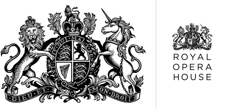
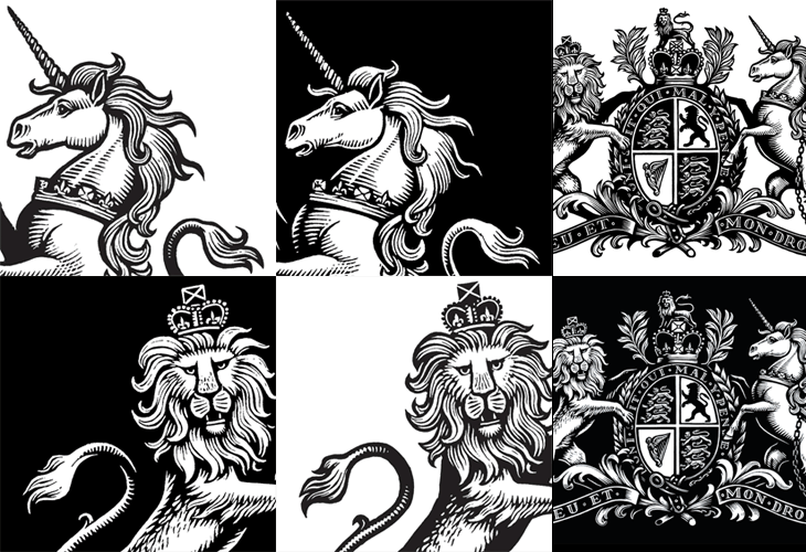
The new crest itself is wonderful. The old one had a certain old-time charm to it, but next to the new one it looks distinctly shabby. Like Armin Vit, I’m especially impressed that they produced two versions for use on light and dark backgrounds, rather than simply inverting the image. The work is so well done that it’s hard to work out what’s actually different between the two images — they’re not just outlined or trimmed, the thickness, detail and density of each image is different, but designed to give the impression they’re the same. Clever and skillful work by a true master of engraving: