Ffffound is a dangerous site. I try not to visit unless I’ve got a couple of hours to spare as before I know it it’s dark outside and I’ve got a couple of hundred tabs open all with amazing things in. On my last bout of browsing the site I found a couple of links to So Much Pileup, specifically these two posts, Philately Fridays: Israel 1967 and Israel 1976. I’ve traced both, but I’m just going to post the one set for now as I’m not entirely satisfied with how the 1976 ones came out. Some things just need gold ink.
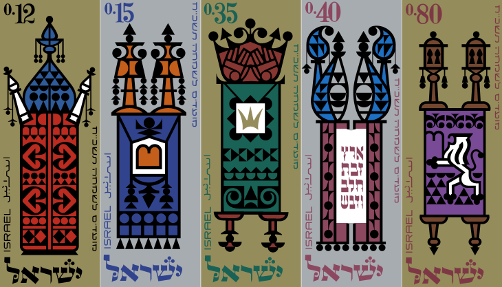
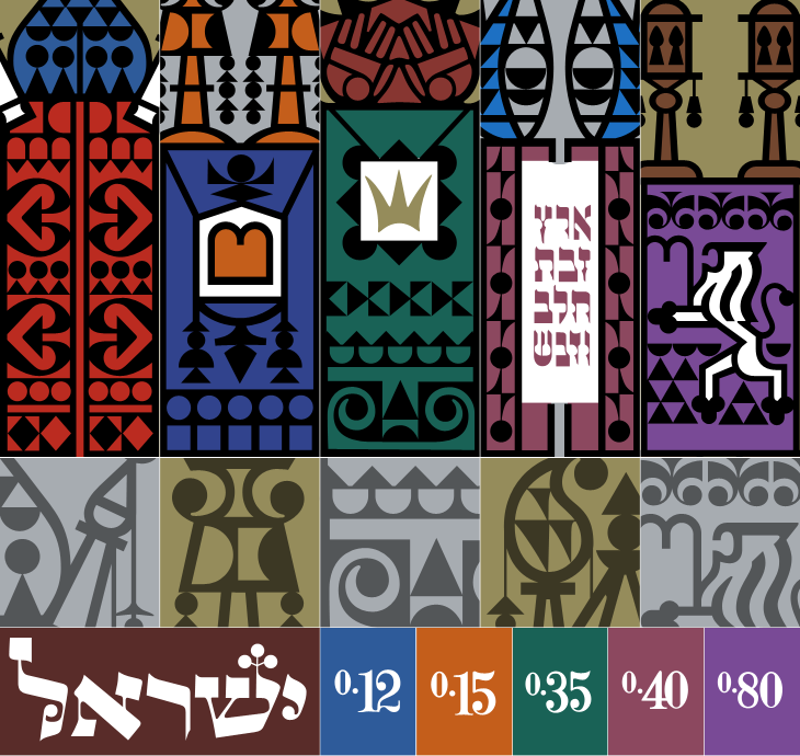
The set of stamps was called “Joyous Festivals 5728”, released in that year (1967) and commemorate five festivals with illustrations of decorated Torah scrolls. Each of the stamps originally had a tab showing an illustration of an open scroll and a biblical sentence, which unfortunately I don’t have decent pictures of. There’s a tiny bit of information here, courtesy of Israel Philatelic Federation’s stamp catalogue (another strangely hard to use website). I’ve included my tracing here. The patterns are beautiful:
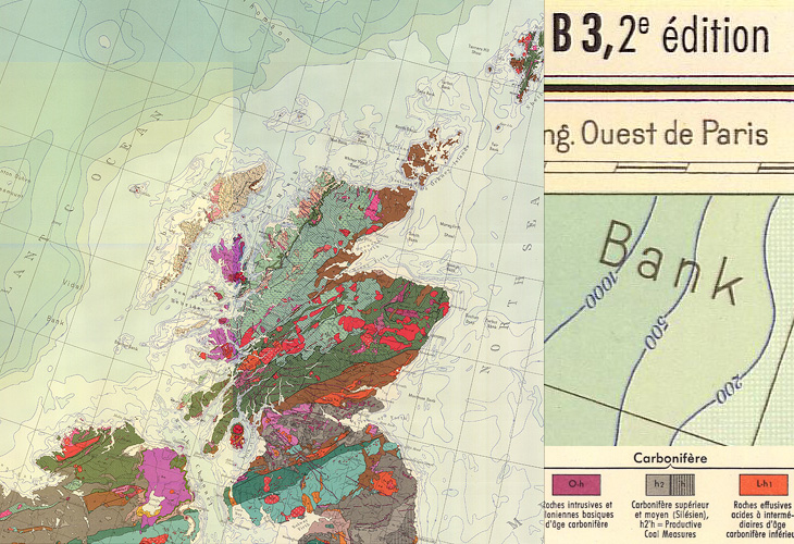
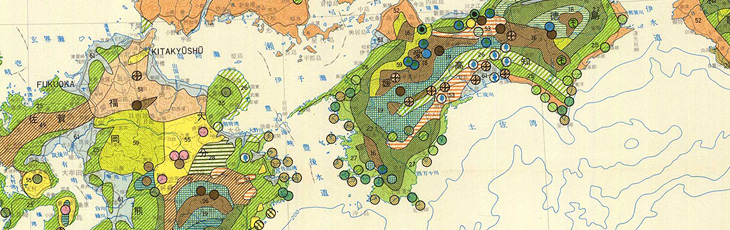
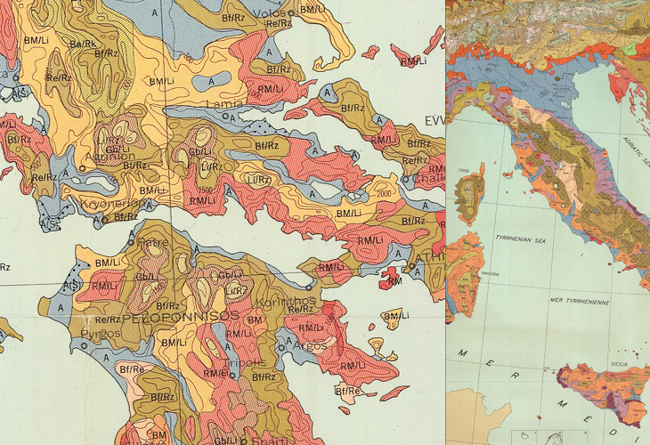
I found some maps from this site in a Google Images search quite some time ago, and kept a few links to some of the prettier ones. The maps show a variety of things, mostly soil types, but some show other environmental information such as bioclimates, soil erosion and watersheds, all in bright colours and fantastic textures and patterns. Some of the compositions are quite beautiful; bright splashes of colour for the regions of interest and stark outlines and clean white paper for everything else - a nice source of inspiration for graphic and information designers.
If you’re interested in site usability, then this might be a (another) good example of a site with great content but bizarrely inconsistent and difficult information architecture and user journeys. The home page is (I think) here, but to save you a few clicks on mostly pointless splash screens, here are the pages for Europe, Africa, Central and South America, Asia, The United States and Canada. Australia, New Zealand and the Pacific Islands don’t appear for some reason, unless I’m missing a link somewhere.
Mostly Scotland, and a nice big chunk of Atlantic Ocean.The forests of southern JapanTwo crops from the same map of a large swathe of Europe.
When I was writing about the St John’s Bible last week I was reminded of the typography of Coventry Cathedral and wanted to post a couple of pictures of it then, but I wasn’t immediately able to find decent pictures. I’ve had a proper look round, done some more research and found some pictures and I think given the history of the cathedral it’s an appropriate post for Easter Sunday, with themes of rebirth and all; Following the destruction of St Michael’s Cathedral (and much of the city) in a Luftwaffe attack on the 14th of November 1940:
…the then leaders of the Cathedral Community took the courageous step to build a new Cathedral and preserve the remains of the old Cathedral as a moving reminder of the folly and waste of war. From that point, Coventry Cathedral became the inspiration for a ministry of peace and reconciliation that has reached out across the entire world.Wikipedia: Coventry Cathedral
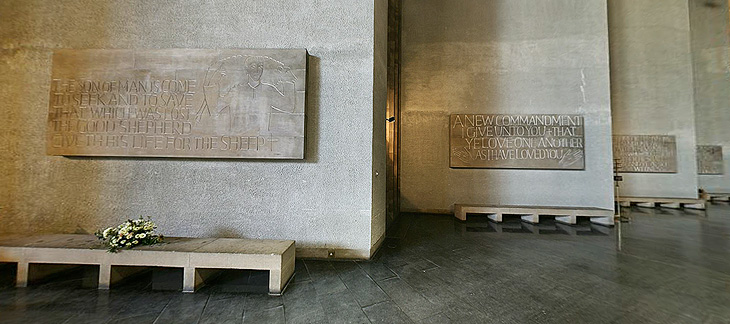
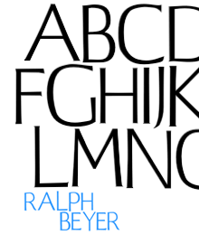
The new Cathedral was designed by Sir Basil Spence (who also designed my alma mater, Sussex University), with stained glass by John Piper and Keith New, the great tapestry by Graham Sutherland, sculptures by Jacob Epstein and John Bridgeman, the Great West Window by John Hutton and last, but absolutely not least, lettering and carvings by Ralph Beyer. It’s this lettering that fascinates me, and it’s strange that there are so very few pictures of it.
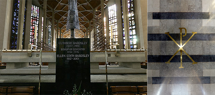
Some of the Tablets of the Word by Ralph Beyer. Picture from the QTVR movies in the Virtual Tour. There is also a picture from 1962 on the Time Life website here.
When I was looking for pictures I revisited the Cathedral’s website (which for some reason has no photo gallery) and realised that it’s possible to get some decent pictures out of the well-intentioned but bizzarely designed ‘Virtual Tour’. So with one exception (below), that’s where I got the pictures here. I don’t like being negative, but that virtual tour really could have a better user interface. It dominates and detracts from the movies, which are presented at a size that’s far, far too small - the content and the Cathedral deserves better than that.
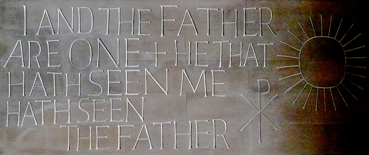
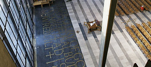
Detail of one of the Tablets of the Word by Ralph Beyer. Picture by Herry Lawford on Flickr.
How Beyer came to be chosen for the Coventry Cathedral project is interesting, and includes a fair few other famous names and some remarkable coincidences. I have to quote fairly liberally from his obituary in the Times, or I’d just be rewriting it:
In 1937, aged 16, Beyer visited England where, on the recommendation of Mendelsohn, he spent six months as an apprentice to Eric Gill. Like Gill, and doubtless enthused by him, Beyer was fascinated by the qualities of carved stone, by simple sculptural forms and especially by letterform. Ralph then studied in London, at the Central School of Arts & Crafts and at Chelsea School of Art where he met Henry Moore, for whom he worked briefly before being interned as an enemy alien at the outbreak of the war.The Times
While in the internment camp, he met and befriended the young Nikolaus Pevsner, who had started work on An Outline of European Architecture and would later write the Pevsner Architectural Guides.
Encouraged by Henry Moore, Spence decided that, the Sutherland tapestry apart, the dominant decorative feature of the interior of the new Coventry Cathedral should be lettering rather than narrative sculpture. He knew he was looking not simply for a craftsman but for an artist capable of making a truly distinctive contribution. It was Pevsner who suggested that Spence should meet Beyer, to learn how he might approach a project which was to become the defining challenge of his life.The Times
The Independent has a more extensive obituary, and highlights a good point about the style of the modern Church of England being inspired by the early church, which I think is what reminded me of this work when looking at the St John’s Bible:
Although Spence’s cathedral was criticised for its conventional Latin cross plan, Beyer’s Tablets of the Word reflected post-war ecclesiastical interest in the early church and today they remain strikingly innovative examples of lapidary art.The Independent
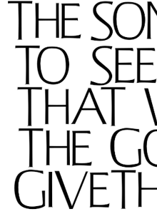
Beyer also designed a typeface for use on hymnals and other publications. The cathedral website makes good use of the typeface using Flash, and using browser zooming and screenshots I’ve assembled the text at right and top right. Of course that’s no substitute for the real typeface; I’d like to see if there’s a lowercase, other weights or styles, what the rest of the numerals look like, and how it’s kerned.
Further use of the Beyer face behind the altar, and at right more influences from the interest in the early Christian church, with the Chi Rho symbol, denoting Christ.
The inlaid lettering by the Great West Window. Finding clear pictures of this is nigh-on impossible, and I’m tempted to turn up with my camera and tripod and make my own. As it is, here’s a closeup.
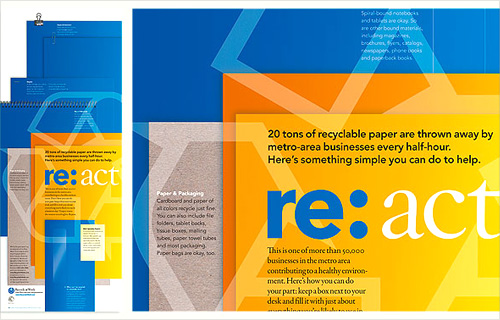
Another one I’ve had open in my browser for a while. I may have got it from a link in Twitter, possibly from Typegirl or (probably) Pinch themselves. I like the basic idea of the re:[word] brand identity, but the implementation is rather nice too. I wanted to keep a note of the two images below in particular because I like the effect of the overlaid print presentations and the super simple white on blue brochure cover.
Grain Edit found a great collection of vintage Porsche posters for sale. Well, some of them are for sale because a lot are already sold, buy they can be seen in the VP Racing poster archive. I’ve had a good look through them and I love the ones by Atelier Strenger - to me they make the 60s and 70s the golden age of Porsche posters - such tight composition, typesetting and use of photography! I’ve traced a couple of examples of type from this Strenger one and the numbers from this Holz one. Lovely stuff.
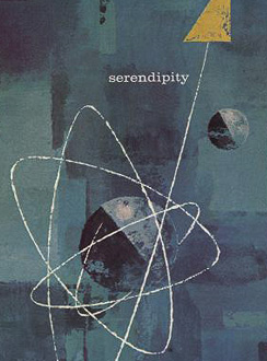
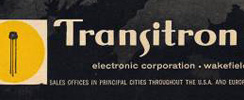
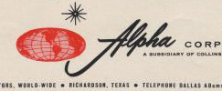
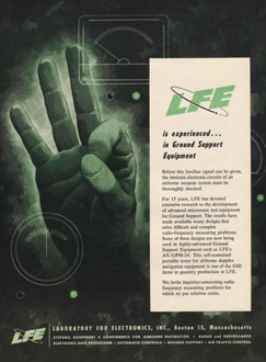
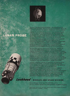
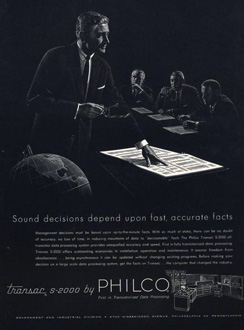
Here’s a great collection of science and techology adverts from the 50s and 60s, full of wonderful illustration, type treatments, vintage logos and some pretty inspirational layouts. I’ve got a few details of some of my favourites below, but be sure to have a good look through the set as there’s a load more in there that are great, such as this, and this. There are a few other interesting Flickr sets by bustbright too, including this collection of Bebrauchsgraphik covers which I’m going to have a look through. This one is great.
Click each image to go to the Flickr page for it.
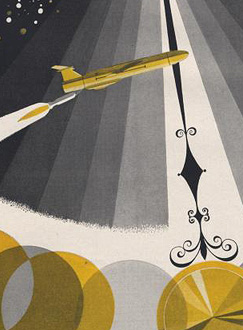
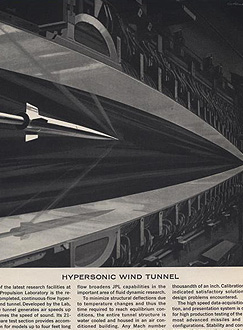
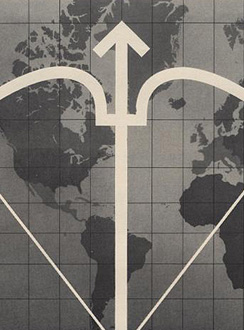
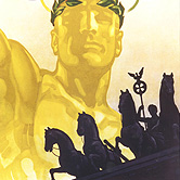
So there are some of my favourites. The top row is that combination of rough-textured painting and precise drawing that characterises mid-century graphic design. I love it. Below those are some nice type and logo treatments: that ampersand, for example, is made from an orbiting particle, yet sits halfway between the classic and commercial ampersands. Interesting! After that there’s six illustration styles: a dramatic JPL illustration which looks like a Victorian steampunk device for testing space-age technology; a cold-war classic world map with presumably The Crossbow of Progress overlaid on it; then a ghostly green hand of A-OK (don’t try this gesture in Turkey)
; a lovely space scene which I think could do without the little globe inset above the text; a spare and sharp layout and illustration for Philco - though the outline drawing of the computer looks like something demanded by the client rather than part of the original design; then an advert promising a level of defence from incoming missiles that even today we don’t have. Old adverts are great.
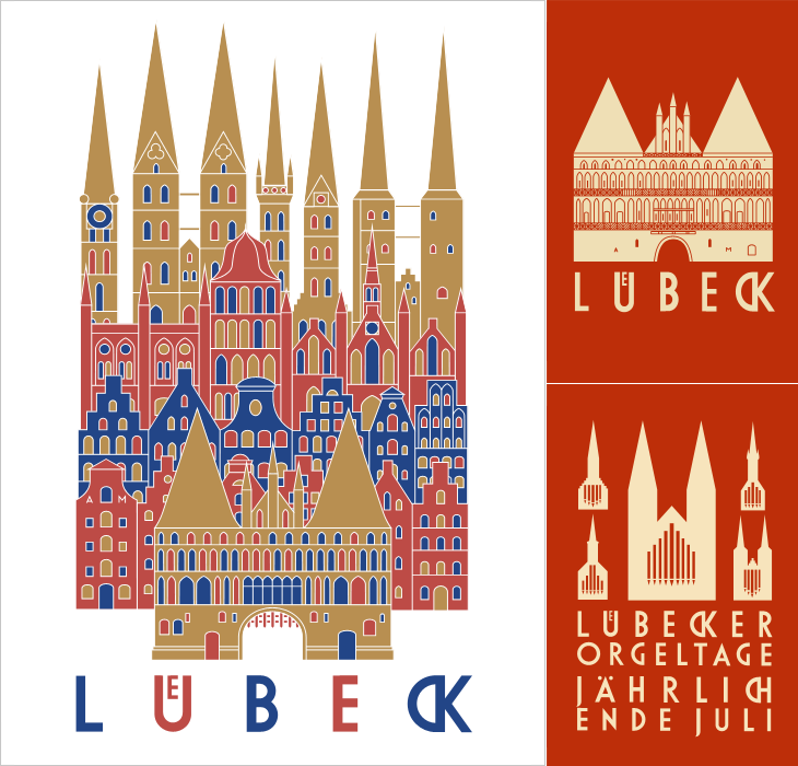
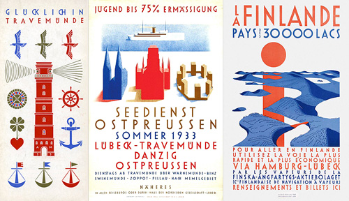
I’ve been following the excellent Cooper Typography Blog for a little while now, and recently Sasha pointed me to his article on Alfred Mahlau, with a short biography and a large collection of images of his work. Of course I’ve traced a few of them below. The lettering is distinctive and highly geometric - the curves are all based on circles - and has some attractive ligatures. As Sasha said in his article, the treatment of some of the umlauts is attractive - replacing the diacritic with a digraph when writing Lübeck. Check out the rest of the site; it’s got great articles, fascinating examples and links (you may lose a day or three with this one), and is definitely well adding to your RSS/bookmarks.
Have a look at this article about Lübeck to see the original of what’s represented in these posters. The distinctive cityscape is also used in the still-used brand identities for Niederegger and Schwartauer Werke, also created by Mahlau.
A few more, so you can see the lettering. More here.
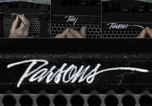
I found this nice little video on YouTube earlier. It’s simple enough, but fascinating to watch; Bob Parsons hand lettering his name in a beautiful style on an amplifier.
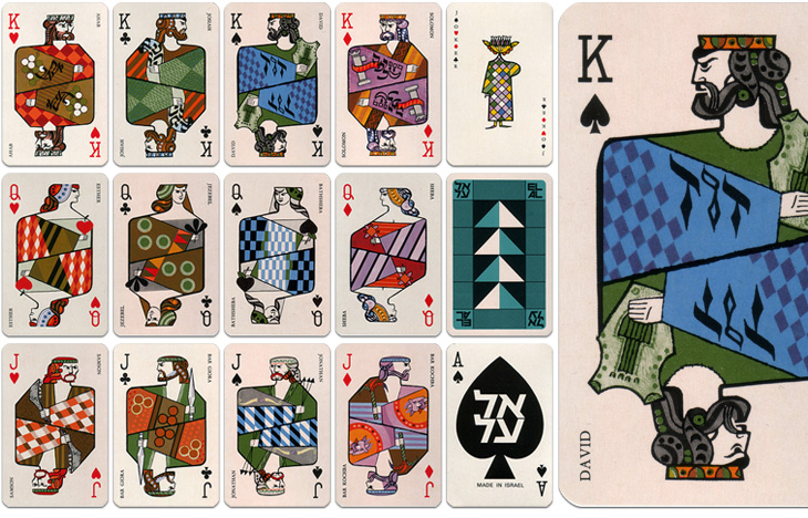
The other week Grain Edit posted some photos of these 1970s playing cards produced by El Al and beautifully illustrated by Jean David. They depict Kings, Queens and Heroes from Israel’s biblical past, and come as a boxed pair of sets with an illustrated cardboard sleeve. I had a look around for some clearer photos so I could get a better look, or even a good source of info on Jean David, but there’s not much out there at all. I did, however, find an eBay auction for a set of the cards, so I got my very own set - eventually, and they really are lovely:
El Al playing cards, Illustrated by Jean David
The cards are indeed beautiful and are also nice depictions of the biblical characters - wise Solomon with his scrolls, Jonathan with his arrows, Samson with his jawbone, etc., and reflect the tradition of representing the legendary or historical characters on cards. There is a nice nod to the Paris court tradition of playing card characters by keeping the depiction of David as the King of Spades. Of the other traditional biblical characters, Sheba replaces Rachel as Queen of Diamonds and (unsurprisingly) Judith is replaced with Esther as Queen of Hearts. Julius Caesar is an obvious one to leave off (far better to show Solomon), and instead of the sometimes-shown Judas Maccabeus as Jack of Clubs there’s another leader of a revolt, Bar Giora. I guess it’s hard to choose such a small number from all the people in Israeli history, but if you’re going to show Bar Kochba, you have to show Bar Giora too. Perhaps.
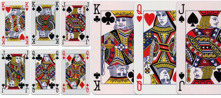
Beyond the history lesson, looking at them got me thinking about the type used to identify individual cards in general. The individual numbers and letters work very well on the card, and are pretty much standard for all cards, but put them together and you see that there’s not much consistency between them at all. As a set, they’re discordant, drawn on a whole different scale to each other, the curve of the J appears exaggerated and incredibly wide compared to the Q, and the K’s slab serifs are enormous, but individually, they each work just fine. I’ve seen playing cards motifs and designs implemented as branding and packaging (such as this rather nicely branded wine), and I notice now that they never used the actual type style from the cards themselves - obviously, designing characters to sit alone is a different art to designing them to sit together.
While I’m on the topic of characters sitting together, it’s a shame (and surprising) that the type for the names isn’t kerned, and more so that it’s the King David card where this is most obvious. Fortunately, apart from Bathsheba, the names of the others are pretty forgiving and the lack of kerning isn’t very noticeable. Still, it’s surprising that that was allowed through, given the overall quality of the cards.
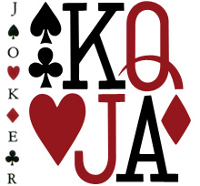
Modern standard card designs. These are from a House of Lords deck.
I dug out my standard set when I got the El Al ones so I could compare them. There’s something quite comforting about how they’re familiar they are, but I was wondering how standardised they really are. Looking at the set above, which is a fancy-schmancy House of Lords set and comparing them to a cheap £1 set from a newsagents, there is a fair bit of difference in the quality and the detail of the drawing, although many of the design elements are consistent; for comparison, I’ve put a queen card from each next to each other here. I had imagined there would be a bunch of royalty free EPS files that you could buy or download and slap on your cards, but perhaps not. One thing that seems to be important for standard cards is that all the characters have to look really, really tired and unhappy, a convention I’m glad to say wasn’t followed with the El Al cards.
If you like mid-20th Century print advertising, and like a lot of it, then this page on diskursdisko may well be just for you. It’s a collection of links to various pools on Flickr containing hundreds of scans of old adverts and promotional materials (mostly, but not all, from the mid-20th Century), and is quite a trove of old type, lettering and illustration. I’ve found quite a few inspirational things on there, including this great General Electric illustration. It reminds me a bit of The Stepford Wives (the 1975 film, not the 2004 one) - they’re not selling freezers, they’re selling exultant joy here. I mean, if getting a GE freezer really made you that happy, wouldn’t you want one?
Gosh, doesn’t she look happy? I love the beautiful brush strokes, they’re so satisfying to trace.
I’ve linked each image to the photo page on Flickr - some have large originals, others not.


