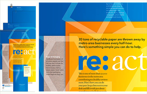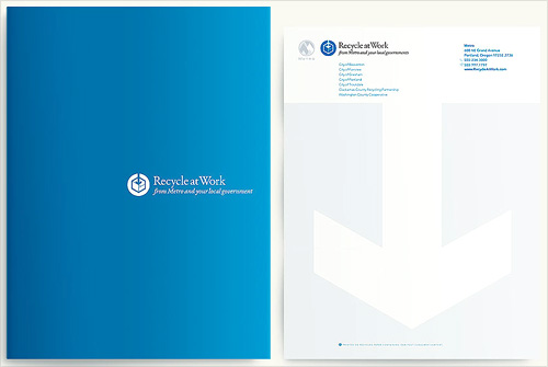
Another one I’ve had open in my browser for a while. I may have got it from a link in Twitter, possibly from Typegirl or (probably) Pinch themselves. I like the basic idea of the re:[word] brand identity, but the implementation is rather nice too. I wanted to keep a note of the two images below in particular because I like the effect of the overlaid print presentations and the super simple white on blue brochure cover.