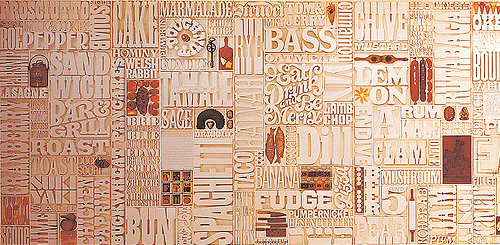
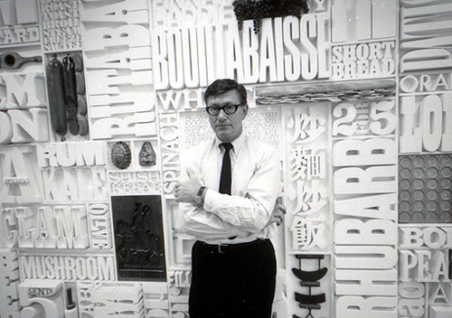
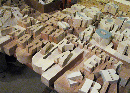
I was catching up on Oh Joy! earlier today and saw this post about Lou Dorfman’s gastrotypographicalassemblage. Wow, what a piece. Cho links to a collection of images on Flickr (where else) showing some original photos of the piece in situ, and some of the work being done to restore it - more on that here. I love the restoration pictures, with all the letters laid out like that.
I would love to have something like this at home, or even at the office for that matter.
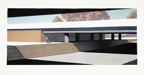
I came across Jörg Block’s site this morning from a link on Drawn! There are some fantastic illustrations and paintings on there; I love his clean, crisp, often isometric drawing style, and especially the page layouts:
Have a look at the paintings too, they remind me of the paintings of intersections and roadworks you’d see advertising the Glorious New Future in the 50s and 60s, but with a solitude and darkness that suggest the future isn’t all that glorious at all. Of course, he could just like architectural paintings and puts the figure in for scale?
This advert for the Zurich Chamber Orchestra has been linked from several design related sites (I can’t remember where I first saw it), but all of them were linking either to Zapp Internet or to YouTube, both of which only had low quality and low resolution versions. For animations with such fine detail as this has, you really need to see the clean, high-res version to appreciate it fully. So, a good few Google searches later, and I’ve found this article on Llámame Lola, which not only carries a link to the MPEG but appears to be the originator of the Zapp upload. My paraphrased translation of their description, which is, to be fair, a bit random:
Here’s a great commercial for the Zurich Chamber Orchestra made by the agency Euro RSCG Zürich. Recently the orchestra carried out a concert in Spain with the Swiss flautist Emmanuel Pahud, at the Palau de la Música in Valencia. For the opening night last week, Emmanuel Pahud performed with the ZKO under the direction of Giovanni Antonini, the Flute Concerto nº7 by Devienne.
Also, I was intrigued by the ZKO logo, and not immediately finding any PDFs containing a high-res version of that either, I decided to redraw it, as is my wont. It’s a beautiful logo, and probably is the subject of much jealousy by other orchestras.
You may need to download VLC to play the video from Llámame Lola as Quicktime claims it’s not a valid video file. Go figure.
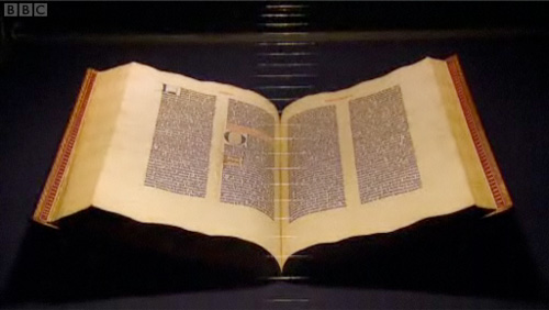
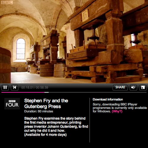
A fair few sites have linked to this recently, but I’ve only just got around to watching it and I can’t recommend it enough. As well as Fry’s flawless presentation of the story of Gutenberg and his invention, there are a few examples of nice lettering to pause the video for too. Mention of the Gutenberg Bible reminds me of this article, from a while back.
It’s the first time I’ve used iPlayer, as it’s the first time my internet connection has worked at a reasonable speed (thank you Virgin Media, it only took you years). I rather like the way its laid out, it’s a bit like my other site, which has looked like that for years, I hasten to add.
Also, for those of you who’ve ever watched the original TV series of Hitchhiker’s Guide to the Galaxy, having Fry present this is just perfect; it’s like a chapter from the Guide itself.
There’s a nice article on Cocoia Blog about the ‘pollution’ of various Mac OS X user interfaces by Helvetica. It’s worth a read, though I can’t resist excerpting this little bit, as it made me laugh:
Speaking of iCal, which proudly boasts Helvetica in miniature point sizes on the screen, it has the utterly mind boggling feature that it shows you calendar information on a computer screen with everyone’s favorite 1950 typeface for print, and prints these exact calendars on paper in Lucida Grande, a computer display font from this milennium. “Utterly backwards” might be an apt term for such misfit typography.
A few years ago I worked on the UI design of an online government-backed TEFL learning programme, which had a lot of input from various charities and education experts. One of the earliest inputs regarded the typeface to use for it. I remember an argument I had with a consultant for a large charity, who argued that Verdana was inherently an illegible face because the ascenders and capitals were different heights; an odd approach to take as I’m fairly sure that enough research had already been done into word shape and readability (by her own organisation as it turns out) to encourage faces with different ascender and cap-heights. Still, the argument quickly ended when the main stakeholder (other than the government) decreed that Comic Sans was the most readable text ‘face’ available and that it must be used for everything. They would allow no dissent. Fortunately a few months down the line and a couple of review stages later, we ended up dropping Comic Sans in favour of Arial - not normally a face to make designers rejoice, but so much of an improvement it felt like a liberation from purgatory. One of the main official objections to Comic Sans was that the letterforms were different from those end-users would be used to, and therefore unfamiliar and hard to recognise. Of course there were many unofficial objections, often centered around the end-users feeling somewhat insulted by such a childish face.
Anyway, I was reminded of all this when David pointed me towards the new face produced by Fontsmith for Mencap, which was actually designed in collaboration with end-users, and benefits greatly as a result. From the press release:
Having narrowed the choice down to a cleaner and more crisp letterform, which avoided the pitfalls of being too childlike and patronising, Fontsmith refined the design to aid legibility and maximise accessibility.FS Mencap is not quirky or odd looking, doesn՚t resemble the childlike design of fridge magnets or early learning tools and is set to challenge Arial as a new standard in legibility.
So rather than to treat people with learning or sight disabilities (or those who just don’t know English) as big children, Fontsmith and Mencap created a face that is clean, professional and adult, while still being friendly and (of course) legible. According to the Typophile article, the face will be available for the public to use too, which is excellent news. I wonder what range of characters are included in it though? The press release shows only basic Latin characters in the examples, but I hope it has broader coverage.
Part of my job involves developing websites in multiple languages, and earlier this week the decision was made to produce an arabic version of a particular very flash-heavy website we did. It’s going to be an interesting challenge, as the website in question is one of those that emulates the action of turning pages in a book (needless to say it’s a pure marketing ‘teaser’ style website) and so the entire site will need to be reconfigured to right-to-left reading and page turning. Anyway, those are fairly straightforward technical details and shouldn’t take too long. What really occupies my time is selecting a new typeface for the site - we use Arno Pro for its wide range of language support, especially Cyrillic and Greek, and so the new arabic face should work well with it. And lo, just this evening I find Palatino Arabic in the Type Director’s Club 2008 winning entries. Perfect.
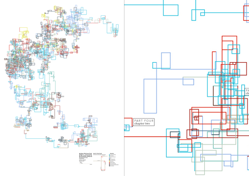
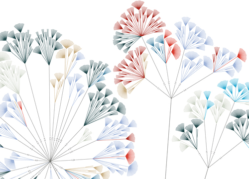
There are some interesting-looking infographics here on NOTCOT, apparently providing some sort of analysis of various literary works. I’ve had a look through them, and while they’re certainly attractive, they don’t seem to provide any insight at all. The one immediately below, for example, might suggest how shorter sentences bunch up together in the narrative flow, but there’s no guarantee that several groups of small sentences, separated by (say) many long sentences, a short sentence and more long sentences might overlap, giving an illusion of a single bunch of terse, active prose. The rotation of the line by 90 degrees with each sentence is an arbitrary insertion in the ‘analysis’, and in itself provides no valuable meaning - it doesn’t even serve as a neutral carrier for information, rather it distracts the reader and confuses the data.
Some of the other illustrations provide a little more promise, but with having to refer to an (again) arbitrary key, any insight a graphical representation could provide is quickly lost. But, they’re beautiful. It’s as if the designer flipped through Tufte’s books without reading anything in them, and decided to create something that ‘looks like that’. OK, I’m being harsh; I’m sure that after a fair bit of reading and working out how the diagrams were made, there’s some vague possibility of gleaning some tiny hint of insight into the literary style of various authors, but you have to get past the fact that they seem to be primarily designed to be pretty* rather than useful. You can see more of the works on the designer’s site, apparently called “Untitled Document” (at the time of writing), here.
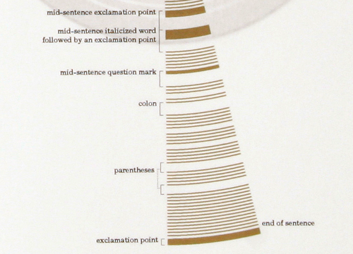
As for the ones attempting to depict sentence structure, they certainly leave a massive amount to be desired - in order to work out the difference between a colon and a parenthesis you’d have to get out your micrometer and be prepared to annotate like crazy. Or you could just read the original text. After all, there’s this amazing set of symbols and conventions that have been used for years to convey meaning and sentence structure. It’s called written language. Heard of it?
* And to appeal to people with more money than design sense, looking at the prices.
The Guardian today had an interesting article on the possibly imminent demise of the semi-colon in French. It also goes on to suggest that this particular punctuation mark is already dead in English, and it is the Anglo-Saxon influence that’s causing the problem with modern French. I use it quite freely myself, and I’m sure anyone who’s read this site knows I’m rather fond of long sentences. In fact, it’s from re-reading what’s I’ve just typed that leads me to add semi-colons; commas are too weak (and in a long sentence, confusing) and full-stops are too heavy, too much of an end, which isn’t always what you want. I wholeheartedly agree with Michel Volkovitch when he says:
“For constructing a piece properly, distinguishing themes, sections and sub-sections - in short, for dissipating any haziness or imprecision of thought. It puts things in order, it clarifies. But it’s precious, too, for adding a little softness, a little lightness; it can stop a sentence from touching the ground, from grinding to a halt; keeps it suspended, awake. It is a most upmarket punctuation mark.”
I agree with the closing paragraph of the article, too, in that it is the fear of using the semi-colon incorrectly that leads to it not being used. I was never taught how to use it at school, and a quick straw poll of some friends and colleagues today shows that of 12 people, only three were taught to use it. Of course, those three were French. Still, half the people polled did know how to use it, so all is not lost.
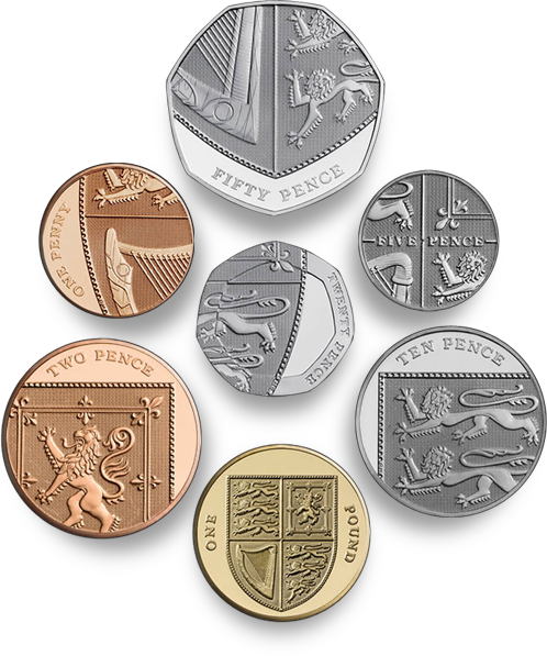
In 2005 The Royal Mint announced a competition to design six of the eight kinds of coin in circulation in Britain, the first full redesign of the coins since decimalisation in 1971. Open to everyone and with a top prize of £30,000, they received 4000 designs from 500 people, and I just saw on the news that the final designs have been completed and the first coins ready for issue. Not only that, but the £1 coin is now included in the redesign, and somewhat appropriately becomes the uniting element of the set.
You can tell they were done by a graphic designer; even with the complexity of the Royal Arms, the designs are clean and sparse, with pleasing variation in placement of the inscription, and on the 20p there is a sense of refraction through the thick border of the coin. Just take a look at them though, they’re fantastic, in fact, they’re astounding - I can hardly believe that these are actually official coins of the real United Kingdom, instead they look like they’re from some sleek, efficient, science-fiction alternate-universe version of the country.
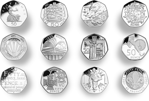
The one thing that gives me pause in the whole process is the thought that we won’t be seeing any more of the beautiful 50 pence designs*. I’m not exactly a numismatist but I do enjoy seeing the new designs every couple of years or so. I suspect that the one coin not included, the £2, will continue to have commemorative designs on it. I wonder when we’ll get a £5 coin actually in circulation?
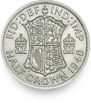
While researching this article, I was looking through earlier coin designs on the Royal Mint site, and I notice the 1948 Half Crown used the Royal Arms as well, but with a more elaborate shield design. I think it’s rather attractive, and I’m intrigued by the crowned GG ligature either side of the shield.