There are some interesting-looking infographics here on NOTCOT, apparently providing some sort of analysis of various literary works. I’ve had a look through them, and while they’re certainly attractive, they don’t seem to provide any insight at all. The one immediately below, for example, might suggest how shorter sentences bunch up together in the narrative flow, but there’s no guarantee that several groups of small sentences, separated by (say) many long sentences, a short sentence and more long sentences might overlap, giving an illusion of a single bunch of terse, active prose. The rotation of the line by 90 degrees with each sentence is an arbitrary insertion in the ‘analysis’, and in itself provides no valuable meaning - it doesn’t even serve as a neutral carrier for information, rather it distracts the reader and confuses the data.
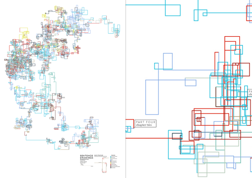
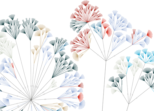
Some of the other illustrations provide a little more promise, but with having to refer to an (again) arbitrary key, any insight a graphical representation could provide is quickly lost. But, they’re beautiful. It’s as if the designer flipped through Tufte’s books without reading anything in them, and decided to create something that ‘looks like that’. OK, I’m being harsh; I’m sure that after a fair bit of reading and working out how the diagrams were made, there’s some vague possibility of gleaning some tiny hint of insight into the literary style of various authors, but you have to get past the fact that they seem to be primarily designed to be pretty* rather than useful. You can see more of the works on the designer’s site, apparently called “Untitled Document” (at the time of writing), here.
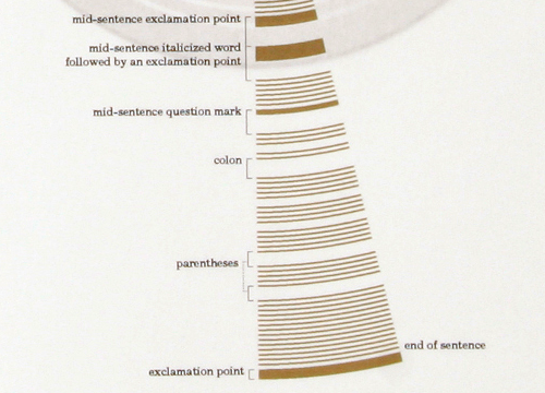
As for the ones attempting to depict sentence structure, they certainly leave a massive amount to be desired - in order to work out the difference between a colon and a parenthesis you’d have to get out your micrometer and be prepared to annotate like crazy. Or you could just read the original text. After all, there’s this amazing set of symbols and conventions that have been used for years to convey meaning and sentence structure. It’s called written language. Heard of it?
* And to appeal to people with more money than design sense, looking at the prices.