A few years ago I worked on the UI design of an online government-backed TEFL learning programme, which had a lot of input from various charities and education experts. One of the earliest inputs regarded the typeface to use for it. I remember an argument I had with a consultant for a large charity, who argued that Verdana was inherently an illegible face because the ascenders and capitals were different heights; an odd approach to take as I’m fairly sure that enough research had already been done into word shape and readability (by her own organisation as it turns out) to encourage faces with different ascender and cap-heights. Still, the argument quickly ended when the main stakeholder (other than the government) decreed that Comic Sans was the most readable text ‘face’ available and that it must be used for everything. They would allow no dissent. Fortunately a few months down the line and a couple of review stages later, we ended up dropping Comic Sans in favour of Arial - not normally a face to make designers rejoice, but so much of an improvement it felt like a liberation from purgatory. One of the main official objections to Comic Sans was that the letterforms were different from those end-users would be used to, and therefore unfamiliar and hard to recognise. Of course there were many unofficial objections, often centered around the end-users feeling somewhat insulted by such a childish face.
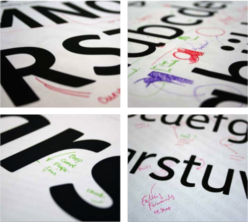
Anyway, I was reminded of all this when David pointed me towards the new face produced by Fontsmith for Mencap, which was actually designed in collaboration with end-users, and benefits greatly as a result. From the press release:
Having narrowed the choice down to a cleaner and more crisp letterform, which avoided the pitfalls of being too childlike and patronising, Fontsmith refined the design to aid legibility and maximise accessibility.FS Mencap is not quirky or odd looking, doesn՚t resemble the childlike design of fridge magnets or early learning tools and is set to challenge Arial as a new standard in legibility.
So rather than to treat people with learning or sight disabilities (or those who just don’t know English) as big children, Fontsmith and Mencap created a face that is clean, professional and adult, while still being friendly and (of course) legible. According to the Typophile article, the face will be available for the public to use too, which is excellent news. I wonder what range of characters are included in it though? The press release shows only basic Latin characters in the examples, but I hope it has broader coverage.