David sent me a link to this, somewhat appropriate for April Fools Day, about an H&FJ spoof font, estupido. I find the idea of creating swashes for OCR A hilarious, but I thought, shouldn’t robots have fancy type too? One day, our machine comrades will be attending theatres and poetry recitals, and instead of programmes set in flourish-heavy Regency scripts like we do, maybe they’ll want something a little more evocative of their earlier eras; Simpler, slower times before 100 Exabyte connections ruined the slow pace of digital romance… And who says computers can’t read swashes? It’s discrimination I say! Discrimination!
David at Typographer.org points out the latest article that shows us how we’re doing it all wrong. He’s right; if you’re really concerned about such things, get The Elements of Typographic Style, and develop an informed opinion on how and when to break the rules, by learning those rules. As I’ve written before, one of the main reasons we use the typographic approximations we do is the keyboard itself, from its development in typewriters to today’s use with computers. If you would rather the world was divided cleanly between typesetters and those who type, then you will never be satisfied - it’s never going to happen. We live in a world of what we might term hybrid-typography, where we routinely use many typographic techniques and tools not available to the typist, but not all the ones available to the typesetter. We rely on Word (say) to convert three dots to an ellipsis, a dash to an em-dash, straight quotes to curved, but we don’t get interpuncts in prices, multiplication symbols in dimensions or true primes in measurements. Well, not most of the time anyway. We could try putting them in, but as many people have complained, many fonts don’t have primes, never mind mathematical symbols, interpuncts or even true degree symbols. Of course, that’s only if you’re using poor quality fonts*. Then, of course, we could just all use typewriters again, but unless you’re a first-year design student that…
* I use the term font, as distinct from typeface, here. The typeface may have the design of the symbol, but it’s not certain whether the font would.
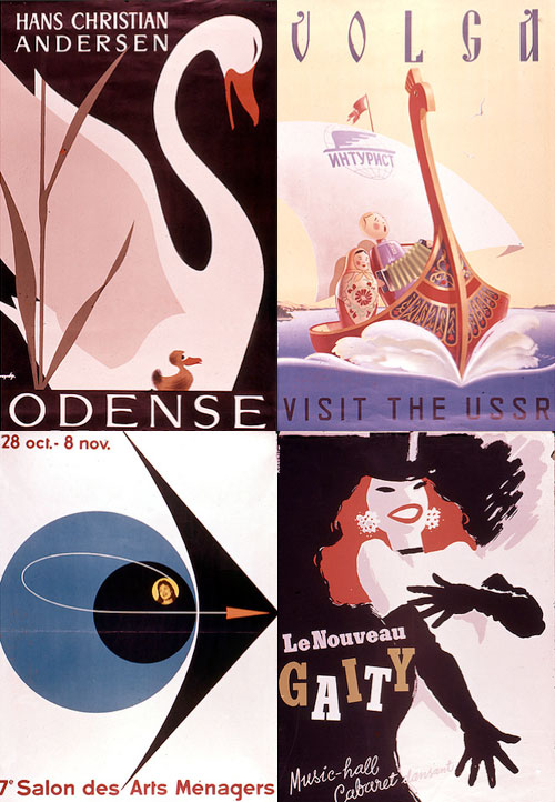
There are many collections of vintage posters on Flickr, most of them full of the mundane, rather than the classic. What makes an old poster a ‘classic’ anyway? Does it have to have inspired a whole style of advertising, or be an exemplar of a particular style, be well-executed or just be by someone famous? I guess it doesn’t really matter, it seems it just has to be old and have survived to be scanned in and shoved online. It’s nice though when you find some good examples in these collections. I particularly like some of the (depressingly low-resolution) scans on this collection, especially the lettering on the Volga one, which I nearly missed thanks to Flickr’s brutal it-must-be-square thumbnail cropping.
Typographer.org has returned, with a beautiful new design and a single-column format. The infrequent Bald Condensed features will be given their own pages, as in David’s own words:
What happened to Bald Condensed? Nothing, it just appears less frequently, that’s all. New editions of Bald Condensed will be announced in the news feed from now on.
And for the first time (oddly), I notice that the logo is not just truncated Didot - the serif has been removed from the ‘h’. Subtle!
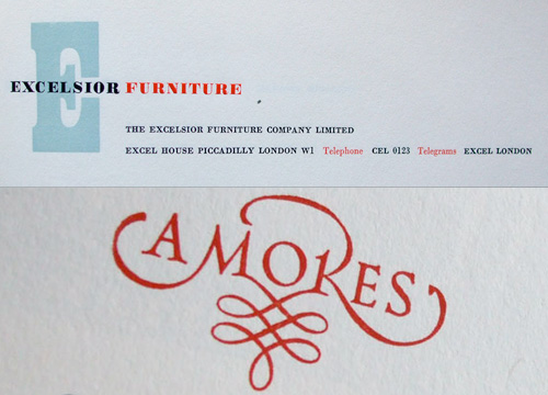
Courtesy of the ever-fantastic Ace Jet 170, this collection of images of the 1958 Penrose Annual. A couple of my favourites at the bottom, but I just had to trace the Amores one, below. I love it. The M-R* ultra-ligature was rather satisfying to do.
I like drawing the ampersand. It’s the character that when you’re designing a typeface seemingly gives you the greatest artistic freedom. It’s big and swooshy, with lots of room for playing with curves, swirls and if you’re feeling special, lots of fine, delicate lines. But why? Why does this, and no other character, allow so much freedom? Well, the ampersand is hardly ever used in body text any more. It used to be - Gill used it frequently to adjust line length* when setting text - but modern usage has it pretty much limited to combining pronouns in titles, company names and credits. So when we design an ampersand, we can design it with a general assumption that it’ll be used in display sizes and weights, and we can fill it with beautiful refinements and detail, knowing that any uses at body sizes will be rare enough not to be a serious problem. Well, perhaps. There are plenty of typographers who feel that the ampersand should again be used in English as a legitimate replacement for the word ‘and’, and mourn the demise of it in common use. After all, until relatively recently the English language was considered to have 27 characters in its alphabet, with the ampersand right after z. A good thread to read on the topic is here.
I’ve had this great gallery of technical illustrations open in a tab for a little while now, and if you’re at all into super-detailed diagrams it’s well worth a look. The one of the fan (below) is my favourite. Via Chris Glass.
There’s a great collection of 3D type designs on You The Designer. I was looking through them and was reminded of the long-neglected Atlas Magazine, which is sort-of still going (well, it’s there but not being updated from what I can tell). I remember Atlas having a new design with each issue, which was what kept me going back, and looking through previous issues you can see how fast the technology was developing in those years. One of them even offers a link to the Netscape Plugin Finder, using a pop-up window. Still, it’s stuck on the last design now, though you can look at previous issues by clicking the roman numerals floating about on the left, if you can. It’d be interesting to see how it would have developed, had it avoided the big-time of IPOs and say, a merger with Slate or similar. I wonder if it would still have navigation that tries to run away from you?
Another great link via Ace Jet 170, this article on the Font Feed about lining, tabular and old-style figures. I’m a fan of old-style figures anyway, and prefer to use them in most of my work as I find them much more readable, even for numerical data. Still, I suspect I’m somewhat disnumerate, so having the extra ‘word shape’ provided by old style numerals is going to be helpful for readability. I was also raised at a time when maths books were also set with old-style, and somewhat contrary to the example in the Font Feed example, so were most recipes I saw.


