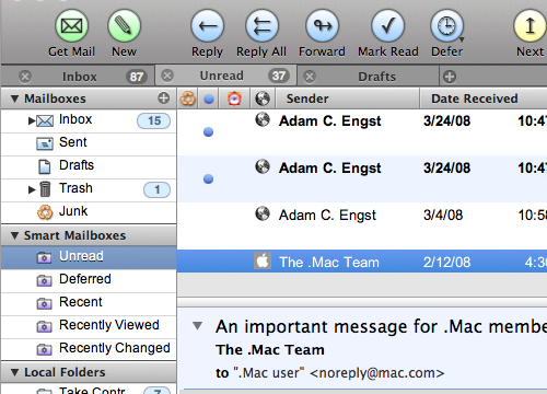
There’s a nice article on Cocoia Blog about the ‘pollution’ of various Mac OS X user interfaces by Helvetica. It’s worth a read, though I can’t resist excerpting this little bit, as it made me laugh:
Speaking of iCal, which proudly boasts Helvetica in miniature point sizes on the screen, it has the utterly mind boggling feature that it shows you calendar information on a computer screen with everyone’s favorite 1950 typeface for print, and prints these exact calendars on paper in Lucida Grande, a computer display font from this milennium. “Utterly backwards” might be an apt term for such misfit typography.

