I found this little tip today on the International Herald Tribune developer blog. It’s a simple solution to an old problem in a modern context - avoiding widows and orphans online. I’m poking around in the innards of my CMS (Expression Engine) to see about doing this on Ministry of Type (I am not going to do it manually!) and fortunately it will (if I do it) be retroactive, unlike the IHT.
OK. Rant time. I was sent this wonderful, wonderful link today. For many years now, I’ve been increasingly bothered by these little yellow flies buzzing around on my screen. They drive me to a level of distraction and rage that (in terms of interfaces) only Windows nag-bubbles can beat. Why developers think that these things are so helpful and vitally useful that they must pop up at almost every opportunity, and that the user must be given no obvious recourse to turn them off, I don’t know. They are the gnats of the typographic world - buzzing and darting in front of your eyes, imparting very little of use, and even then merely duplicating what the rest of the interface provides in a much more studied and calm manner.
The reasoning for them existing is often given (at least in the online world) as ‘accessibility’, assuming somehow that a user needing some kind of assistive technology would also be the kind of user always able to hold a mouse pointer steady over an arbitrary interface element for the requisite two seconds to see the damn thing. For the rest of us, just leaving the pointer somewhere ‘out of the way’ while typing, reading or (heaven forfend!) thinking, results in this pointless yellow box popping up. Perhaps ironically, it’s a situation made worse by using that finest of input tools, the wacom tablet, as removing the pen from the sensing region leaves the pointer static wherever it last was on screen; perfect prey for the predatory tooltip.
The actual accessibility modifications that lead to tooltips showing up everywhere are such things as adding title attributes to links and other elements, and the tooltip is merely an unpleasant symptom of this noble effort. That the browser shows a tooltip for these things is analogous to an overkeen child endlessly demonstrating how clever they’ve been: Look at me! Look at me! Look at me! In fact, the browser does not need to display tooltips for these things - they are there to provide additional information when the context of the item is removed, such as in an audio or text-only browser. If the interface relies on tooltips in, shall we say a conventional environment, then it’s a very poor interface indeed, or an experimental dotcom-boom-era ‘project’, which is I suppose the same thing.
I’ve done a fair bit of work designing interfaces, and I’m glad to say most of them are tooltip-free. I’d rather all of them were, but you can’t win every battle. My message to developers, marketers, designers, whatever, but more importantly OS developers, it’s quite simple: give us an option like this, please:
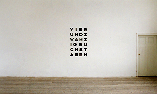
Not much information about this, apart from it being from 2001 and being 24 characters that say “twenty four characters” in German. As a wall decoration, however, it reminds me of these.
This Flickr set of vintage logos has been around a while now, and I looked and didn’t immediately get much inspiration. I mean, anyone else who’s linked to them has done the equivalent of, “Hey look, old logos! Um. Yes. Old logos!” so I guess I’m not alone.
Still, patience rewards the virtuous (or something) and I had a closer look through the ‘Original Size’ of all of them - my, that was a fun exercise, thank you, Flickr - and found some logos that I think are pretty interesting. Unfortunately, most of the ‘logos’ on those pages really don’t deserve the distinction of being called logos. In fact, most of them are pretty poor. I guess that makes the good ones stand out better. Perhaps.
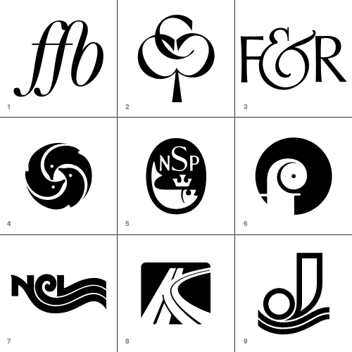
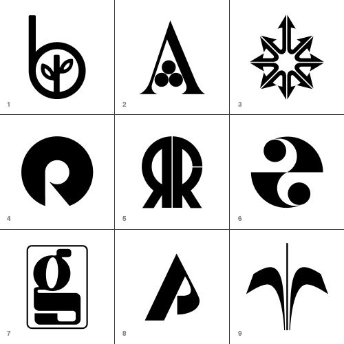
So, enough bad-mouthing. I’ve traced (manually, of course, with lovely beziers) the ones I either like, or think are inspirational and felt quite a bit of ’70s and ’80s nostalgia in the process. You may have a different set of choices of course, and no, I wouldn’t include the Lubalin logo in the ‘crap’ ones. I just don’t like it very much. I know, I know, there’s a space in Design Hell reserved just for me… Below are thumbnails of the ones I’ve traced, and I’ve added notes for most of them too. If you’re reading this on the home page, click “Read the rest…” to see the whole lot.
Forening for Boghaandvoerk I’ve seen plenty of FF ligatures, but it’s the FB one on this that I like and wanted to keep for reference.
Cumberland Capital Corp. Just great. I imagine it’s supposed to imply ‘growth’ with the tree image, but it makes a pleasing image - perfect for a monogram.
Fernandec & Rubin This ampersand is wonderful.
New York Aquarium Reminds me of Japanese mon, and unlike a lot of the logos that look symmetrical but aren’t, this one is. Perfectly.
National Sea Products Limited A fish with a crown? How could I say no? I like the composition and old-timey lettering too.
Oy Finleuy Ab This one makes me laugh. It looks like a demented chameleon.
Norwegian Caribbean Lines Interesting to keep, just to show any letter can be made to trail off into a wavey line.
Keystone Park I did make a slight modification to this - I cleaned up the ‘central reservation’ in the curved road. I’m not entirely sure what a motorway intersection has to do with a parkbut I’m sure it made sense at the time.
Jonneret SA Lovely wavey lines… ‘nuff said.
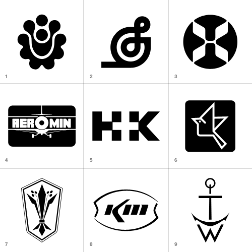
Hillside Townhomes It’s an interesting pattern, though not sure how that relates to a housing development though. Maybe it follows the rough plan of the road layout?
Splendix Musical Instruments I think this one would be vastly improved by removing the line trailing to the left. Still, it’s an interesting depiction of a treble-clef.
Hawaiian Airlines Well, it was fun to trace!
Ciba Geigy Canada Ltd. I’m guessing this is a trademark of theirs… This one really does look vintage.
Hill + Knowles Public Relations I like it as an example of the type - though I don’t think it readsparticularly well.
Japan Agricultural Co-op Associations An iconic little bird - for reference mainly.
Distinctive Designs Odd logo for a company with that name… it looks agricultural.
Kerr McGee Chemical Corp I like this because it’s so sparse and clean - it looks like someone overexposed a picture of the logo and just drew what was left of the dark bits.
Thomas Walker and Sons Well, it’s a monogram that looks like an anchor. What’s not to like?
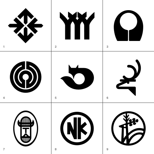
Hillier Things to do with arrows, part 295,041
Herman Smith Management This one reallyreminds me of another logo…
Arbeitgemeinschaft der Lukal-und Bringing to mind a labarynth, without being one.
Kusnierz On the Flickr set, someone added a comment that this could be an alternative to the Firefox logo. I quite agree.
Harvey Dodds Limited Simple and clever.
Tjernlund Manufacturing Company Cute little Viking!
Nikko Again, for reference - playing with the letterforms to ensure consistent optical space around them. It can be difficult to make letters work in a circle like this.
Jelen This one seems really familiar too! I just can’t place it.
These are perhaps borderline for me, but there was just enough reason for me to keep them.
Beverly Hills Bancorp Very simple and attractive - it’s quite sweet.
Amigen Presumably a pharmaceutical logo - it certainly looks like one. I like it though.
Montgomery Ross and Partners This was fun to draw, but as a logo it’s incredible aggressive. All those phallic arrows…
Franco Ranchetti Now, a lot of the logos are simple geometric shapes with a chunk taken out, and they’re as a whole not very good. I think this is one of the few exceptions - the negative space does form a nice R.
Ramon Reig Cabanas This would be quite unremarkable if the strip hadn’t been removed from the R. It’s curious.
Health and Comfort Supplies Limited Very much of the time. Probably the only one of the op-art logos that I actually like.
Gregson Manufacturing Company This is just weird. Combining OCR and traditional forms like that. Maybe they were going for the old "fusion of old and new" schtick.
Pinewood Plantation Simple, not entirely satisfying, but I kept it as reference.
Orchard Decor Canada Limited Simple and straighforward… a bit borderline for me.
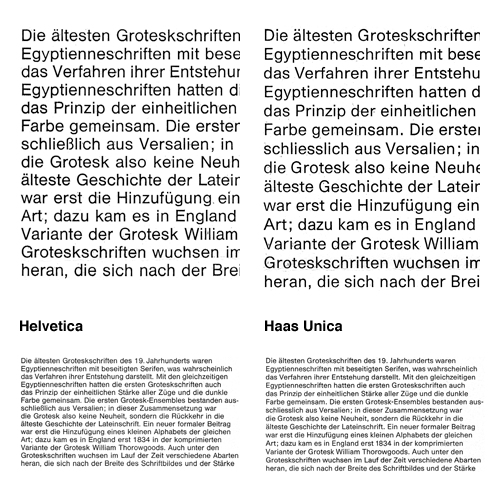
Bauldoff linked to some scans he’d done of the 1980 promo for the typeface Haas Unica, by Team’77. I’d seen a copy of this back in the 90s but then forgot about it until seeing these scans - back then I was only a callow youth so the idea of improving Helvetica didn’t seem so remarkable or interesting as it does now.
Essentially, Haas Unica came about as a result of analysing the original version of Helvetica, its variants (as they were in 1980) and similar faces and seeking to improve them - to produce the ultimate archetypal sans serif face. A single face to unite them all, if you like. Looking at the comparitive settings of both faces at text size shows how subtle the differences are, with a detail closeup first:
You can get an idea of the kind of analysis they did from this little snippet:
The character width of Haas Helvetica appears to us to be generally somewhat narrow, so that the rhythm of the typeface is rather uneasy in its effect. The same applies to Akzidenz Book. Linotype Helvetica is wider than the Haas version in relation to its character area and appears to us to be generally more balanced. Its character width corresponds basically to that of Univers.
And the results, based on improvements and adjustments to the stroke thicknesses, relationships of the capital letter widths, numerals and the basic forms of the letters:
The differentiation of capital letter widths leads to a tighter rhythm in upper case composition. A slightly more open form in the Haas Unica specimen setting, compared with the original version, together with the individual corrections to characters, improves the readability of the typeface, especially for continuous text.
Unfortunately when the face was released there were some legal problems as Linotype and Scangraphic both claim ownership. As a result it is no longer available commercially, which is a huge shame. Perhaps a petition for the conflicting parties to get over themselves and perhaps release the face jointly? I mean, making some money from it is surely better than making none at all - especially when ‘ownership’ is being judged from contract and the shifting seas of corporate ownership. Meanwhile, some people are taking matters into their own hands by redrawing the letterforms for their own use.
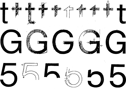
On the left is the original Haas Helvetica, on the right the new Haas Unica, and in between some transitory and experimental forms.
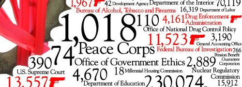
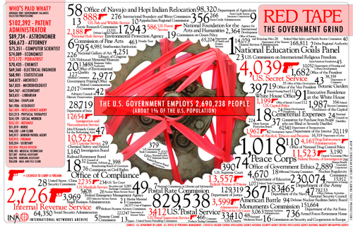
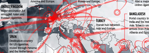
I was hunting for a link I’d omitted from a previous post and came across an old bookmark for these infographics (found originally via Chris Glass). I especially like the red tape one, and the map part of the tobacco one is great.
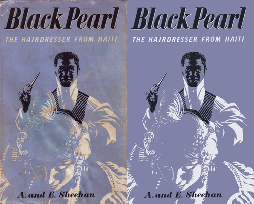
Drawn! the other day had a link to this treasure trove of retro illustrations, posters, books, covers, and pretty much everything else committed to print, and an on-link to the Mid-Century Illustrated Flickr pool. Looking through these is a bit like browsing ffffound, you keep finding things you want to keep links to… or just keep. I tend to want to redraw things, as I find it helps me understand how it was done a bit better and I often learn some new technique or style, or get inspiration for something else. I particularly liked the Black Pearl cover - it’s an engaging and compelling image, but made with just three colours. No halftones or tints either. I didn’t redraw this, I just used clean-up techniques to recreate it:
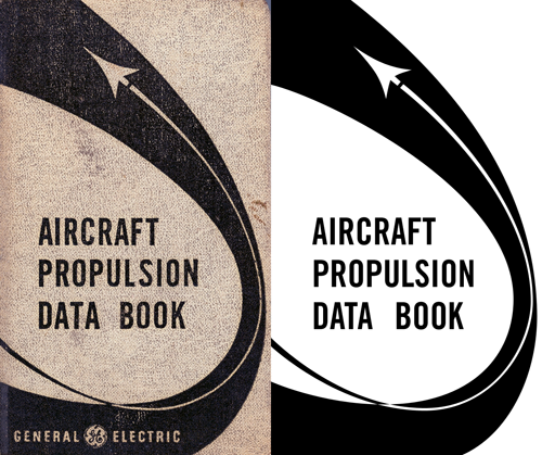
The Aircraft Propulsion Data Book is interesting as the curve appears smooth and aerodynamic, but under close examination it seems a bit… well, clumsy. Still, that’s the kind of thing that interests me - for example, when doing things like icons the details can seem crude and ugly up close but at their intended size provide useful (and subtle) clues on how to interpret the whole image.
Also in the sets of images are various examples of very nice typography, these two caught my eye in particular:
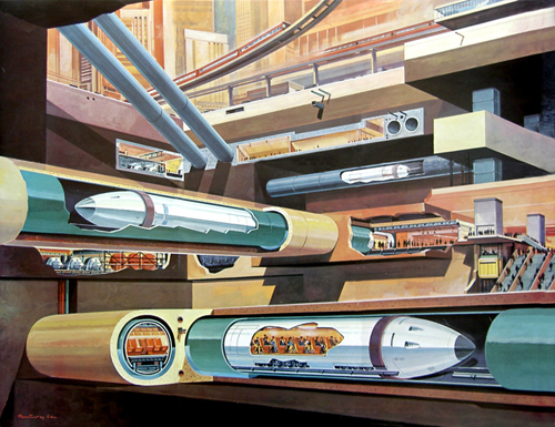
Then, finally, no collection of mid-century illustrations would be complete without at least one retro-futurist image, so here’s a fabulous subway illustration by Klaus Bürgle:
Just followed this link from Design Observer, to this great clock by Christiaan Postma. I daren’t think how long it took to work out. It’s made out of lots of smaller clockworks that all combine to spell the time. For a large part of the day though you’d be at a loss what time it is, say at half-five, so if you wanted to make it practical (why?) you could stick a big set of hands in front… but I like it the way it is. Watch the animation (page 3) to see it in action.
You know, when it comes to designing a logo that’s going to appear on documents, mousemats, brochures, you know: portable things, you really do have a duty to examine it from all angles. It also helps to get people in whose thought processes tend to the profane, because such people exist in great numbers ‘out there’ in the real world and will at a moment’s notice point out any even slightly lewd or coarse associations*. Also, perhaps develop a familiarity with iconographic representations of the human body, just in case your logo resembles such a figure. Say, like the Cerne Abbas Giant would be if the ancients fancied a more demonstrably explicit image…
Anyway, this logo for a British Government agency is quite hilarious, and I’m amazed they’re going ahead with it. Oh, and from the Register article that the Times sourced this from:
For the record, and in case you’d like to get your hands on a rebranded OGC mousemat, we gather staff have stripped the building of every example not nailed down, so check eBay later this week for your five-knuckle shuffle collectable.
* I have to state that I, of course, would never do such a thing. I blame the Times.
I’ve been checking this site periodically for quite a white now, it’s great to look through the updates when you’re in need of a bit of inspiration. Unusually for any site anywhere, many of the comments are good too, sometimes providing links to similar works and some good opinions. Either they moderate heavily or the site content means it doesn’t attract too many idiots.