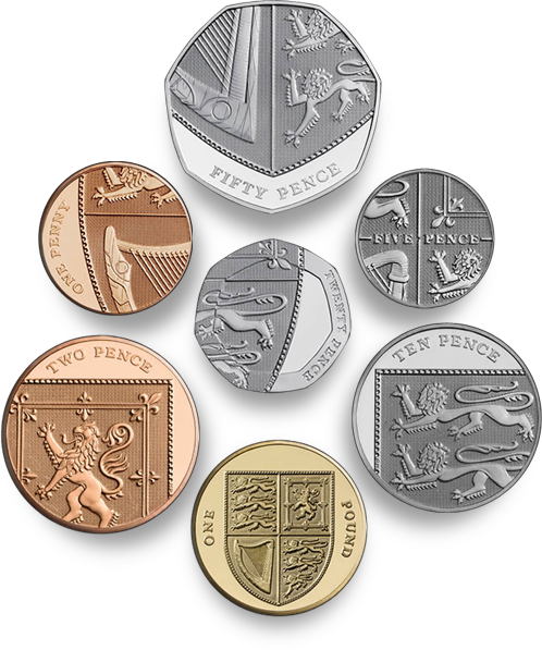
In 2005 The Royal Mint announced a competition to design six of the eight kinds of coin in circulation in Britain, the first full redesign of the coins since decimalisation in 1971. Open to everyone and with a top prize of £30,000, they received 4000 designs from 500 people, and I just saw on the news that the final designs have been completed and the first coins ready for issue. Not only that, but the £1 coin is now included in the redesign, and somewhat appropriately becomes the uniting element of the set.
You can tell they were done by a graphic designer; even with the complexity of the Royal Arms, the designs are clean and sparse, with pleasing variation in placement of the inscription, and on the 20p there is a sense of refraction through the thick border of the coin. Just take a look at them though, they’re fantastic, in fact, they’re astounding - I can hardly believe that these are actually official coins of the real United Kingdom, instead they look like they’re from some sleek, efficient, science-fiction alternate-universe version of the country.


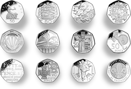
The one thing that gives me pause in the whole process is the thought that we won’t be seeing any more of the beautiful 50 pence designs*. I’m not exactly a numismatist but I do enjoy seeing the new designs every couple of years or so. I suspect that the one coin not included, the £2, will continue to have commemorative designs on it. I wonder when we’ll get a £5 coin actually in circulation?
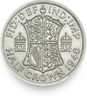
While researching this article, I was looking through earlier coin designs on the Royal Mint site, and I notice the 1948 Half Crown used the Royal Arms as well, but with a more elaborate shield design. I think it’s rather attractive, and I’m intrigued by the crowned GG ligature either side of the shield.

