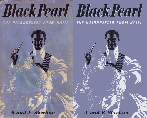
Drawn! the other day had a link to this treasure trove of retro illustrations, posters, books, covers, and pretty much everything else committed to print, and an on-link to the Mid-Century Illustrated Flickr pool. Looking through these is a bit like browsing ffffound, you keep finding things you want to keep links to… or just keep. I tend to want to redraw things, as I find it helps me understand how it was done a bit better and I often learn some new technique or style, or get inspiration for something else. I particularly liked the Black Pearl cover - it’s an engaging and compelling image, but made with just three colours. No halftones or tints either. I didn’t redraw this, I just used clean-up techniques to recreate it:
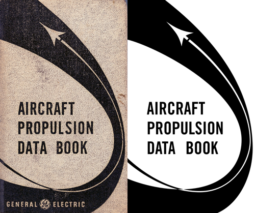
The Aircraft Propulsion Data Book is interesting as the curve appears smooth and aerodynamic, but under close examination it seems a bit… well, clumsy. Still, that’s the kind of thing that interests me - for example, when doing things like icons the details can seem crude and ugly up close but at their intended size provide useful (and subtle) clues on how to interpret the whole image.
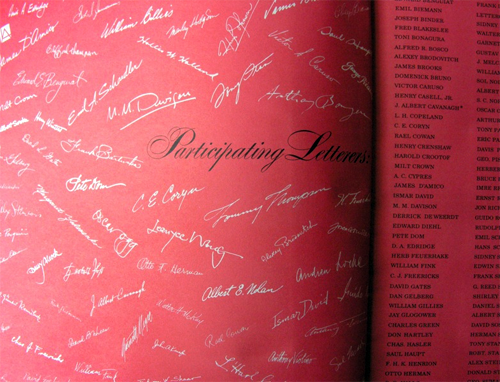
Also in the sets of images are various examples of very nice typography, these two caught my eye in particular:
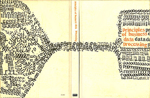
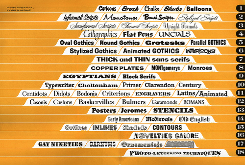
And linked from the Photo Lettering one, this beautiful, beautiful thing:
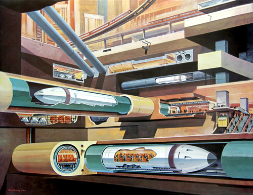
Then, finally, no collection of mid-century illustrations would be complete without at least one retro-futurist image, so here’s a fabulous subway illustration by Klaus Bürgle: