This Flickr set of vintage logos has been around a while now, and I looked and didn’t immediately get much inspiration. I mean, anyone else who’s linked to them has done the equivalent of, “Hey look, old logos! Um. Yes. Old logos!” so I guess I’m not alone.
Still, patience rewards the virtuous (or something) and I had a closer look through the ‘Original Size’ of all of them - my, that was a fun exercise, thank you, Flickr - and found some logos that I think are pretty interesting. Unfortunately, most of the ‘logos’ on those pages really don’t deserve the distinction of being called logos. In fact, most of them are pretty poor. I guess that makes the good ones stand out better. Perhaps.
So, enough bad-mouthing. I’ve traced (manually, of course, with lovely beziers) the ones I either like, or think are inspirational and felt quite a bit of ’70s and ’80s nostalgia in the process. You may have a different set of choices of course, and no, I wouldn’t include the Lubalin logo in the ‘crap’ ones. I just don’t like it very much. I know, I know, there’s a space in Design Hell reserved just for me… Below are thumbnails of the ones I’ve traced, and I’ve added notes for most of them too. If you’re reading this on the home page, click “Read the rest…” to see the whole lot.
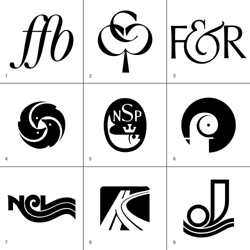
- Forening for Boghaandvoerk
I’ve seen plenty of FF ligatures, but it’s the FB one on this that I like and wanted to keep for reference. - Cumberland Capital Corp.
Just great. I imagine it’s supposed to imply ‘growth’ with the tree image, but it makes a pleasing image - perfect for a monogram. - Fernandec & Rubin
This ampersand is wonderful. - New York Aquarium
Reminds me of Japanese mon, and unlike a lot of the logos that look symmetrical but aren’t, this one is. Perfectly. - National Sea Products Limited
A fish with a crown? How could I say no? I like the composition and old-timey lettering too. - Oy Finleuy Ab
This one makes me laugh. It looks like a demented chameleon. - Norwegian Caribbean Lines
Interesting to keep, just to show any letter can be made to trail off into a wavey line. - Keystone Park
I did make a slight modification to this - I cleaned up the ‘central reservation’ in the curved road. I’m not entirely sure what a motorway intersection has to do with a parkbut I’m sure it made sense at the time. - Jonneret SA
Lovely wavey lines… ‘nuff said.
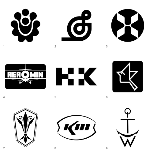
- Hillside Townhomes
It’s an interesting pattern, though not sure how that relates to a housing development though. Maybe it follows the rough plan of the road layout? - Splendix Musical Instruments
I think this one would be vastly improved by removing the line trailing to the left. Still, it’s an interesting depiction of a treble-clef. - Hawaiian Airlines
Well, it was fun to trace! - Ciba Geigy Canada Ltd.
I’m guessing this is a trademark of theirs… This one really does look vintage. - Hill + Knowles Public Relations
I like it as an example of the type - though I don’t think it readsparticularly well. - Japan Agricultural Co-op Associations
An iconic little bird - for reference mainly. - Distinctive Designs
Odd logo for a company with that name… it looks agricultural. - Kerr McGee Chemical Corp
I like this because it’s so sparse and clean - it looks like someone overexposed a picture of the logo and just drew what was left of the dark bits. - Thomas Walker and Sons
Well, it’s a monogram that looks like an anchor. What’s not to like?
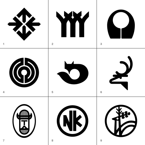
- Hillier
Things to do with arrows, part 295,041 - Herman Smith Management
This one reallyreminds me of another logo… - Acushnet Company
And thisone reminds me of this. - Arbeitgemeinschaft der Lukal-und
Bringing to mind a labarynth, without being one. - Kusnierz
On the Flickr set, someone added a comment that this could be an alternative to the Firefox logo. I quite agree. - Harvey Dodds Limited
Simple and clever. - Tjernlund Manufacturing Company
Cute little Viking! - Nikko
Again, for reference - playing with the letterforms to ensure consistent optical space around them. It can be difficult to make letters work in a circle like this. - Jelen
This one seems really familiar too! I just can’t place it.
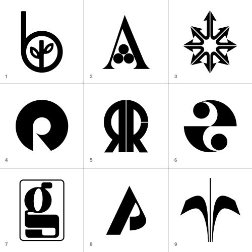
These are perhaps borderline for me, but there was just enough reason for me to keep them.
- Beverly Hills Bancorp
Very simple and attractive - it’s quite sweet. - Amigen
Presumably a pharmaceutical logo - it certainly looks like one. I like it though. - Montgomery Ross and Partners
This was fun to draw, but as a logo it’s incredible aggressive. All those phallic arrows… - Franco Ranchetti
Now, a lot of the logos are simple geometric shapes with a chunk taken out, and they’re as a whole not very good. I think this is one of the few exceptions - the negative space does form a nice R. - Ramon Reig Cabanas
This would be quite unremarkable if the strip hadn’t been removed from the R. It’s curious. - Health and Comfort Supplies Limited
Very much of the time. Probably the only one of the op-art logos that I actually like. - Gregson Manufacturing Company
This is just weird. Combining OCR and traditional forms like that. Maybe they were going for the old "fusion of old and new" schtick. - Pinewood Plantation
Simple, not entirely satisfying, but I kept it as reference. - Orchard Decor Canada Limited
Simple and straighforward… a bit borderline for me.