Bauldoff linked to some scans he’d done of the 1980 promo for the typeface Haas Unica, by Team’77. I’d seen a copy of this back in the 90s but then forgot about it until seeing these scans - back then I was only a callow youth so the idea of improving Helvetica didn’t seem so remarkable or interesting as it does now.
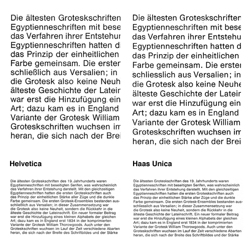
Essentially, Haas Unica came about as a result of analysing the original version of Helvetica, its variants (as they were in 1980) and similar faces and seeking to improve them - to produce the ultimate archetypal sans serif face. A single face to unite them all, if you like. Looking at the comparitive settings of both faces at text size shows how subtle the differences are, with a detail closeup first:
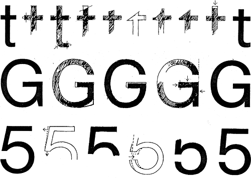
You can get an idea of the kind of analysis they did from this little snippet:
The character width of Haas Helvetica appears to us to be generally somewhat narrow, so that the rhythm of the typeface is rather uneasy in its effect. The same applies to Akzidenz Book. Linotype Helvetica is wider than the Haas version in relation to its character area and appears to us to be generally more balanced. Its character width corresponds basically to that of Univers.
And the results, based on improvements and adjustments to the stroke thicknesses, relationships of the capital letter widths, numerals and the basic forms of the letters:
The differentiation of capital letter widths leads to a tighter rhythm in upper case composition. A slightly more open form in the Haas Unica specimen setting, compared with the original version, together with the individual corrections to characters, improves the readability of the typeface, especially for continuous text.
Unfortunately when the face was released there were some legal problems as Linotype and Scangraphic both claim ownership. As a result it is no longer available commercially, which is a huge shame. Perhaps a petition for the conflicting parties to get over themselves and perhaps release the face jointly? I mean, making some money from it is surely better than making none at all - especially when ‘ownership’ is being judged from contract and the shifting seas of corporate ownership. Meanwhile, some people are taking matters into their own hands by redrawing the letterforms for their own use.
On the left is the original Haas Helvetica, on the right the new Haas Unica, and in between some transitory and experimental forms.