I came across this site the other day - Ridiculous Design Rules. I’m not quite sure what the basic premise of the site is - whether it’s to collect ridiculous rules together and collectively point and laugh at them by giving them stars, or to collect rules together and rate them as ridiculously good or relevant. It’s very odd. I thought of the ridiculous design rules I’ve encountered before but they tend to be about the audience, or users, for example the truly ridiculous and unproven (and unprovable) “99.9% of people set their browser to the correct language” to the too-many-caveats-to-say-one-way-or-another, “text on screen is unreadable compared to print”.

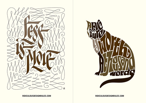
Whatever you think of the rules or how they’re presented, the site does have some beautiful illustrations by Niels Shoe Meulman - only four for now, but hopefully a lot more soon. I’m particularly taken with the cat picture, it’s a nice Latin script variety of the kind of illustrative Arabic writing I’ve posted about before. Very nice indeed. You can see them larger on the site, or on this Flickr set.