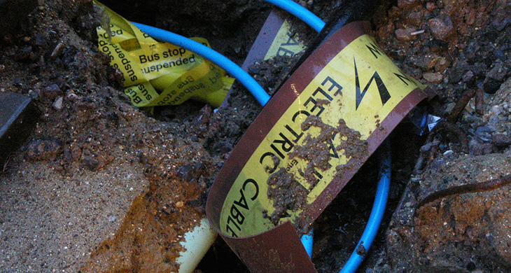
Buried Type

I was going through some old photos I found in a folder and came across this one. I took it in Brighton several years ago, there were some roadworks in the North Laine and I must have wondered at the tape and signage buried in it. I found it amusing when I saw it again and rather like the effect, so I’m putting it up here.

Gnuf

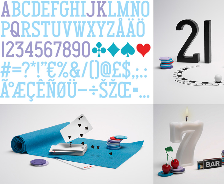
One of the design sites I read regularly is Fubiz, and on there I recently read this post on Daniel Carlsten’s work for the new gambling site, Gnuf. I’m rather fond of the type and iconography of playing cards (as I’ve posted before), so a new identity using many of those themes is going to get my attention, especially as Carlsten has designed a typeface for Gnuf based on them. Looking at how the whole identity works on gnuf.com, I like how he’s not tried to ‘smooth out’ the type, keeping the instead the odd widths and shapes of the letters and numerals and their exaggerated, oddly-placed serifs. I guess there are free fonts out there that do the playing card thing well enough, since the theme hardly requires fine kerning or balance, but it’s unusual and worthy of comment to see it as part of a nicely integrated identity like this. It’s worth checking out the rest of Carlsten’s work too, there’s some lovely work in his portfolio.

The Exquisite Book

Browsing earlier, I came across this blog post for The Exquisite Book. It’s a book project involving ten groups of ten artists, including fine artists, illustrators, designers and comic artists, where each artist creates one page having only seen the previous page. It’s roughly the same idea as a game you may have played as a child, which I’ve only just learned was invented by the Surrealists and was called The Exquisite Corpse. I can’t remember what we called it, but certainly not that.

Anyway, the book project looks like one worth following, and the blog post has a few sample pages. I’ll be interested to see how it ends up looking as a collection, and what the binding will be. I was especially interested in the sketch for the book title page (below left) and had a play with the idea in Sketchup.

Some output from Sketchup, from me playing with the ideas in the sketch from The Exquisite Book site at bottom left. To match the sketch I used a mix of Century Gothic and Helvetica - and some hand lettering naturally.

Small Caps

I just read this post by Joe Clark, linked from Daring Fireball, about why you shouldn’t use small caps for acronyms. In it, Clark provides some examples which at first glance seem to support his argument, but a little thought reveals them to be mere examples of ill-considered typography rather than a crushing blow on the use of small caps.

I’m well aware the whole article may well be trolling, but there is one particularly egregious argument I’ve heard many times when the subject of typographic style comes up - though normally about apostrophes:

This nonsense, promulgated by snobs like that bore Bringhurst who have not read anything written after Jane Austen croaked, ostensibly improves typographic colour. What it actually does is inhibit reading.

Of course, anyone who has actually read ‘that bore’ Bringhurst would know that he is far from a bore and that he is all about promoting typography that aids reading. Setting acronyms in small caps does work well in a large number of cases, and it does indeed improve page colour, thereby reducing distractions to the reader, but as in anything there are no universal solutions. From the very section in The Elements of Typographic Style on the use of small caps for acronyms, Bringhurst states, ‘Refer typographic disputes to the higher courts of speech and thinking’. In other words, if you’re not sure, remind yourself how you’d say it or think of it — think of the meaning first and the style should follow.

I feel a little dirty responding to stuff like this, but I have a point to make. Articles like this promote a dichotomy, an idea that this way is right and that way is wrong, this way is snobbish and that way is proletarian — but when applied to typography it boils down to utter nonsense. The goal here is to allow the meaning of words to shine through. If you use small caps and it makes something hard to read, you should stop using small caps for that thing, and vice-versa.

Making a typographic decision based on some political or class motivation is fine if it’s appropriate for the text, but beyond that vanishingly rare case it’s a mere affectation. Don’t be swayed by trash-talking and accusations of ‘snobbery’, please.

Oh, and on the subject of apostrophes (amongst other things), read The Complete Plain Words by Sir Ernest Gowers. It’s a good read, and full of good sense.
MMX

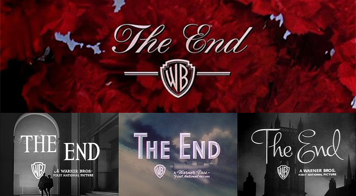
For all that I’ve heard and read from friends, colleagues and associates, it seems that the end of 2009 can’t come soon enough. I’ve not had a bad year at all — it’s been full of good things, both professional and personal — but somehow I’ve picked up the excitement and promise of a new year and I’m looking forward to 2010. It’s going to be a good year, I think. So, without further ado, I’ll bring your attention to a fantastic collection of ‘The End’ title stills from Warner Bros on The Movie Title Stills Collection, perfectly timed to commemorate the end of the year. Go and take a look!

Have a very happy and prosperous new year, and thank you for your visits, your kind, interesting and useful emails — I read every one and even if I can’t reply I appreciate and enjoy all of them. Here’s to two thousand and ten!

Some end titles from The Movie Title Stills Collection

Gravestone Lettering

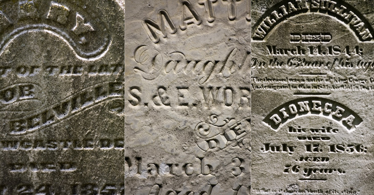
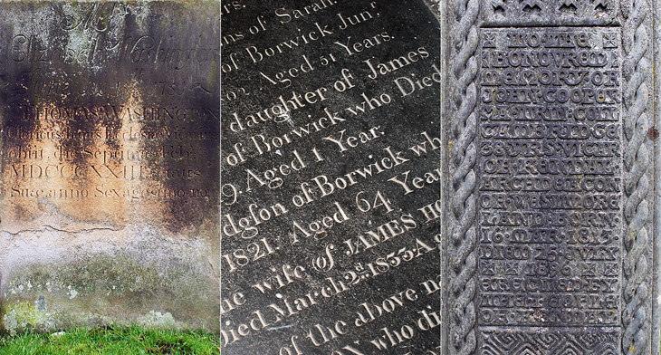
I’m fascinated by the (mostly) Ohioan gravestones in this Flickr set by Tom Davie. Take a look, then have a look at these ghost signs, and you’ll notice how similar the lettering is. I’ve never seen gravestones lettered like this —any flamboyance I’d seen was kept to Celtic patterning or hideously overblown Victorian sentimentalist statuary; the lettering was universally rendered in a sombre, understated style, or at least an archaic one. Still, most of these stones look to date from the mid-19th Century, when commercial lettering like this was all the rage, and I can imagine that for many towns the best-qualified letterer was the same person who did the signpainting and advertising, so much of the style would have carried across. I wonder also whether people simply preferred to have their relatives’ gravestones done like this — who’d want a dull, plain bit of lettering when even a tin of Cocoa gets something far more ornate? What, didn’t you love Grandpa? It’s a theory anyway. The three at the bottom are all ones I’ve taken myself, all from the north of England, so you can see the style I’ve been used to.

All images from this Flickr set by Tom Davie<

The left and centre ones are from St. Oswald’s church in Warton (my hometown!) and the one on the right is from Kendal’s parish church.

Measuring Type

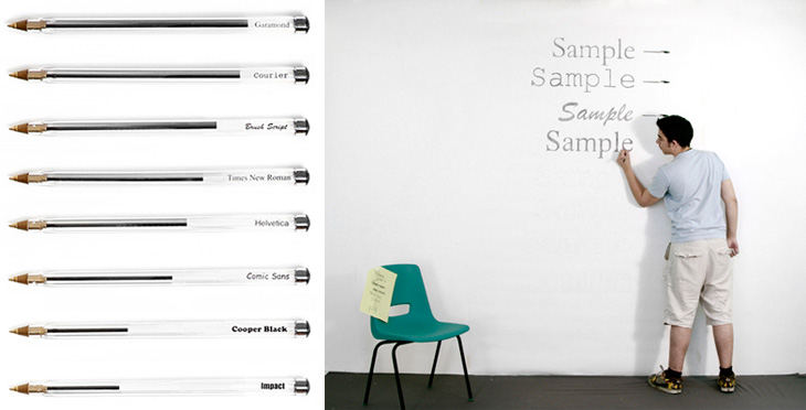
I’ve just seen this project on Swiss Miss and I really like the idea. Matt Robinson and Tom Wrigglesworth compared how much ink different common typefaces use at the same point size by drawing them out on a wall using biros. It’s not a scientific analysis or anything but it is a gloriously fun thing to do. I like the way they ended up with a graph made out of biros at the end of it, showing how much ink is left — the resulting evidence is its own data. It’s a great way of explaining typographic colour too. Love it.

Parking by Numbers

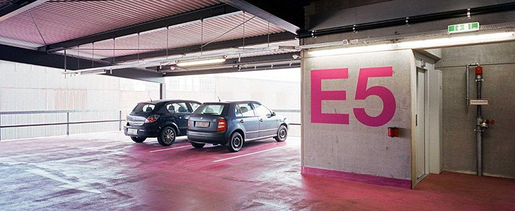
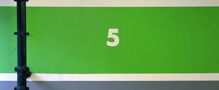
One of the sites I visit regularly (or at least, read the RSS feed of) is Arch Daily. I’ve always had a strong interest in architecture and I enjoy looking through the pictures of new building designs — even if they do often look unrealistically neat and perfect. It’s nice, then, to find actual photos of an actual built structure, and this one caught my eye for the rather predictable reason that it’s got giant floor numbers painted in bright pink Helvetica Neue on it. As so often happens I was reminded of something, this time another set of car park numbers that also caught my eye, the Futura-esque ones on the Brighton Marina car park just down the road from me. I also think I have a bit of a thing for the number 5.

Photo by David Schreyer, from this article on Arch Daily.

Picture taken near here by me. Still there on my old photoblog.

Established and Sons

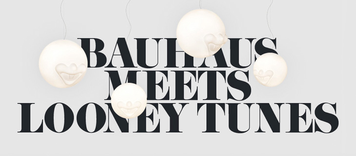
Normally I find all-Flash websites intensely frustrating and rarely recommend them to anyone. I think no matter how glittering with effects, how technically accomplished they may be, they represent a regrettable attitude to the web; a lack of ‘playing nice with others’ that keeps the information locked away, often unlinkable, frequently unquotable and usually inaccessible. Still, sometimes there are sites that do something so nice it’s worth linking to them, despite their Flashtastic nature. A few days ago It’s Nice That linked to the new site of Established & Sons which has some lovely things, and some lovelier type treatments using URW’s Didoni. One of my favourite examples is below:

OASIS New York

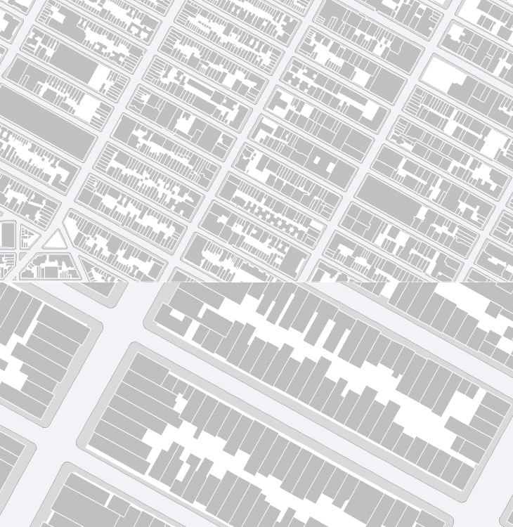
Now I really have been meaning to post about this for ages. So long in fact I really can’t remember where I found it. I don’t even have a link to it anymore and it’s only because it’s easily Googled* that I could find it again. As far as I understand it, OASIS is a map-based system for New Yorkers to see how open space is used in the city - the page about it describes this as enhancing the stewardship of said open space, whatever that means. Still, the new maps they’ve got are really quite lovely, and astonishingly detailed. I know our very own Ordnance Survey has maps this detailed, but the data is jealously guarded and even with recent changes in the right direction, detail at this level is not something for we mere taxpayers (who pay for it) to see and use without paying for it again. I hope the Ordnance Survey will see sense soon and we’ll see some fun applications with UK data like this.

Hey, I just like the maps without anything on them.