November 4th

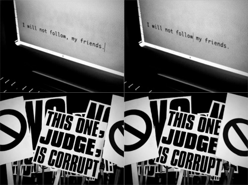
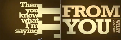
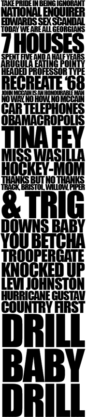
Well it’s finally here. The actual day of the US election. I don’t really want to write about it, it’s been on TV, in the press, online, everywhere, for two years and I can’t wait for it to be over - I’m sure it’s got more coverage on British TV than any of our own elections ever has. It’s been at such a level of saturation that I, as someone who lives outside the US, a British citizen, someone who hasn’t been actively following the election, can look at this (rather nice - snippet at right) bit of typography and recognise pretty much all the stories it represents*. However, there are some compensations; there’s been a big focus on graphic design this time around, though seemingly only on the Obama side of things - to the extent that that Shepard Fairey poster is the subject of much parody.

The Obama campaign branding is of such incredibly high quality and consistency I’m hoping there’ll be a book about it - they must have had to use so many suppliers over the campaign, if not for artwork then printing, set building, copywriting and typesetting. To ensure a consistent quality and tone for such a long time over such a wide distribution is quite an achievement.

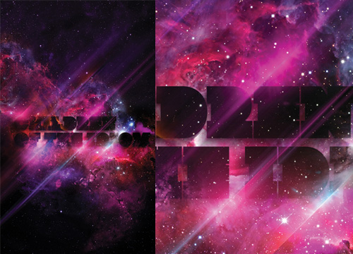
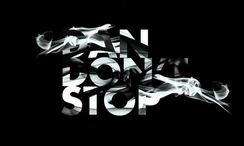
Anyway, now that the day is finally here, and with the full knowledge from my site stats that about 40% of my readership is from the US, I urge those of you from that country to get out and vote. The biggest threat to democracy is people thinking that the election is already won - it isn’t. So vote. I hear the turnout may be record breaking - let’s hope it is, and it inspires lazy British voters to get out there when it’s our turn. And to make this post a bit more related to type, some lovely posters to get you in the mood:

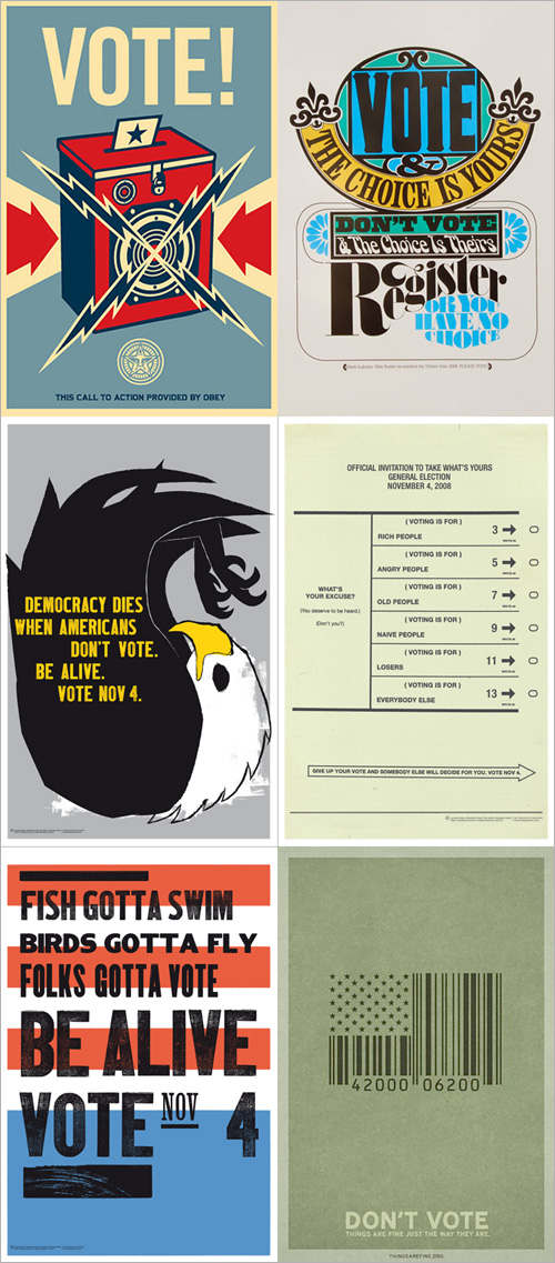
Posters from Monoscope, Supermarket, Things Are Fine and Tomorrow Partners.

The Comma

This pair of videos by the Brazilian Press Association is pretty interesting to watch. I’ve had the link bookmarked for a while as I like the animation style. In Portuguese and English, the animation demonstrates how the placement of a single comma can alter or reverse the meaning of a sentence, and makes the point that no one should be allowed to make any changes to what’s written in the press, no matter how ‘small’ the edit:

With the animation style for this piece being rather good, I can’t help but think that while there’s a lot of ‘typographic animation’ around, most of it is pretty samey and unoriginal, repeating over and over the idea of attaching each new word to the previous one, rotating the viewpoint, zooming in or out and then attaching the next word. The style can work wonderfully, but a lot of animations leave a lot to be desired - using typefaces that simply don’t work at such a range of scales and angles, are badly kerned, use too tight or too loose leading, and sometimes look just plain rushed. Sometimes they come so close to a great result, but a lack of polish (and checking for typos) limits the effect.

The style demands a great deal of attention to detail, which is why the really good ones are so impressive. The Pulp Fiction one is, to me, the acme of this style - being made up almost entirely of text, but I think that the animation on The Project for the New American Century deserves a lot of credit for using it with more traditional 2D and 3D animation to convey a powerful and provocative message.

Studies in Pen Art

Drawn linked to this fantastic PDF, “Studies in Pen Art”, a scan of a 1914 pamphlet by William Dennis. It has loads of examples of penmanship and advice on techniques and equipment which is pretty much all relevant today - although not perhaps the emphasis on speed; even a commercial letterer today wouldn’t have to produce work as quickly - producing this kind of lettering by hand would be a project in itself these days and so more time would be devoted to it. Still, we all have deadlines and knowing how to work quickly is never a bad idea. The PDF is available for download from the Drawn page - worth a look.

Memory Cloud

Alas, I found out about this way too late to visit it in person, but there are some pictures of the event on Flickr. I love the way the words float, apparently in multiple planes; a rich, multilayered and compelling effect; the silhouettes of the crowd, the dramatically lit lush architecture with the bright, translucent clouds of glowing words in the centre. Maybe the photos make it seem more impressive than it was, but I’d certainly like to have been there… with my own camera.

The Adventures of Rusty

I found this massive collection  of movie title screens a couple of weeks ago in a Google image search (for something else, naturally) and, well, the nature of life at the moment meant I didn’t have time to have a proper look. I had a look through it today and found this beautiful piece of script lettering. Of course, I had to trace it, and it’s really quite special; the lowercase reminds me of Savoir Faire a bit, but the capitals are just so… movie! Take a look:

I found many other examples of great lettering, but here are four special ones I might trace at some point:

The Lubalin VA Logo

Phillip Niemeyer of Double Triple kindly wrote to explain who that VA logo was for:

I checked my own photo archive of the archive and found the VA business card. VA stands for “Ike Vern & Associates, Photography”. Much of Lubalin’s great graphic work seems to have been simple jobs for small clients. I love that.I posted the VA image, a tissue in Lubalin’s handwriting specing a logo, and a unique logo for the World Trade Center.http://www.doubletriple.net/lubalinPhillip Niemeyer

Technically this is an update to this earlier post, but I wanted to create a new one because I rather like the Double Triple logo, at right - a mirrored ‘3’ in ITC Baskerville.

The New Fontfeed

Excellent news; Erik Spiekermann’s brainchild The Fontfeed has relaunched as a new, independent site. Combining the insights of Erik Spiekermann himself, Stephen Coles and Yves Peters, this is definitely a site to add to your RSS reading list, or should you be so inclined, your bookmarks. It sounds like it’ll be very much worth it:

Along with delivering advice and inspiration, our goal is to add a perceptive voice to the type community, bridging the gap between font users and font suppliers. We hope to stimulate interaction and kick start a valuable and lasting discourse between all parties, so don’t hesitate to let us know your thoughts.

So yes, congratulations on the new site!

Lush Type

A certain someone commented that many of my recent posts haven’t been about type at all, so, entirely coincidentally I have a post about some very lush type and calligraphy I saw the other day. This post on DesignFeedr has some nice examples of typography on a dark background. Using a dark background is good for making decorative and illustrative type stand out really well - the colours are richer, the darkness concentrates the eye on the main subject, and (on screen at least) the piece literally glows. Some of the examples in the article are nice (others less so) but scroll down for the work by Pablo alFieri, Theo Aartsma and Daniel Gordon especially.

Some of my favourites are below, but visit the article to see all the others.

Vexed Punctuation

Coudal linked to this interesting article on Art Lebedev about some common problems with typesetting punctuation, such as centering, tracking and bolding. I agree wholeheartedly with all of them, though I’m interested at the solution to the problem of how to punctuate smileys. I may be an old traditionalist here, but I think if you’ve got smileys in your text, you’re not going to be typesetting it. If you have to then you may as well set the smiley in Wingdings and treat it as a normal glyph, rather than leave it as two punctuation marks. Still, when typing in plain text and you’re prone to using smileys, here’s an idea of how to use punctuation with them.

Notice on the Art Lebedev site that the paragraphs are numbered? That’s interesting, no?