John Emerson sent me a link to this article ages ago, and I’ve just re-read it. It’s worth a read as an introduction to how type has been used to enforce and shape national identity around the world:
Hindi and Urdu also share a common vocabulary and grammatical structure, and linguists refer to them as one language: Hindi-Urdu. In print, however, the distinction has religious and political significance. Hindi is written in Devanagari, historically associated with Hinduism, while Urdu is written in an Arabic script associated with Islam. Hindi is used in India, while Urdu is used in Pakistan. The ideological wedge between what it means to be Serbian or Croatian, Hindu or Muslim, has been used by nationalist demagogues to promote conflict and political power.
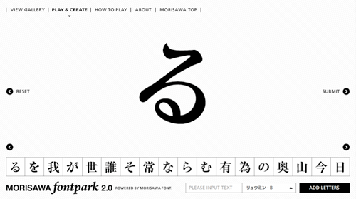
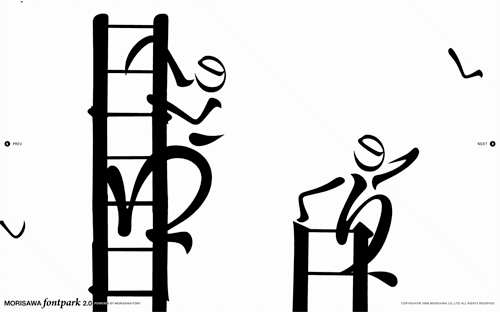
Coudal Partners linked to this rather nice toy by Morisawa & Company. My Japanese knowledge is rather woeful, so I don’t have very much more information than; it’s pretty, it’s fun, it has a very nice interface, and it appears to be promoting the sheer loveliness of Morisawa’s fonts, so please buy some. I was told by a Korean colleague that there are relatively few fonts available for East Asian languages compared to Western ones because of the sheer number of glyphs that need to be designed, so I would guess a new one would elicit at least a moderate fanfare. Maybe. Anyway, have a play - here are a few screenshots:
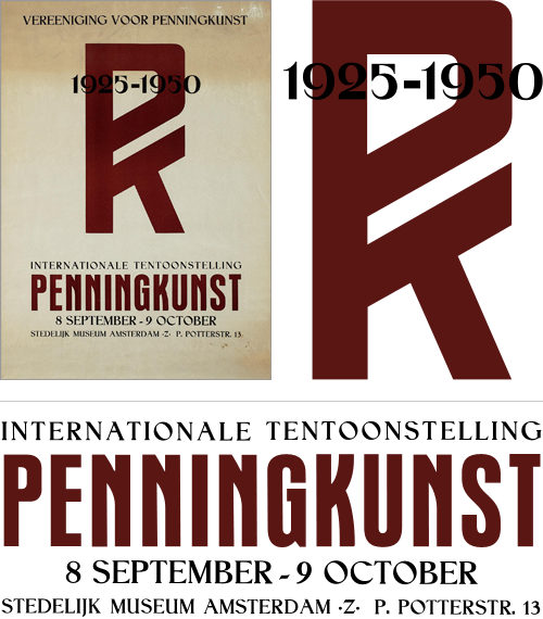
I rediscovered a set of saved images and links I had, labelled “150 Years of Dutch Advertising Art”. I’ve had the link sitting around for quite some time in the vast dusty archives of my home directory, and I can’t understand why I’ve not put it up here before. The site is an incredible collection of fascinating and inspiring images, from the baroque and painterly to the most sparse and graphic. Great stuff.
As usual, I’ve had to trace some of them with trusty beziers - I’ve just finished doing this one. I love the PK monogram and the composition of the two styles. Fun to trace too.
I just read this fascinating article on GT!Blog, presenting a theory of why Japan never made the iPod. The basic premise is due to the increased memory and processing requirements of representing Japanese text on screen adequately, Japanese manufacturers tended to develop appliances, rather than general purpose computers. So Japan (and by extension, east Asia in general) became leaders in electronic gadgetry such as games consoles, fax machines, watches, stereos and the like, with the trend reaching its (possible) apotheosis with the mobile phone - not one of which devices required a general purpose personal computer as the connecting hub. Each device did its thing, and was specialised for that - if anything became close to a general purpose device, it was the mobile phone itself, though it was, and is, quite limited in what it can do and what people want it to do.
Now, as the article points out, modern computers can handle Japanese (and Chinese, Korean, etc.) and the computer-as-hub idea is gaining popularity in east Asia, but it’s fascinating how the typographic requirements of a language have apparently altered the entire economy (and culture!) of not just a country or region, but the whole world.
Using the characters from the GT!Blog article, you can see how an 8×8 grid is inadequate for representing Kanji.
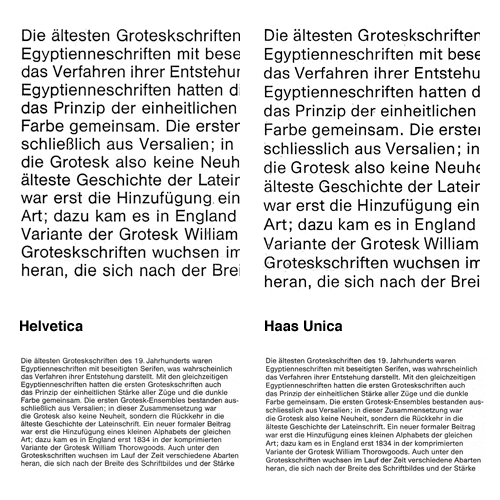
Bauldoff linked to some scans he’d done of the 1980 promo for the typeface Haas Unica, by Team’77. I’d seen a copy of this back in the 90s but then forgot about it until seeing these scans - back then I was only a callow youth so the idea of improving Helvetica didn’t seem so remarkable or interesting as it does now.
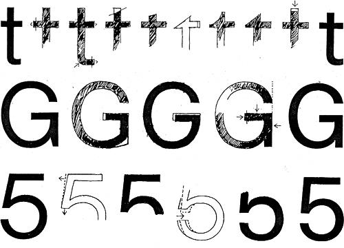
Essentially, Haas Unica came about as a result of analysing the original version of Helvetica, its variants (as they were in 1980) and similar faces and seeking to improve them - to produce the ultimate archetypal sans serif face. A single face to unite them all, if you like. Looking at the comparitive settings of both faces at text size shows how subtle the differences are, with a detail closeup first:
You can get an idea of the kind of analysis they did from this little snippet:
The character width of Haas Helvetica appears to us to be generally somewhat narrow, so that the rhythm of the typeface is rather uneasy in its effect. The same applies to Akzidenz Book. Linotype Helvetica is wider than the Haas version in relation to its character area and appears to us to be generally more balanced. Its character width corresponds basically to that of Univers.
And the results, based on improvements and adjustments to the stroke thicknesses, relationships of the capital letter widths, numerals and the basic forms of the letters:
The differentiation of capital letter widths leads to a tighter rhythm in upper case composition. A slightly more open form in the Haas Unica specimen setting, compared with the original version, together with the individual corrections to characters, improves the readability of the typeface, especially for continuous text.
Unfortunately when the face was released there were some legal problems as Linotype and Scangraphic both claim ownership. As a result it is no longer available commercially, which is a huge shame. Perhaps a petition for the conflicting parties to get over themselves and perhaps release the face jointly? I mean, making some money from it is surely better than making none at all - especially when ‘ownership’ is being judged from contract and the shifting seas of corporate ownership. Meanwhile, some people are taking matters into their own hands by redrawing the letterforms for their own use.
On the left is the original Haas Helvetica, on the right the new Haas Unica, and in between some transitory and experimental forms.
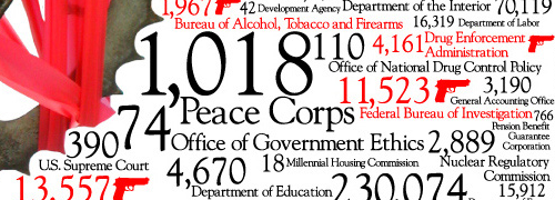
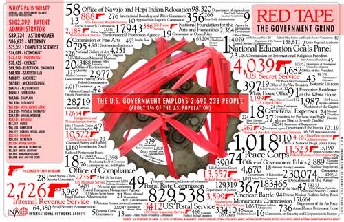
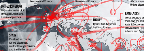
I was hunting for a link I’d omitted from a previous post and came across an old bookmark for these infographics (found originally via Chris Glass). I especially like the red tape one, and the map part of the tobacco one is great.
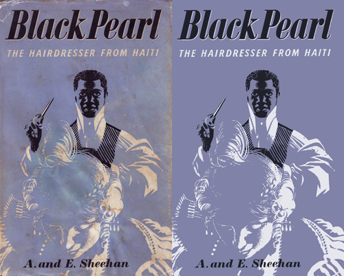
Drawn! the other day had a link to this treasure trove of retro illustrations, posters, books, covers, and pretty much everything else committed to print, and an on-link to the Mid-Century Illustrated Flickr pool. Looking through these is a bit like browsing ffffound, you keep finding things you want to keep links to… or just keep. I tend to want to redraw things, as I find it helps me understand how it was done a bit better and I often learn some new technique or style, or get inspiration for something else. I particularly liked the Black Pearl cover - it’s an engaging and compelling image, but made with just three colours. No halftones or tints either. I didn’t redraw this, I just used clean-up techniques to recreate it:
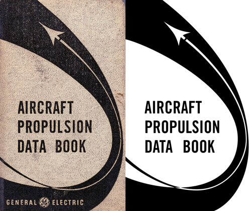
The Aircraft Propulsion Data Book is interesting as the curve appears smooth and aerodynamic, but under close examination it seems a bit… well, clumsy. Still, that’s the kind of thing that interests me - for example, when doing things like icons the details can seem crude and ugly up close but at their intended size provide useful (and subtle) clues on how to interpret the whole image.
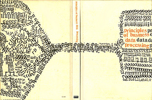
Also in the sets of images are various examples of very nice typography, these two caught my eye in particular:
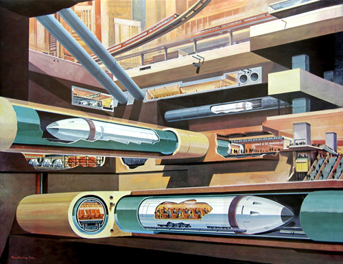
Then, finally, no collection of mid-century illustrations would be complete without at least one retro-futurist image, so here’s a fabulous subway illustration by Klaus Bürgle:
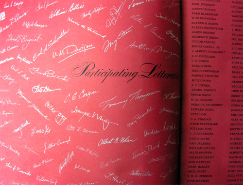
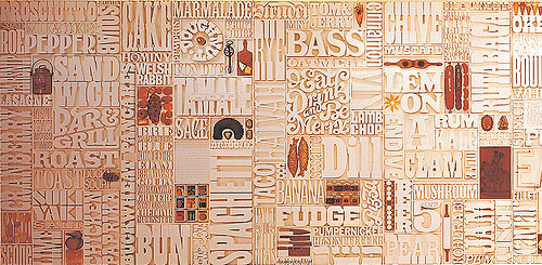
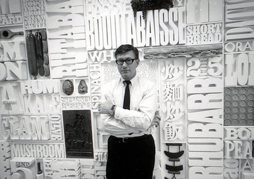
I was catching up on Oh Joy! earlier today and saw this post about Lou Dorfman’s gastrotypographicalassemblage. Wow, what a piece. Cho links to a collection of images on Flickr (where else) showing some original photos of the piece in situ, and some of the work being done to restore it - more on that here. I love the restoration pictures, with all the letters laid out like that.
I would love to have something like this at home, or even at the office for that matter.
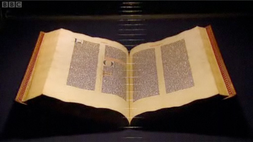
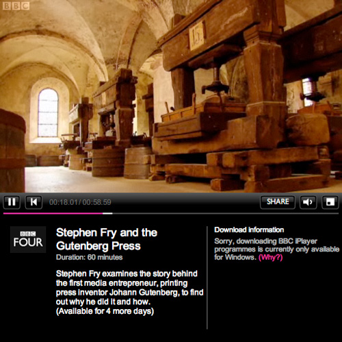
A fair few sites have linked to this recently, but I’ve only just got around to watching it and I can’t recommend it enough. As well as Fry’s flawless presentation of the story of Gutenberg and his invention, there are a few examples of nice lettering to pause the video for too. Mention of the Gutenberg Bible reminds me of this article, from a while back.
It’s the first time I’ve used iPlayer, as it’s the first time my internet connection has worked at a reasonable speed (thank you Virgin Media, it only took you years). I rather like the way its laid out, it’s a bit like my other site, which has looked like that for years, I hasten to add.
Also, for those of you who’ve ever watched the original TV series of Hitchhiker’s Guide to the Galaxy, having Fry present this is just perfect; it’s like a chapter from the Guide itself.
A few years ago I worked on the UI design of an online government-backed TEFL learning programme, which had a lot of input from various charities and education experts. One of the earliest inputs regarded the typeface to use for it. I remember an argument I had with a consultant for a large charity, who argued that Verdana was inherently an illegible face because the ascenders and capitals were different heights; an odd approach to take as I’m fairly sure that enough research had already been done into word shape and readability (by her own organisation as it turns out) to encourage faces with different ascender and cap-heights. Still, the argument quickly ended when the main stakeholder (other than the government) decreed that Comic Sans was the most readable text ‘face’ available and that it must be used for everything. They would allow no dissent. Fortunately a few months down the line and a couple of review stages later, we ended up dropping Comic Sans in favour of Arial - not normally a face to make designers rejoice, but so much of an improvement it felt like a liberation from purgatory. One of the main official objections to Comic Sans was that the letterforms were different from those end-users would be used to, and therefore unfamiliar and hard to recognise. Of course there were many unofficial objections, often centered around the end-users feeling somewhat insulted by such a childish face.
Anyway, I was reminded of all this when David pointed me towards the new face produced by Fontsmith for Mencap, which was actually designed in collaboration with end-users, and benefits greatly as a result. From the press release:
Having narrowed the choice down to a cleaner and more crisp letterform, which avoided the pitfalls of being too childlike and patronising, Fontsmith refined the design to aid legibility and maximise accessibility.FS Mencap is not quirky or odd looking, doesn՚t resemble the childlike design of fridge magnets or early learning tools and is set to challenge Arial as a new standard in legibility.
So rather than to treat people with learning or sight disabilities (or those who just don’t know English) as big children, Fontsmith and Mencap created a face that is clean, professional and adult, while still being friendly and (of course) legible. According to the Typophile article, the face will be available for the public to use too, which is excellent news. I wonder what range of characters are included in it though? The press release shows only basic Latin characters in the examples, but I hope it has broader coverage.