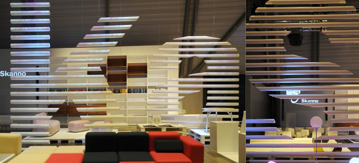
This feels more like a found type entry than anything else, even if I didn’t strictly find it, and that it’s more lettering than type. The Contemporist posted an article and series of photos of Habitare ’09, Finland’s largest furniture and interior design fair. Buried deep in the photos were these two, of Finnish store Skanno‘s stand, showing large letters (presumably spelling the name of the store) made out of plastic tubes and suspended like venetian blinds as dividers. It’s a simple technique, well done. I want some letters like that.
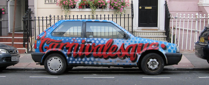
Whenever I’ve seen this car around Brighton it’s either been very dark or I’ve not had a (decent) camera with me, so it was good the other day to see it sat there in full sunshine, and me with a proper camera too. Too few people decorate their cars, fearing perhaps for the resale value, but seeing this car I can’t help but wish more people would have a go. Whoever you are who did this, thanks!
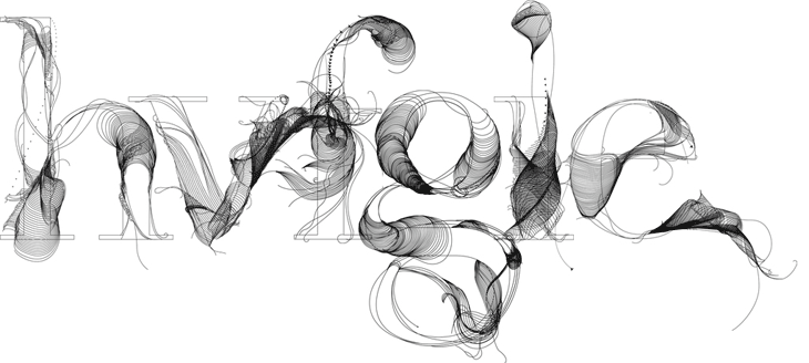
Whenever I’m playing around with guilloches, I often think it’d be nice to make an alphabet - to actually generate letterforms with them. It’d mean loads of eye-wateringly complex formulæ, but I think it’d be worth it. Well, Tania Alvarez has created some beautiful letters called Fabric Type that convey some much of the appeal and intricacy of guilloche patterns and reminded me instantly of that idea. If ever I needed reminding that the products of inspiration are infinitely variable, then it’s this; these are beautiful and I love them, but I’m happy to see that they’re different from what I was thinking of doing. This list of things that I want to get done isn’t getting any shorter. Found via the ever-inspirational Fubiz.
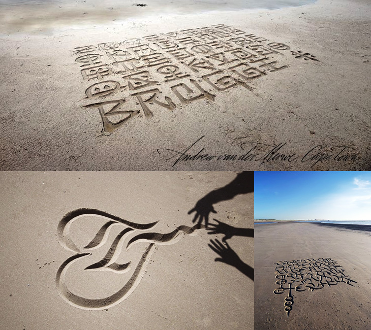
Browsing Behance the other day I came across the portfolio of Andrew van der Merwe, a calligrapher and letterer from Cape Town. These sand lettering pieces he’s done are really beautiful - the edges of the letters are so clean and the forms so precise, there’s definitely a technique going on here, which he confirms:
Scratching in the sand with a stick, however, has proved less than satisfactory because it makes more of a mess than a mark. This has led me, over the past seven years, to develop various instruments which mark the sand in less messy ways, and ultimately to a kind of scoop which leaves neat V-cut letters of the sort one gets in stone carving.Andrew van der Merwe
Lovely stuff. Go and have a look. There’s his Behance portfolio here, and a site which desperately needs some attention here.
I’m loving these examples of signage and lettering in this Flickr set, linked from City of Sound. Most of them seem to be from Prague, but there are a fair few from various other places in Central and Eastern Europe, and as far as I can tell a lot of them are fading or at risk of being scrapped in gentrification projects. Well, I say scrapped, but since you can expect to pay as much as £50 per letter for old signs just here in Brighton, I expect there’ll be lots of architectural salvage types schlepping round the old Warsaw Pact countries buying up this stuff as we speak.
I hope some of them are kept though - I was reminded of this shop in Paris that has been left empty since the 1980s and has been opened as a new Paul Smith store, with all its original signage and internal fittings intact. I read about it on It’s Nice That, and the history of the place is interesting:
The walls are unpainted for many years, the floor tiles are the original, 80 year old shelves, everything dates back to the 1930’s when La Tourrette was opened by Monsieur Tourrette as a ‘Bougnat’; the left side of the shop selling coal, the right side selling wine.It’s Nice That
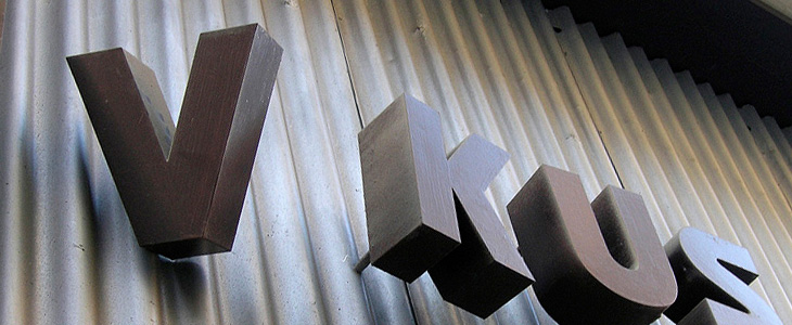
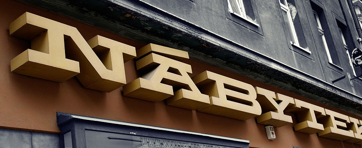
I love the Nábytek one above - it’s such a powerful block of lettering, so monumental and such a strong sense of horizontal motion, it’s like a freight train of type. It did remind me of a few things I’ve seen - this t-shirt for example, or Dispatch Extended Bold, but none really have that strength and density, nor some of the nice features the sign has. The A on the sign has those serifs and that incredible accent - why you wouldn’t want to include diacritics like that in your display face I don’t know - the offset diagonal on the N is just great too.
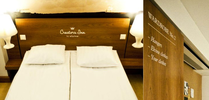
I’m often saving links from the Contemporist, but this hotel, Creators Inn by Elvine (and others), caught my eye for the nice labelling of the wardrobes and the printed history of Elvine on the shower screen. It’s a nice touch, but I wonder if it doesn’t seem a little incomplete as an implementation - things like this are best left subtle or taken to the extremes; if every item in the room was labelled in the same way, with usage notes perhaps, it would be quite the thing. Also, as one of the commenters pointed out, it’s hard not to notice the similarities between the hotel logo and that of a rather large hotel chain. Still, it does look rather nice, and if you’re a creative person visiting the city, you can get free accommodation there. Now that’s a nice touch.
Adrian Giddings just linked to this on Twitter, a linocut map of Paris by Mark Andrew Webber. It reminds me a little bit of these typographic maps of London and Portsmouth, and of course the ORK ones of various places, but because it’s hand-done (and a linocut at that) when it’s printed it’ll have a very different effect. There’s one of Amsterdam (and London, and New York) on Webber’s site which shows how it might look.
The Paris one looks to be made of a combination of face and lettering styles, I assume to reflect the character of each place being represented, and from that I was wondering at the idea of doing that for whole cities, if you could. It could never be a perfect representation for everyone - I’m sure that for many people a typographic representation of London would involve Johnston Sans, whereas I tend to think of Caslon types. For others, who knows?
The linocut itself has a gorgeous sculptural quality, shown up beautifully in Webber’s photos; I would quite fancy a copy of that rather than a print (oh, OK, as well as a print) - to run your fingers over it would be a real pleasure. Lovely stuff:
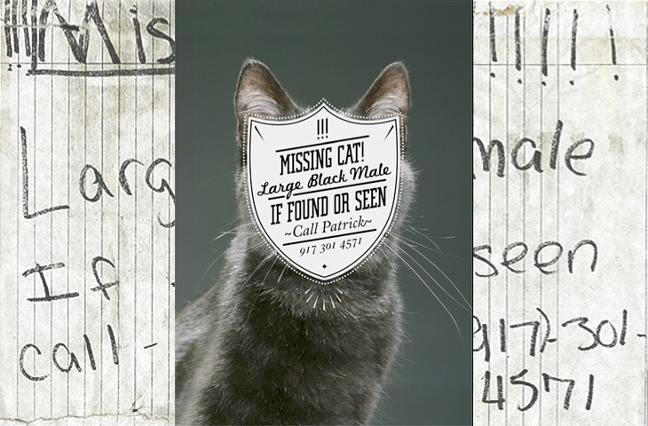
One for the ‘what a nice idea’ pile, this. Cardon Webb goes round upgrading notices pinned up in the streets - you know the ones, ‘Lost Cat’ and the like. There’s one I saw the other day near me that was pleading for the return of a lost plush bunny. I hope they found it; the tone of desperation told a whole story in itself, a wailing inconsolable child, pushchair left unfolded in the hall, coat fallen to the floor, scattered attempts to make-it-all-better: a melted bowl of ice cream, other toys, the Teletubbies DVD and so on, and still the sobbing.
Anyway, back to the nice things. I found this on idsgn, who had created a nice header graphic out of the ‘before’ and ‘after’ images of one of them, and I found that such an appealing presentation I’ve recreated it myself. Still, the original works are the stars of the show, so have a look round on Cardon Copy at the others. I initially thought that the idea was to simply improve the original notices but found a few of them rather hard to read, reading the Cardon Mission reveals all:
Cardon copy takes the vernacular of self-distributed fliers and tear-offs we have all seen in our neighborhoods. It involves hijacking these unconsidered fliers and redesigning them, overpowering their message with a new visual language. I then replace the original with the redesign in its authentic environment.Cardon Copy
So there you go, the key phrase is ‘overpowering their message’. Explains some of them. The others, like the one below, are far more appealing. You’d keep an eye out for that cat:
This is my favourite one.Harder to read at a glance, but probably more likely to make you stop and look than the originals.
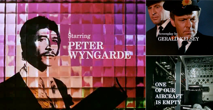
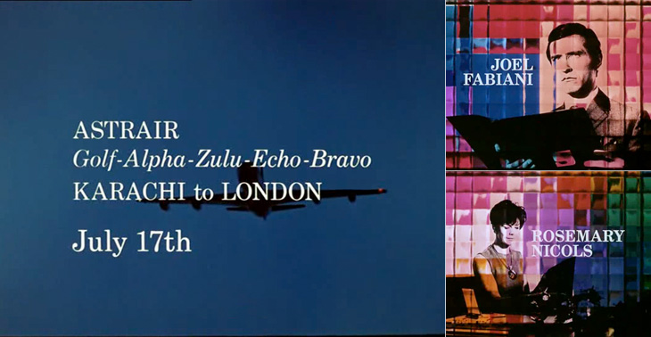
I first watched some episodes of Department S on the UK channel Bravo a few years ago, and I remember thinking at the time how great it was - the Jason King character is ace (there was a spinoff series based just on him). However, what really got my attention and had me making screenshots from the DVDs is the typography of the titles and scene-setting panels. They’re very nicely done, and highly unusually are set in a fairly fine and delicate (for low-resolution TV!) serif face - in this case Century Schoolbook. The titles were done by Chambers and Partners, who did a lot of the titles for TV series in the 1960s, and I wonder whether this was a bit of an experiment for them, an attempt to break the mould somewhat. Their experience shows though; it’s all very well done and brings a lovely printerly quality to the screen. I’m glad they did it.
There are other nice bits of lettering in the series too - lots of traditional signwriting, some big typeface samplers used as decoration, and the odd bit of Letraset. Overall the show seems designed, there’s a real touch of quality to the whole thing - I guess that’s why it’s one of those cult classics. If you ever see any of it, pay attention to the cuts between scenes, there’s a very nice alternating set in Six Days especially (the bit with the phone calls and the photos being taken of secret documents, if you want to know). Very nice.
Some of the titles and scene-setting panels.A few other bits of lettering and type in the show.