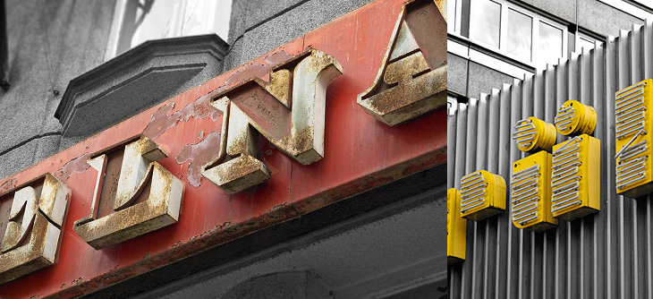
I’m loving these examples of signage and lettering in this Flickr set, linked from City of Sound. Most of them seem to be from Prague, but there are a fair few from various other places in Central and Eastern Europe, and as far as I can tell a lot of them are fading or at risk of being scrapped in gentrification projects. Well, I say scrapped, but since you can expect to pay as much as £50 per letter for old signs just here in Brighton, I expect there’ll be lots of architectural salvage types schlepping round the old Warsaw Pact countries buying up this stuff as we speak.
I hope some of them are kept though - I was reminded of this shop in Paris that has been left empty since the 1980s and has been opened as a new Paul Smith store, with all its original signage and internal fittings intact. I read about it on It’s Nice That, and the history of the place is interesting:
The walls are unpainted for many years, the floor tiles are the original, 80 year old shelves, everything dates back to the 1930’s when La Tourrette was opened by Monsieur Tourrette as a ‘Bougnat’; the left side of the shop selling coal, the right side selling wine.It’s Nice That
All you need is a bakery and you’re set.
Lovely. There’s another view of this here.
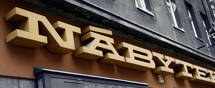
I love the Nábytek one above - it’s such a powerful block of lettering, so monumental and such a strong sense of horizontal motion, it’s like a freight train of type. It did remind me of a few things I’ve seen - this t-shirt for example, or Dispatch Extended Bold, but none really have that strength and density, nor some of the nice features the sign has. The A on the sign has those serifs and that incredible accent - why you wouldn’t want to include diacritics like that in your display face I don’t know - the offset diagonal on the N is just great too.