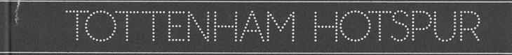
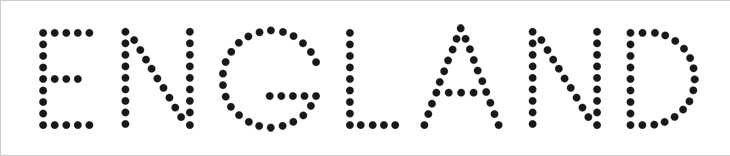
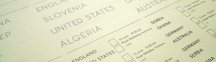
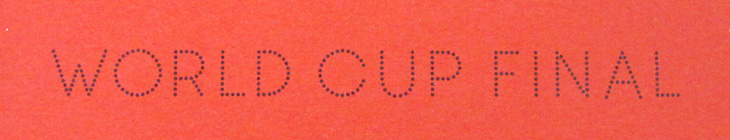
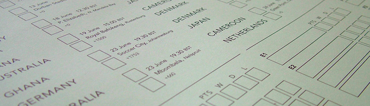
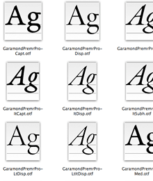
I wasn’t expecting to have anything to write about that was football-related, even during such a big event as the World Cup, but wonders never cease. When Benjamin Prescott mailed me about a personal project to create and sell limited edition World Cup wall charts he’d designed I had a big of trouble thinking what it was for — I’m so out of touch with such things. I mean, yes, I’ve a theoretical knowledge of the offside rule (something that’s talked about as if it’s one of the Great Mysteries of the Ancients) and yes, I played it at school, but the whole yelling-at-the-tv, wearing team colours and flying the flag kind of thing always passed me by. Still, I know enough people who like it all (so I can ask), and as it turned out I was just re-reading the email when I noticed I was sat right next to one of the wall charts, and a lovely thing it is too! What really interested me in it was the recreation of the typeface from Subbuteo scoreboard references — I like lettering and illustrations made from dots anyway so this was a nice find, and it works well with the Avenir used on the rest of the chart too. The wallcharts are limited edition, so I hope I’m not too late in writing about them and you can still get one if you want one.
An original Subbuteo reference and a sample of Prescott’s redrawing.
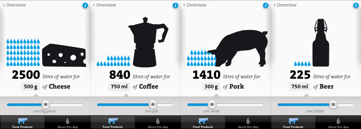
I remember seeing, and liking, the first edition of the Virtual Water poster, and I see now there’s not only a new version but an iPhone app, which has even more information in it. I particularly like the visual style of the project — the simple black silhouettes and the blue accent colour work beautifully (a combo you may notice I rather like already), and the bold, slab-serif typeface (see below) just looks perfect. The little info cards behind each item are nicely laid out too, reminding me of classic recipe cards (or cocktail bar cards), and the short sharp explanations and consistent use of units back up the infographics nicely.
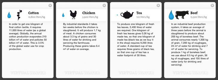
Some screens from the app. I like the indicator of the ‘usual’ amounts on the slider.The background info cards.
I’m guessing the face is TheSerif Classic by Luc de Groot), though for unknown reasons I’ve never used it, it looks so incredibly familiar that I was convinced I must have. But, I hadn’t. How very odd! I may have to remedy the situation soon.
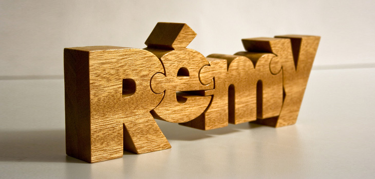
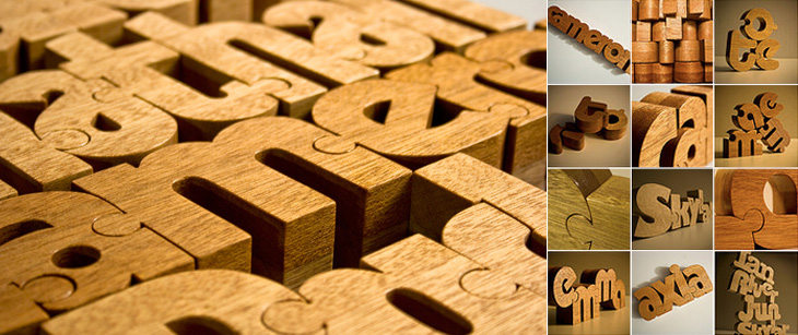
These wooden name puzzles by John Christenson are great. Grain Edit posted about them recently and I kept the link — one part of me really wants one of my own name, but the sensible part of me warns that I’ve got more than enough stuff and I’m supposed to be minimising clutter, but still, they are very nice. Seeing the photo of a number of them together makes me wonder whether a poem or short piece of prose would be a good subject, then it’d go on the wall and it’d be art and it wouldn’t be clutter at all, oh no. Rationalisations, rationalisations…
I’ve been thinking about pages, print and scrolling for a while, mainly because I’m a designer and it’s part of my job, but also (I have to admit) because I quite fancy getting an e-reader of some kind. I’ll say right now I’m not going to write about any particular gadget, nor do I care which is best, which is more open, which is morally better, which one is approved by the People’s Front of Judea or the Judean People’s Front or whatever, right now I’m just thinking about one particular aspect of the technology: the page metaphor.
I’m writing this with full knowledge that there are some truly excellent articles out there about this very subject, this one in particular, which you might want to read too. Thing is, while people are talking about digital books, the talk is about the printing, transport and warehousing costs and trees it’ll save, and there’ve only been a few scant mentions of how the form of your everyday novel or reference book could change. Any discussion on form has been about the premium-quality books, the Alice for iPad style remakings, the ones that make new and playful uses of the page-as-screen, and there will be some truly wonderful digital books made, we know there will. However, it’s just taken as read that for all the other books that a bunch of text will be squeezed into an arbitrary set of pages of arbitrary size, like making sausages out of text. We’re not doing these books justice with this tired old page metaphor.
What’s so good about pages?
There are some functional and aesthetic reasons we might like to use pages for a long text. The main functional one that I can see is that we get a handy idea from pages where we are — they are numbered. To return to the book later we need only remember a single number and we can find that page again and carry on where we left off. That’s a great idea, but it breaks, and breaks badly if you were to change the text size, or to carry on reading on one device from where you left off on another. I think as these are two big advantages of digital books, we can’t easily ignore them. Fortunately placeholding is pretty easy on a digital book. It simply remembers where you were and loads the book up at that point.
Yes, I know my metaphor has holes in it, like a huge Hampton Court Palace shaped one. Just bear with me, OK?
So, what about aesthetic reasons? Well, here I like to compare it to architecture, specifically building materials. In years past, and here I’ll emphasise I’m assuming quite an early sensibility, if you built your house with cut and dressed stone, it marked you out as being a pretty wealthy and (presumably) classy individual. If you built your house out of brick, it just said you had a house made of brick. It might be a nice house, but it’s a house made of brick. Nothing wrong with that, you understand, but hey, it’s not stone, and brick was something associated with industry, with commerce and with houses built on a massive scale for factory workers. So houses were built out of brick and then given a coating of render which was then scored and moulded to look like stone. It didn’t really fool anyone, so while it didn’t mark you out as wealthy, you could at least appear to be classy, and that’s important to a lot of people.
And so to books. The equivalent in my metaphor of a stone house is an actual professionally set, printed and bound dead-tree book. They’re the kind of book that is made to store Great Works; the dictionaries, philosophies, histories, plays, religious texts, the physical manifestation of all human knowledge that can be set on a page. No wonder people place great store in the idea of a printed book, for the past couple of centuries they’ve been the acme of Stuff That’s Worth Keeping. Of course, now we have perfect-bound (ha!) books produced in the millions and I don’t think even I could be accused of snobbery in saying that most of them are from the category of Tedious Drivel than Great Work, but there you go, we still have this idea that printed books are so very special, better than any other medium.
So, what of the brick house in my belaboured Victorian metaphor? This, to me, is a scrolling page of text on a screen — pretty much the kind you’re reading right now, and do on any website. Yes, it’s called a web page but it is at least a true digital page in that it can be any length, any width and be as static or dynamic as you want. It is a product of the digital age, and while the code we use to describe its content may still be inadequate and subject to billion-dollar playground fights it does the job pretty well. The reason I liken it to the brick house is that there’s nothing really wrong with it but it hasn’t the cachet, it’s associated with the mass-produced red brick terraced house in some mill town somewhere — it’s commercial, it hasn’t the sense of permanence, it’s just a this’ll do commercial pragmatism about it. Of course, just as there are astoundingly beautiful brick buildings there are beautiful web pages, but it’s all about how these things are commonly associated in people’s minds.
And so to our prettified house. The brick one with the rendering on the outside made to look like stone. It can be built nearly as cheaply and quickly as a plain brick house, but it just looks so much better (well, more fashionable) and will sell for a load more cash. It’s got the association of quality in people’s minds but very little of the cost. And here we find the metaphorical equivalent of nearly every damn e-reader on the market right now. Loaded with serif fonts because printed books use serif fonts, sepia-toned backgrounds because printed books go a bit brown with age, with justified text because… and yes, here we get to it. Justified text! For crying out loud. They’re justifying text on a small screen with such an appallingly crap set of algorithms that sometimes it’s like looking at two lists of words against opposite margins — sometimes there might be a few words floating about in the middle somewhere but in all cases the reading experience is dreadful. I’ve only heard of one app that has a decent algorithm for hyphenation and justification, but even so I think the easiest (and given the size of the screen, the best) option for justification is a setting called OFF. For a particular erudite complaint about all this, check out Stephen Coles’ article for the FontFeed.
Then we get to the real fake-Georgian pediment over the front door, the overly-shiny brassy door furniture, the PVC window frames, something that infests reading software rather than dedicated e-reader hardware (but is no less annoying for it): yes, it’s the page turn animation. Oh how these software producers love their page turn animations. They might not make a big deal about their font selection, their crappy justification algorithms or even the number of books you can buy through their store, but they will always make a great big bloody feature of their sodding page turns, even the app I pointed to above. Even if an app doesn’t have these damn things, you get the impression they’re working on adding them. In a book, an actual dead-tree book, you don’t notice turning the page because it’s just part of what a book is. That’s how you get to the next bit of text. The whole idea of pages bound like that is an artifact of a particular printing technology — it’s the nature of the delivery medium, not the message. So when we have a digital book, we’re using technology that has its own set of conventions, its own restrictions and its own freedoms, and every bit of digital technology has some means of moving through any arbitrary content: a keyboard has cursor keys, page up and page down keys, a mouse has a scroll wheel, laptops have trackpads with scroll areas, and smartphones have touchscreens, joysticks or D-pads. But no. Those aren’t good enough. They’re not booky enough. You’re going to be reading Ullysses on this thing, War and Peace, The Illiad with this thing for crying out loud! You can’t sully things like that with a scroll wheel! You’re supposed to be imagining reverentially turning the thick, musty, ancient pages in some great national library somewhere, worshipping at the altar of Knowledge! Never mind the story! Never mind leaving you free to just read! No, every 250 words, perform the gesture, watch the animation!
Just let me scroll, please? I’ve been reading stuff off the screen seriously for what, 15 years? More? Scrolling is fine, you know.
I guess you could assume I’m not a fan of the current state of e-reading software. I hold out a lot of hope for it though. I think if the Instapaper (say) people went and made a full e-book reader I’d be very happy indeed. Of course, there may well be an absolutely blindingly-good bit of software out there that was made by someone who cares about simply reading but I don’t know of it — I assume someone will write one eventually. For iPad/iPhone please. If you know of one, please do let me know.
Here’s a nice topical post for St. Valentine’s Day. I just read about this fun project over on Brand New: Redesigning Valentine’s Day. Studio 360 came up with the idea, following on from previous ‘challenges’ to redesign Christmas Day and the Gay Freedom Flag. I normally like reading things like this because of the fresh thinking and the usually interesting return to first principles as a place to start, but this feels a bit flat. Brand New give a list of positives and negative aspects of Valentine’s Day, and they have some interesting ideas, but if this was a branding brief, I’d start with a list of brand aims, what we want to achieve:
Accessible—Whatever symbols you use, they have to be recognisable. At some level it’s a similar task to designing a national flag; a child must be able to draw it recognisably.
Obvious—Love may not actually be blind, but it’s certainly not thinking at full capacity, so whatever you use to characterise it has to work on an emotional, intuitive level. If you have to think about it too much, it’s failed.
Fun—It really can’t be serious. Romantic love is mad, illogical, impulsive and emotional — there’s no tedious routine here, no worries about bills or ailments or whatever, it’s about life, and it’s exciting.
Optimistic—It has to speak of unbounded promise, of potential, of positivity, happiness and, not to put too fine a point on it, the fruits of love — kids, basically, assuming reproduction is possible with one’s intended. It has to lift our spirits and make us feel good.
To go with the brand aims, you want to see what’s wrong with the existing brand:
Commercialisation—Money (or the exchange of valuable/useful items) has been part of love, marriage and romance for however long we care to look back into human history: dowries, bride prices, dynastic unions, etc. Negative? Perhaps. Just part of life. I say deal with it.
Waste—An increasingly valid point. If you value something, you keep it safe, dry and clean. Otherwise, you’re going to discard it, right? You’d want it to be biodegradable and recyclable — and surely you wouldn’t want the symbols of your unending love to have poisoned a river with its manufacturing byproducts?
Taste—Ah, it’s all so crass, isn’t it? The schmalzy, glittering gifts, the plush, the fluff, the overly decorated crap that fills the shops, the low-quality chocolate, the forced roses, the sheer lowbrow nature of it all. Yes, if I admit it, this is the main problem I have with it all.
So what did Brand New come up with? A cross, essentially, a cross that sort of looks like a V. Made from the diagonal axes of the heart symbol, curved a bit to soften them up, and vertically orientable to indicate availability, it’s iconic and reasonably flexible, and the suggested application on Facebook and the like is pretty nice. The thing is, with those colours it really reminds me of the brands for the Pink Ribbon Campaign and Breakthrough Breast Cancer. If I saw this symbol without knowing its origins, I’d assume it was part of the branding for one of these two charities, and given that Valentine’s isn’t serious, and breast cancer is, this is a problem. Also, it’s too reliant on accurate reproduction of those gentle curves. In most people’s hands it’ll just be a plain ‘X’, a symbol of affection certainly, but not quite the heartfelt romantic love you’re trying to get across. So as much as I respect Armin and Bryony, I think this symbol is a dud. It’s too serious, too cold, too (sorry) dull. It’s based on diagonals across a heart, so it’s based on a heart. Why not use a heart symbol then?
What defines the new curves on the cross? Where do they come from? It’s all a bit arbitrary.
And this is the root of it. We already have a set of well-recognised, simple, straightforward symbols we use to indicate romance and love, and we have a very flexible brand palette, ranging from rose pink to carmine red. The biological (and anatomical) associations with the colour are pretty obvious, and happily elicit a strong emotional response of exactly the sort we’re looking for with Valentine’s Day. No other colour does the job; for example even if Tiffany Blue is a welcome sight for some on Valentine’s Day, it’s not the colour that people will ever associate with love, just merely one of the benefits of it.
So, let’s look at the symbols of love and Valentine’s Day, then. What do we have?
The Heart
Hearts on everything! This surely is the main thing everyone associates with Valentine’s Day. It’s simple, obvious, easy to draw, recognisable, and even has a kind of logic to it. It may not be a perfect image of a human heart, but it’s close enough — the way it’s usually drawn, it’s round, plump, healthy, it’s a symbol of fullness, of comfort, of abundance. It’s even the symbol Armin and Bryony started with to create their cross, so why gild the lily?
Cupid
The god of erotic love, we all recognise Cupid; the winged, plump little boy carrying a bow and arrow. These days he’s pretty much interchangeable with the legions of generic winged babies floating around with ribbons, hearts, garlands of flowers and the rest. They’re often called cherubs, but these aren’t the four-winged, four-faced, ninth-rank angels from the Bible at all, so while there’s not going to be much confusion, you can call them putti. Whatever you call them, they’re often depicted doing something slightly mischievous; Cupid represents the impulsive and childish nature of love. He is anything but serious, he is newborn love personified. In a literal sense too, he represents that ultimate product and beneficiary of love - the child.
Roses
What better symbol of romantic love than the genitals of a plant? I guess a picture of our own organs would be considered a little forward and might embarrass the waiter at that nice restaurant you’re at. People give all sorts of flowers on Valentine’s Day, but it’s the rose, the red rose that’s become the ultimate gift of love. It’s the richness of colour, the fullness of the shape of the flower, the heady scent, they’re beautiful and inspire our senses. They’re also a bit pricey around Valentine’s Day, so to be cynical for a moment, they say, “Look, you’re worth me shelling out for these things, even if they are going to be dead tomorrow”.
Food
Chocolates, sweets, a nice meal – a gift of food has been a tangible sign of love for as long as we can tell. It has to be something rich and indulgent, preferably sweet, uncommon and yes, expensive. In the past, honey was the acme of sweets, to get at it you usually had to kill the hive (and face the angry bees), and that made it much, much more expensive. It’s no accident that we have a honeymoon (not exactly an everyday occurrence) and that the promised land was described as a land of milk and honey. Giving a gift of honey to your beloved showed that you were willing to spend money on them, and that you had it to spend. Commercialisation is hardly new when it comes to love.
The Brand
I think the branding of St Valentine’s Day is pretty much perfect. It fulfils everything it needs to do. Sure, it can be tasteless and crass, but it can be refined and beautiful too. You’ve four symbols with which to express your love, the abstract heart, the figurative cupid, the symbolic flowers and the tangible gifts of food, and you have a colour scheme you can use to brand any additional gifts and accessories, lingerie, wines, foods, lighting, and so on — you can simply do whatever you want with them.
Valentine’s Day is an incredibly democratic event; the barriers are low, the incentive to be creative high, and the rewards of success extraordinary.
And, of course, you can refuse to have anything to do with it and grumble about all these grinning idiots facehugging all over the damn place and upsetting the horses. Clearly, that’s the sensible opinion, held by all right-thinking people, which, I guess, is the point.
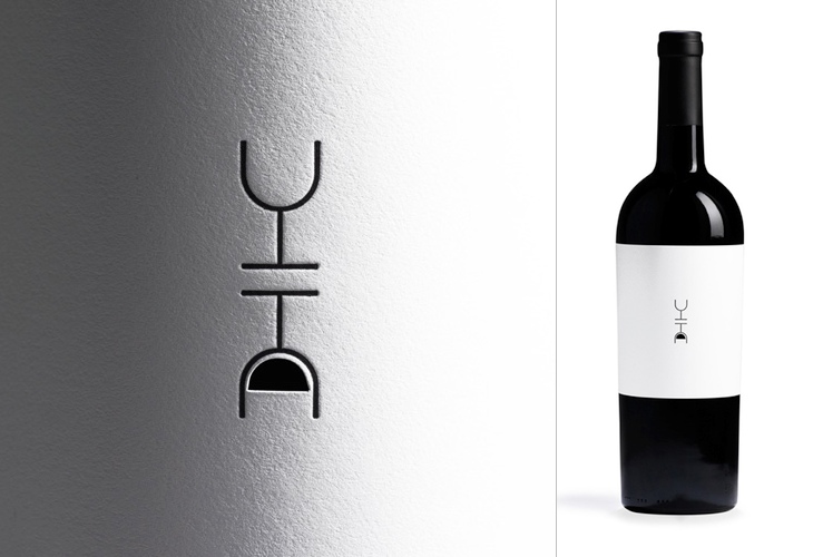
There’s quite a few things I’ve been meaning to post about lately. One of them is this post by FPO on Siquis’ annual gift to their clients — a bottle of wine — but more specifically, the label. It’s a nice idea, every year a different designer gets to design the wine label, and this year’s designer, Greg Bennett, focussed on optimism — the old question, is the glass half full or half empty? Of course, with the ‘full’ side of the glass being a cutout that you can (theoretically) see the wine through, and reversed, if you want to see it you’ll end up pouring out some wine, thereby filling your glass. Of course, that assumes you’ve opened the bottle (and have a glass), which I guess is the point — it’s a subtle way of saying, “drink me”.
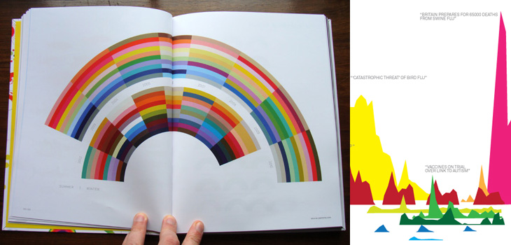
A quick heads-up on a book project I had the honour of being involved with. If you’re a regular visitor to Information is Beautiful you’ll of course already be aware of this, but just in case you aren’t, The Visual Miscellaneum by David McCandless is available for pre-order on Amazon. Sadly, I only had time to do one image for the project, but I see from the back that it looks like it made it into the book, so hurrah! Pre-order on Amazon UK here, and Amazon US here. It’ll most likely be available elsewhere too.
No, these aren’t mine. I just like them. I’m worried mine isn’t colourful enough now I’ve seen these.
It seems hardly a week goes by lately without some interesting new development in online typography. For years there has been a constant grumble from many that the web needs more typefaces available to designers to create great online typography, and there’s been a consistent, and entirely correct (but perhaps rather hardline) response from others that great typography doesn’t come from having lots of typefaces. Perhaps you can tell from that which side I come down on, and yes, it is rather hardline, and I freely and happily admit that as a response to the problem it rather misses the point.
You can, of course, create great typography using only one or two typefaces for your entire working career as a designer. I’ve met a few designers who seem to want to do just that, and indeed, I heard a story of a creative director so obsessed with Bembo that he wouldn’t allow any other face to be used on anything, so that none of the designers who worked with him could ever bear to use it ever again. Most of us, like those very designers, would quite reasonably get bored to death with using the same faces all the time. No matter how beautiful, how perfect, how utterly balanced the typeface was, you can have too much of a good thing, eventually - and if the faces you have available are, shall we say, of mixed quality, then you can feel rather stifled, rather quickly.
This is the situation we’re in now. We’ve had the ‘Web Core Fonts’ for seemingly forever, and we’re fed up with them. There are so many excellent screen faces out there, and we want to use them. But how? I won’t seek to repeat some excellent articles on the current state of play (I suggest you read this article on ilovetypography.com), but I fancied including some of the context, the history of how we’ve used non-core faces online until now, and my own opinions one where it’s all going.
Making images of text yourself
Slow and tedious, not very accessible and relatively inflexible, this isn’t really a solution at all, but is certainly the most reliable way of presenting text in your own typeface online. It’s getting less common thanks to the growth of various other methods, but still hangs around for obvious reasons: You can fine-tune everything - the kerning, ligatures, alternates, all sorts of effects, it’s all under your control. Sounds great, until you have to change the text. Then you have to fine tune it all again, save off all the images again, upload all the images again, then try and work out why you’ve got a broken image on your site again until you remember you changed the filename when you were in a hurry that time and you forgot about it…. So, it’s good for things you don’t change often.
Making images of text automatically
For many years this seemed a golden solution, lit by a kind of heavenly light from within, choirs of angels and all that: all the benefits of making images yourself, but without all the fuss and effort! Joy! Well, not quite. There are various methods for creating the images automatically, from using a desktop application like Fireworks to online PHP libraries (and similar), and they all have their limitations. The first, of course, is that you’re creating the images automatically so you don’t have quite so much control over how the type looks, and most of the PHP libraries I’ve seen over the years don’t support kerning, which is a bit of a showstopper if you care about such things, and if you don’t care, why are you doing this anyway? Also, like creating the images yourself, you still end up with folders full of loads of tiny files, and your pages will be slower as a result of the browser having to request each of those files individually. Not ideal in other words.
Live replacement with Flash or SVG
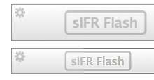
And here we find some very clever solutions, the most widespread being Scalable Inman Flash Replacement, or sIFR (yes, with a small ‘s’). This technique uses a combination of Javascript and CSS to replace text with a Flash movie showing that same text but instead using a font embedded within the movie. When used for small amounts of text, such as a couple of headlines on your page here and there, it can work very well, hence its popularity.
There are some benefits to using sIFR: You can choose a subset of characters to include, which can keep the filesize of the Flash movie fairly low; and as it’s not the actual font file you’re embedding, it adds a barrier of security to people who might want to rip it off (how high a barrier that is remains debatable), and, as with all Flash movies, you can block the file from being reimported back into the Flash editor (again, with debatable efficacy).
There are also some real problems with using sIFR. The main one is speed. If you use it for any amount of text you’ll notice quite a lag while the text is replaced and the Flash movies rendered. Using it for a lot of text, such as the body of an article, and you will most likely notice a significant performance hit on your browser, or a crash. It can also be blocked by ad-blocking software - I use Click2Flash on Safari and I haven’t set it to allow (or disallow) all sIFR, just in case, so I often see placeholders all over pages. The other main problem, and it doesn’t particularly affect users, is that it is a fairly brittle, poorly documented and really annoyingly bitty solution - it’s an absolute pain in the arse to set up, basically.
Another option very much worthy of mention (and I’m not going to cover every single one) is Cufón. This works by using Fontforge to convert a TrueType or OpenType font file to, essentially, a Javascript file. Naturally there’s a little bit more to it, which you can read on the Github page should you wish. The setup is extraordinarily simple, the rendering of the type is extremely fast, even when used on a lot of text, and works with straighforward CSS rules. It’s not absolutely perfect, as there are a few issues with Internet Explorer (no surprises there) and there are some concerns that the font file can be reassembled from the Cufón file - though the technological barrier to that is enough to defeat most people.
Of which questions of licensing and piracy leads nicely onto…
Directly linking to the font file on your server
Basically, you upload a font file to your server and link to it on your web page or stylesheet and when someone views your page, the font gets downloaded, interpreted, and your text is then displayed using it. Simple. Well, kind of. Since version 5, Internet Explorer has supported the font-face rule, allowing you to link to a proprietary file format, Embedded OpenType (EOT), which allows for subsetting (like sIFR does), proprietary compression and a simple form of DRM to limit the file to use on certain domains. This format was never supported by other browser makers, and foundries never explicitly allowed for the use of their typefaces in this format, so it never took off. In many circles, it was viewed as a Bad Thing, another attempt by Microsoft to foist proprietary technologies onto the web, and further evidence of how evil they were. Though perhaps if you subscribe to that view you might want to look up who commissioned the Core Web Fonts in the first place. Verdana and Georgia are bloody great (on screen).
So, we went many years with a partial solution available, but never used. Recently, however, a couple of new proposals have emerged. One is the .webfont proposal by Tal Leming and Erik van Blokland, which seeks to create a format-independent XML wrapper for fonts, with compression for the font data itself. The XML wrapper contains various data, including allowed URLs, the license and origin, and anything else the foundry wants to put in there.
Essentially, the XML wrapper in .webfont is a form of DRM. It contains the license, and if you ignore it and rip off the font file, then you’re open to prosecution. It’s true Digital Rights Management rather than Digital Rights Enforcement.
Interestingly, there isn’t any restrictive DRM (Digital Rights Management), obfuscation or encryption in the format. DRM is a tricky one. I’ve never been entirely against it as a concept, but more against the appallingly greedy, grasping, restrictive, anti-consumer, anti-liberty, anti-fair-use moneygrabbing application of it the music industry employed. I don’t rip off music or movies, and yet my use of my media is limited by these restrictions - it’s insane, so I can see why the idea of adding any form of DRM to font files is now beyond the pale, even though with typefaces it could, arguably, be justified. The only option is to keep educating people that they’re not free, that they take time to design and perfect, and that yes, if caught, you can be prosecuted. Kids and enthusiasts building massive font collections they’ll never use are one thing, but professionals should, and must, know better.
Anyway, I digress. The other proposal getting attention is EOT Lite. This is a resurrection of Microsoft’s original EOT format, but with the DRM-like restrictions and patented compression methods removed. This makes it a reasonably credible addition to the options available as it is already supported by a major browser, but whether it can overcome the poor start (and worse publicity) EOT had is doubtful. While .webfont has the support of most of the larger and important foundries, a couple of big foundries have backed EOT Lite. Well, that is until halfway through me writing this article when Typegirl tweeted that Adobe are backing the .webfont proposal. We shall see, and of course there’s no problem with a foundry supporting multiple solutions. Certainly Linotype have already added EOT to their EULA, which is great news as it signals that one of the biggest barriers to using different faces online, licensing for web use, is actually now being overcome.
And, with that other nice link on licensing, we move to…
Subscription: Using the font file on someone else’s server
Typekit’s list of typefaces. Cropped from this screenshot. Yes, I recoloured it too.
Now this is really exciting, and has implications for font licensing for the desktop as well as online. You pay a subscription, and you get access to a variety of typefaces you can use on your site. With Typekit, the process is handled using Javascript to enable the font in the browser, which you then refer to in your stylesheet using standard CSS rules. Other services, whether from foundries, resellers or dedicated service providers, will no doubt develop their own systems, but I imagine they’re be all along similar lines. The question for me is one of performance. I don’t know about you, but I’ve occasionally been left waiting for a page to load while the browser waits for a response from, say, google-analytics.com - there’s no question Google’s main analytics web servers are down (not this often anyway), but just that sometimes this happens on the web. How would this affect a page using Typekit? Is there any option for local server caching for example? If so, how would that be handled?
I’ve often thought that a subscription model for typefaces would be ideal for agencies, designers and printers - people who need access at short notice, and for short periods to a wide range of faces. At the moment, there’s a lot of dodgy emailing of font files about, and you can bet that no matter how scrupulous at licensing everyone concerned may be, that a lot of these font files stay installed and end up being used beyond their licenses. Foundries, and for agencies, etc. concerned about their liabilities to prosecution (and of course, for doing the right thing) would welcome a system that allows you to get access to a face for a week, or a month, or whatever, and, most importantly, to change what they have access to whenever they need to. To make it work you’d have to be paying less per font (or even per face) than for a full license, but for the foundries this would represent a consistent income, rather than no income at all. It’s a thought. I’d certainly use it.
The Future
The whole push to develop practical ways using typefaces online is inevitable given how many applications are now moving into ‘the cloud’. We’ve word processors and photo editing applications online now, and it’ll only be a matter of time before professional creative tools go online too. We want to be able to access our documents from anywhere, and for them to use the same faces as we created them with, and for these documents, the web core fonts aren’t going to do the job.
With the online subscription model, there is a cautionary note to keep in mind - you don’t have control over what’s available. As Kindle users who thought they’d bought Orwell’s 1984 recently found out, if your service provider doesn’t want you to have it anymore, you have no say in the matter. At least if you have the font file on your own machine or your own server, you can keep using it even if the company you bought it from no longer wants to sell it. We’ll no doubt see both honourable and dis-honourable business practices, some scandals, some interesting legal actions, and probably new primary legislation on the matter, but until then, as ever, caveat emptor.
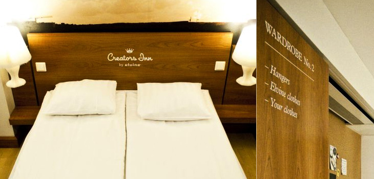
I’m often saving links from the Contemporist, but this hotel, Creators Inn by Elvine (and others), caught my eye for the nice labelling of the wardrobes and the printed history of Elvine on the shower screen. It’s a nice touch, but I wonder if it doesn’t seem a little incomplete as an implementation - things like this are best left subtle or taken to the extremes; if every item in the room was labelled in the same way, with usage notes perhaps, it would be quite the thing. Also, as one of the commenters pointed out, it’s hard not to notice the similarities between the hotel logo and that of a rather large hotel chain. Still, it does look rather nice, and if you’re a creative person visiting the city, you can get free accommodation there. Now that’s a nice touch.
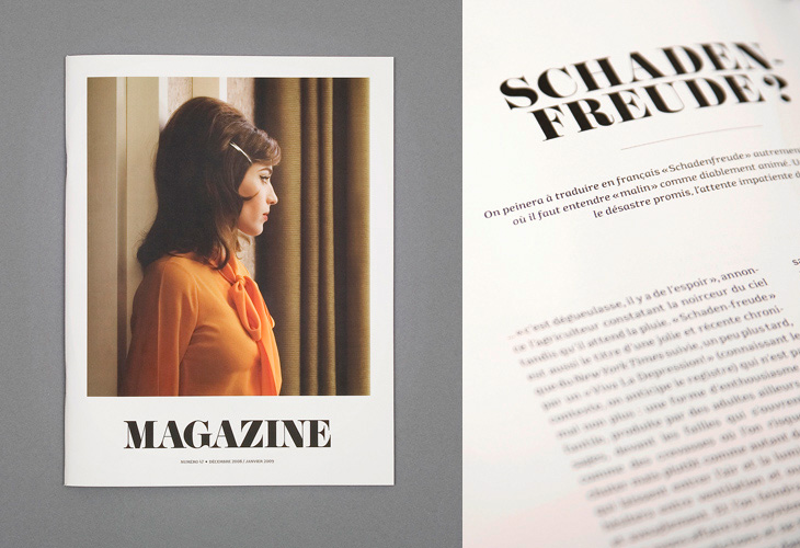
I saw the cover of this magazine, designed by Ill Studio, on ISO 50 and immediately saved the link; I love the type, the photo, the composition, everything. The rest of the magazine is beautiful, but it’s the cover I love - go and take a look at the rest of it. Now if only there was a link to the magazine’s site - with such a generic name it hardly pops right up on Google.