I’ve been thinking about pages, print and scrolling for a while, mainly because I’m a designer and it’s part of my job, but also (I have to admit) because I quite fancy getting an e-reader of some kind. I’ll say right now I’m not going to write about any particular gadget, nor do I care which is best, which is more open, which is morally better, which one is approved by the People’s Front of Judea or the Judean People’s Front or whatever, right now I’m just thinking about one particular aspect of the technology: the page metaphor.
I’m writing this with full knowledge that there are some truly excellent articles out there about this very subject, this one in particular, which you might want to read too. Thing is, while people are talking about digital books, the talk is about the printing, transport and warehousing costs and trees it’ll save, and there’ve only been a few scant mentions of how the form of your everyday novel or reference book could change. Any discussion on form has been about the premium-quality books, the Alice for iPad style remakings, the ones that make new and playful uses of the page-as-screen, and there will be some truly wonderful digital books made, we know there will. However, it’s just taken as read that for all the other books that a bunch of text will be squeezed into an arbitrary set of pages of arbitrary size, like making sausages out of text. We’re not doing these books justice with this tired old page metaphor.
What’s so good about pages?
There are some functional and aesthetic reasons we might like to use pages for a long text. The main functional one that I can see is that we get a handy idea from pages where we are — they are numbered. To return to the book later we need only remember a single number and we can find that page again and carry on where we left off. That’s a great idea, but it breaks, and breaks badly if you were to change the text size, or to carry on reading on one device from where you left off on another. I think as these are two big advantages of digital books, we can’t easily ignore them. Fortunately placeholding is pretty easy on a digital book. It simply remembers where you were and loads the book up at that point.
Yes, I know my metaphor has holes in it, like a huge Hampton Court Palace shaped one. Just bear with me, OK?
So, what about aesthetic reasons? Well, here I like to compare it to architecture, specifically building materials. In years past, and here I’ll emphasise I’m assuming quite an early sensibility, if you built your house with cut and dressed stone, it marked you out as being a pretty wealthy and (presumably) classy individual. If you built your house out of brick, it just said you had a house made of brick. It might be a nice house, but it’s a house made of brick. Nothing wrong with that, you understand, but hey, it’s not stone, and brick was something associated with industry, with commerce and with houses built on a massive scale for factory workers. So houses were built out of brick and then given a coating of render which was then scored and moulded to look like stone. It didn’t really fool anyone, so while it didn’t mark you out as wealthy, you could at least appear to be classy, and that’s important to a lot of people.
And so to books. The equivalent in my metaphor of a stone house is an actual professionally set, printed and bound dead-tree book. They’re the kind of book that is made to store Great Works; the dictionaries, philosophies, histories, plays, religious texts, the physical manifestation of all human knowledge that can be set on a page. No wonder people place great store in the idea of a printed book, for the past couple of centuries they’ve been the acme of Stuff That’s Worth Keeping. Of course, now we have perfect-bound (ha!) books produced in the millions and I don’t think even I could be accused of snobbery in saying that most of them are from the category of Tedious Drivel than Great Work, but there you go, we still have this idea that printed books are so very special, better than any other medium.
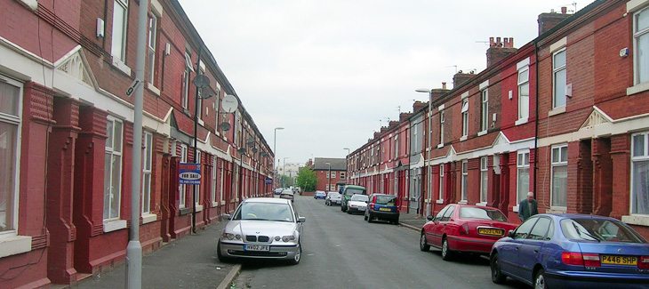
Your typical red brick terraces. Moss side, photo by Gene Hunt.
So, what of the brick house in my belaboured Victorian metaphor? This, to me, is a scrolling page of text on a screen — pretty much the kind you’re reading right now, and do on any website. Yes, it’s called a web page but it is at least a true digital page in that it can be any length, any width and be as static or dynamic as you want. It is a product of the digital age, and while the code we use to describe its content may still be inadequate and subject to billion-dollar playground fights it does the job pretty well. The reason I liken it to the brick house is that there’s nothing really wrong with it but it hasn’t the cachet, it’s associated with the mass-produced red brick terraced house in some mill town somewhere — it’s commercial, it hasn’t the sense of permanence, it’s just a this’ll do commercial pragmatism about it. Of course, just as there are astoundingly beautiful brick buildings there are beautiful web pages, but it’s all about how these things are commonly associated in people’s minds.
And so to our prettified house. The brick one with the rendering on the outside made to look like stone. It can be built nearly as cheaply and quickly as a plain brick house, but it just looks so much better (well, more fashionable) and will sell for a load more cash. It’s got the association of quality in people’s minds but very little of the cost. And here we find the metaphorical equivalent of nearly every damn e-reader on the market right now. Loaded with serif fonts because printed books use serif fonts, sepia-toned backgrounds because printed books go a bit brown with age, with justified text because… and yes, here we get to it. Justified text! For crying out loud. They’re justifying text on a small screen with such an appallingly crap set of algorithms that sometimes it’s like looking at two lists of words against opposite margins — sometimes there might be a few words floating about in the middle somewhere but in all cases the reading experience is dreadful. I’ve only heard of one app that has a decent algorithm for hyphenation and justification, but even so I think the easiest (and given the size of the screen, the best) option for justification is a setting called OFF. For a particular erudite complaint about all this, check out Stephen Coles’ article for the FontFeed.
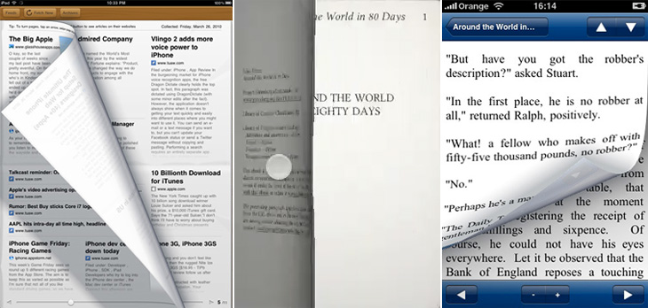
Early Edition, Eucalyptus and iReading Classics.
Then we get to the real fake-Georgian pediment over the front door, the overly-shiny brassy door furniture, the PVC window frames, something that infests reading software rather than dedicated e-reader hardware (but is no less annoying for it): yes, it’s the page turn animation. Oh how these software producers love their page turn animations. They might not make a big deal about their font selection, their crappy justification algorithms or even the number of books you can buy through their store, but they will always make a great big bloody feature of their sodding page turns, even the app I pointed to above. Even if an app doesn’t have these damn things, you get the impression they’re working on adding them. In a book, an actual dead-tree book, you don’t notice turning the page because it’s just part of what a book is. That’s how you get to the next bit of text. The whole idea of pages bound like that is an artifact of a particular printing technology — it’s the nature of the delivery medium, not the message. So when we have a digital book, we’re using technology that has its own set of conventions, its own restrictions and its own freedoms, and every bit of digital technology has some means of moving through any arbitrary content: a keyboard has cursor keys, page up and page down keys, a mouse has a scroll wheel, laptops have trackpads with scroll areas, and smartphones have touchscreens, joysticks or D-pads. But no. Those aren’t good enough. They’re not booky enough. You’re going to be reading Ullysses on this thing, War and Peace, The Illiad with this thing for crying out loud! You can’t sully things like that with a scroll wheel! You’re supposed to be imagining reverentially turning the thick, musty, ancient pages in some great national library somewhere, worshipping at the altar of Knowledge! Never mind the story! Never mind leaving you free to just read! No, every 250 words, perform the gesture, watch the animation!
Just let me scroll, please? I’ve been reading stuff off the screen seriously for what, 15 years? More? Scrolling is fine, you know.
I guess you could assume I’m not a fan of the current state of e-reading software. I hold out a lot of hope for it though. I think if the Instapaper (say) people went and made a full e-book reader I’d be very happy indeed. Of course, there may well be an absolutely blindingly-good bit of software out there that was made by someone who cares about simply reading but I don’t know of it — I assume someone will write one eventually. For iPad/iPhone please. If you know of one, please do let me know.