DKNG recently launched their ICON series of posters, showing a single scene or prop from a range of movies that are so recognisable they’re actually iconic. My knowledge of cinema is clearly lacking (hey, an opportunity to watch some more!) as there are a fair few I don’t recognise. They’re lovely things though, and tap into the current resurgent fashion for simple vector style illustration and desaturated flat colours. I’m very much a fan of the style and love how something so often linked to retro ephemera is being updated and made fresh and new again. However, I do feel a little sad that we’re going to see it so often that we’ll all get fed up of it pretty soon. In the meantime though, let’s enjoy it.
I already have so many prints that need framing, but I might need to get one or two more.
There’s plenty out there to look at in the style, and at the risk of being terribly commercial (I have absolutely no connection to either of these, I just want to link to them), there’s another link to stuff-for-sale that I rather like, these three icon sets, Flatties by UI Parade:
I do have a license for these, but for obvious reasons I’m showing only their obfuscated images.
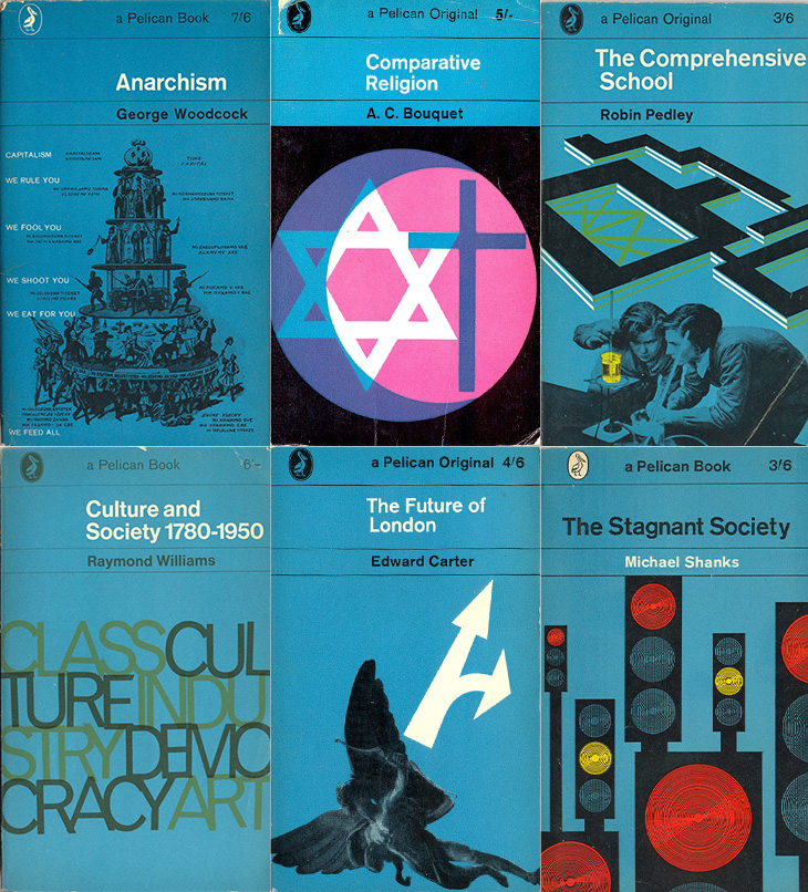
Very much a hey, look at this post, this. I’ve just seen a link to this collection on Things Magazine of Pelican Books covers for the 1960s (and each decade they were published). It’s interesting to see how the template developed along with the Penguin series until it all got a bit chaotic in the late ’70s and was discontinued in the 1980s. Joe Kral also maintains a collection of Penguin and Pelican covers on Flickr.
It’s a fantastic thing which has the potential to be very useful. You are drawing with a biro though so adjust your expectations accordingly. The software is awful, but not so bad as to make the device useless. Just make sure you export as SVG.
Far TL:DR
If you sketch a lot and need a digital copy of your sketches, get one. I’m glad I did. Actually, I’m not. See below.
Update: I discovered that Wacom believe the Sketch Manager software is so vital to your everyday computing needs that they’ve set it to launch on startup. What’s more (and I suspect this is down to the dodgy Windows to Mac port) it doesn’t do this properly, in a way you can change using the Mac OS ‘Login Items’ setting. To stop it launching at startup, have a look at this Apple Discussion entry. I found entries for Sketch Manager in both the main and user ‘Library’ folders. What’s more the user library folder is hidden, so you might want to ‘unhide’ it first. This is a terrible thing to do, requiring technical knowledge that shouldn’t be expected of any buyer of a consumer product to fix.
Update 2: I bought mine from Wacom directly. I don’t know anywhere that has them in stock. You might want to reconsider anyway, given the above.
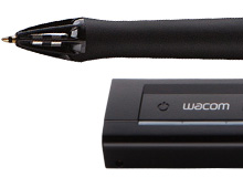
Wacom have (finally) started sending out orders of their new product, the Inkling. I got mine the other day and I’ve been having a good play with it. It’s very good. Not perfect, but very good. The announcement video set some very high expectations, some of which are matched by reality, while some… aren’t.
The whole idea of the device is to record what you draw so that you can import it into image editing programs later, either as a bitmap or (more excitingly) as a vector image. It keeps a track of every stroke, in the order you made them, and records how hard you were pressing on the pen, so the recorded lines vary in thickness with pressure. I think it was this that really got everyone interested.
As a gadget, it’s a lovely little thing. There’s a pen, a receiver, some spare nibs and a USB cable, all neatly packaged in a case that doubles as a charger. Closed, the case looks like a rather glam pencil case with an elaborate hinge.
Using it
Getting started with it is straightforward. You clip the receiver onto the edge of your paper (or notepad, envelope, napkin or whatever) turn it on, and draw. The pen turns on when you start drawing, though I found best to give the nib a preparatory tap on the page somewhere first, just so you know it’s ready, otherwise you’ll lose the first stroke.
The receiver has a couple of buttons, one to turn it on, and the other to create a new layer in your drawing (yes, you can create layered drawings). Turning the receiver off and on will create a new file, as will squeezing the clip – as you might do when changing the paper, which is a nice touch.
Does it actually work?
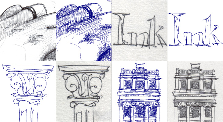
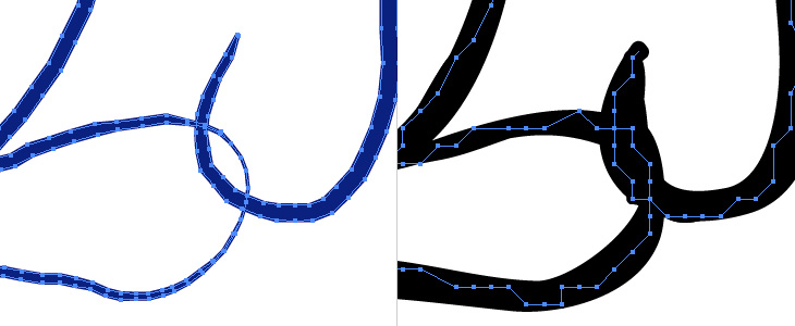
Well yes it does, rather well actually, but it does depend on your drawing style and your expectations. It does a very good job of recording your strokes, from the faintest to the heaviest of lines, and it’s as good as my tablet at recording the fairly fast and loopy lines of my handwriting. I tried a few drawing styles, from handwriting to fast and loose scribbles to a sketch of my hand, crosshatched shading and all, to see how it would record them, and for the most part it did a very good job. Looking at the vector output I can see why Wacom supplied the pen with only ballpoint tips; you can probably play with the settings to improve things but ballpoints aren’t particularly nuanced or subtle drawing devices, and the output reflects that. As I said, it records things well, but not beautifully. When exporting as SVG, the vectors are made from very short line segments (they aren’t smooth beziers) and very faint lines tend to come over a bit thick, so what you’d drawn as subtle crosshatching is recorded as a rather heavy bit of shading, while thicker lines come across as a bit thin.
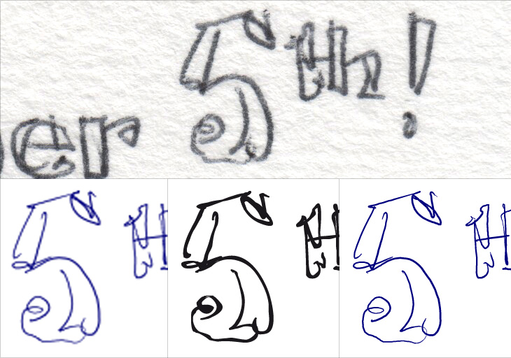
Scans of various sketches, compared to how they come across as SVG. This is using all default settings the device comes with.
I don’t see any of this as a serious problem though. I think by making the pen a ballpoint Wacom are signalling the quality and style of drawing that the device records well. With a few tweaks to the settings, I can see myself using it to record some actual illustrations for use as final artwork, but its real strength seems to be in recording rough ideas. My sketches of lettering ideas, flow diagrams, outline illustrations, logo and site ideas all came across perfectly (though with provisos, see below) and were great to use in Illustrator as guides for finished artwork. Because the output is vector and faithfully records pen pressure it works far better than a scan might, and means I don’t feel I need to delete the guide layer to keep file sizes down (as I might with a scan).
What the device offers is convenience, and a bit of magic. It’s less hassle than scanning or photographing your notebooks, and you get scalable vectors nicely separated into whatever layers you want. You can draw an outline sketch and then feel free to scribble and annotate all over it, knowing each addition can be turned on and off and moved about at will, or even deleted entirely. That’s the real appeal of this thing.
The software
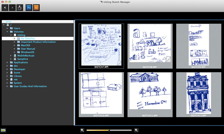
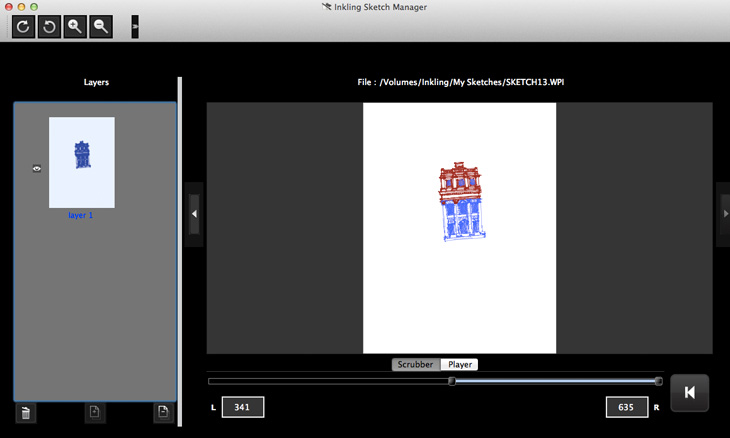
There are some extra special bits of magic the Inkling hints at, but isn’t yet backed up by the software that comes with it. When you look at a sketch using the ‘Sketch Manager’ software, you can replay the drawing process as an animation, or use a scrubber to focus on a particular sequence of strokes. There’s something quite fabulous at seeing a time lapse of something being drawn, and here it is with your very own sketches! But, and I found this a little disappointing, you can’t export the sequence as an animation. The whole purpose of the player and scrubber is to allow you to split your drawing into multiple layers, as you might want to if you’d not pressed the ‘new layer’ button at a particular point. Useful, I’ve no doubt, but a rather mundane use case compared to the “can you see what it is yet?” fun potential. It would be nice to be able to export animations, and I know it’s not the main purpose of the software, but it seemed like such a big potential win that I was surprised it wasn’t there.
The main interface of Sketch Manager. Pretty horrid. Showing the directory tree is a very strange choice, especially for a Mac app. It’s not useful at all. Note how the toolbar icons look borrowed from another app.
The other issues with the software are less structural and more down to (it appears) a rushed job and skipped testing. The screenshots in the manual show the software running on Windows, looking fairly good, with everything looking like it’s in the right places. Seeing what it looks like on the Mac, I would hazard a guess that it was designed originally for the Windows UI, written for Windows, tested on Windows and then ported over to the Mac. Button assets look clumsy against the Mac’s grey UI, some buttons end up in the kind of drop down that you get when there’s no room to show everything and the text is jargon-filled and doesn’t feel like it was written for humans. There are some very odd labelling choices too; for example, the scrubber for the drawing timeline shows two numbers, one labelled L, the other R. Left, and right. I had no idea what these meant other than to wonder whether it was a count of left versus right handed strokes, which would be an odd thing to show since I’m fairly sure ambidextrous illustrators are quite rare. But no, as you move the scrubber bars, it shows you how many strokes are to the left of the scrubber (i.e. earlier), and how many to the right (later). I can’t imagine why this would be at once so important to show, and yet not label properly.
The document interface. Also pretty horrible, and largely incomprehensible. That large button down the bottom right takes you back to the main screen. Placed next to the scrubber and player like that, I thought it was a rewind control.
More serious problems show up when you try exporting sketches to Illustrator and Photoshop. At this point you really need to have restarted your computer after installing Sketch Manager (yes, it’s rather old school), if you don’t, Illustrator will give you a dialog asking whether you want to import the text as ANSI or not. Whatever you pick, you’ll get a large text field with the contents of an XML file in it. If you have restarted, you’ll get a series of very strange paths with stroke widths set using Illustrator’s calligraphy tool. It’s not great. Sharp corners get filled in as splodges and the whole thing looks like a vector trace of a bitmap.
A scan of the original drawing, and three different outputs. First is direct to Photoshop, the second is direct to Illustrator, and the last one was exported as SVG and opened in Illustrator.
Exporting to Photoshop was a bit better in that I got an actual image first time, but it created a 600dpi document with what looked like a scaled-up 300dpi image in it, which I think is exactly what it is; when you choose to export to any of the bitmap formats they create a 300dpi image. Also, when you choose to export to Photoshop, it changes your Photoshop settings so that the units of measurement are inches. I can’t even begin to comprehend the utter boorishness of this. I’ve checked, and checked again. I set my units back to pixels, export a picture from Sketch Manager, and there it is, inches again.
Not good. Really, really not good.
The only way to export vector data reliably is to use the ‘Save as different format’ option, and choose SVG. This works well, but is a faff as it defaults every single time to PNG and defaults the file location to the device itself. As I said above, the vectors are short straight-line segments rather than smooth beziers, but it does at least create a faithful replica of your drawing.
Viewed in Illustrator, the paths of a sketch exported as SVG (left) and direct to Illustrator (right). Even without looking at the scan, the difference in fidelity is clear.
I should point out that the Sketch Manager is far better than any vendor-provided scanning software I’ve ever used. Not exactly praise, but it is something.
The upshot
The Inkling feels very much like a tool for designers more than illustrators. If you sketch rough ideas – layouts, lettering, schematics and the like, you’ll find it very useful. If you want to record your sketchbook of illustrations, you certainly could, but it might cramp your style having to use that pen - Wacom themselves say it’s good for preparatory drawings, and I agree. I don’t use ballpoints very often for a couple of reasons – I don’t particularly like the quality of line they offer, and the ink smells bad. For the sheer convenience of this tool though, I could live with both.
A bit of a campaigning post, this one. The International Printing Museum is running a Kickstarter campaign to expand their collection of matrices for the Ludlow Typograph. It’s a worthy project, to keep an example of fairly democratic technology in use and in people’s awareness, to keep rare typefaces in use and to let people around the world use them – and, well, just because. The Ludlow is similar to the Linotype, but excels at producing slugs for very large type - over 200pt. In the words of British Letterpress:
The principles behind the Ludlow are simple — the operator collects a small brass mould for each character needed in the line. These are assembled into a ‘stick’, a small frame, and the moulds are clamped together to form a line of moulds. This stick and moulds are then clamped in to a machine which injects hot metal into the moulds. A line of type is cast and ejected from the front of the machine. The moulds have to be distributed back into the relevant cases by hand. Unusually, the Ludlow can cast between 6pt and 228pt type on slugs without changes to the machine. Other systems have to be modified with each size change. British Letterpress
If you’re interested in helping keep some printing technology alive and not just a piece of history, you can back the project here (there are some nice rewards on offer too).
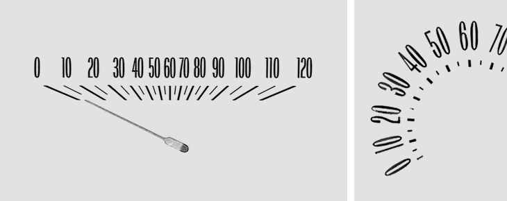
I was taken by this collection of Chevy speedometer designs brought together by Christian Annyas. As I’m always a passenger (I don’t drive) I’ve had plenty of time to study the details of the dashboard and to note the little typographic touches there. Purely graphically I much prefer the horizontal kind of indicator, but in terms of function the dial has an advantage in that the numbers are spaced evenly. The horizontal kind means it’s harder to differentiate at a glance between speeds in the centre of the speedometer, simply because they’re bunched together. It’s also just the range where most speed limits are. Just in writing this article I’ve wondered whether a logarithmic scale might work better for speedos – giving you greater read accuracy at lower speeds, and less at higher ones. The odds of killing someone in an accident change dramatically between 10 and 40 miles an hour, but don’t change much at all above that (i.e. it’s pure chance whether they die or not), so if you’re going fast the only practical awareness of your speed is whether you’re near the limit or not. I’m not entirely convinced by my own argument, but I’m not exactly a fan of going fast in cars and generally grumpily mutter about people going too fast on the roads anyway. Anyway, go and take a look at the full collection, here.
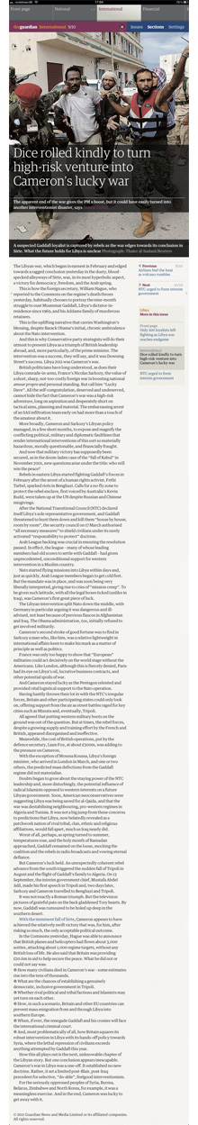
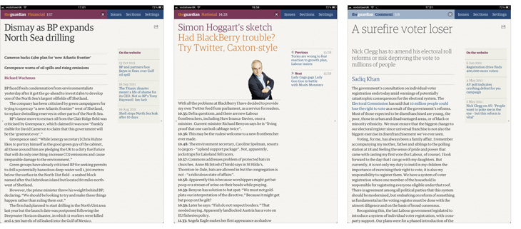
The Guardian now has an iPad app. Previously if you wanted to read Guardian content on an iPad you could read the website, use the iPhone app or attempt the Digital Edition. I used to subscribe to the Digital Edition, a downloadable PDF of the paper (now with an online viewer) in exactly the same form as it was printed. By the looks of it, it’s much improved these days. I cancelled my subscription fairly quickly, because while it was good for reading some articles, seeing things like “continued on page 5” with no hyperlink felt weird, and some of the diagrams in articles had text on them which at the resolution the PDF was created at was unreadable. I complained about one issue like this and was sent a jpeg of the graphic at a higher resolution. Great customer service but it never seemed a scalable or sustainable solution.
So last year the Guardian did a survey of its iPhone (and presumably web) users asking what they’d think of an iPad app, and how much (if anything) they’d be willing to pay for it and/or a subscription. I figured that if they did it well, it could be revolutionary. The iPhone app was (and is) so good it still stands as a reference guide for how to do a content-driven app well. If the iPad app was as good, then it’d be great.
I’ve used a fair few magazine and news apps for the device and they’ve all been a bit of a let-down. As it’s the first mass-market tablet the iPad presented a new and unfamiliar environment to design apps for. Some went down the fill-it-with-crazy-interaction route, others down the scan-our-printed-edition route, most sort of somewhere in between, but nothing really felt natural to the device. It takes time to learn about the new medium rather than simply adapting what went before.
I think the Guardian app is mostly there. There are a few things that I think ‘hmm’ at (well one thing, the issues list), but it does what it’s designed for and is a pleasure to use. The design principles for the app (from this article by the project lead, Jonathon Moore) are beautifully focussed and simple:
Reflect the strength of the form
Create an interface that is always responsive and consistent
Design simple user journeys
Design for the majority (what are the 3 or 4 features that everyone will enjoy?)
Realise we can’t do everything
Appreciate simple is best
These are principles that can and should apply to the design of pretty much everything.
Strength of the form (of content)
A full feature.
It struck me that in all reviews of apps like these, much attention is given to the surface features of the software, but the content is largely ignored. It’s typical feature-itis, and ignores the user’s experience of a thing. The entire reason for someone using this app is to read the Guardian, and let’s be fair, reading a printed broadsheet (or even a Berliner) in almost any situation is rarely a comfortable experience. But you put up with it, it’s worth it for the content, and after a while the medium of crumpled, flapping paper tends to fade away. To do the same (or better) in an app requires a deep understanding of what the content is and how people regard it.
“But to me it was always about how to capture the essence of the print experience and translate that into forms and behaviours that felt right on the iPad.” Mark Porter
I know from experience of developing websites that content is often regarded as the ‘word filler’, viewed as the own-brand mystery sauce to be poured into the shell of the app, not really to be considered as an aspect of the design itself. This is a massive mistake.
Browsing the printed Guardian you see articles from a broad range of subjects, short snippets of fact here and there, and huge page-spanning features and editorials. Newspapers are varied. News websites, even the Guardian’s, are rather more uniform. The pressures of news-now, of getting the story ‘up there’ before anyone else changes the style and format of journalism. There seems to be less room for editorial and analysis - a story is happening now, and this is how it is, …but what does it mean? Most of that type of content remains in the printed paper.
“When we look at the pages of a printed newspaper we take in a range of stories at once. Some are big, some small; some are obviously more important than others. The decisions about space, position and treatment are the product of the experience and values of the editors, and when you buy a printed newspaper you’re not just buying the words and pictures, you’re also buying those values and judgments.” Mark Porter
Bringing that to an app requires a solid understanding of how it works in the paper - how to signal to the reader the relative importance and scale of an article. Is it news reporting? Is it opinion? Is it editorial? Analysis? In any paper it’s the typography and layout of the page that gives you this information.
“I worked closely with Barry Ainslie, our Art director for Sport, to define a range of typeface styles that suited our headlines from print. We defined the minimum required and slowly built them out as the app developed. It’s the first time we’ve used our (extensive) range of fonts to such effect in any of our digital products.” Andy Brockie
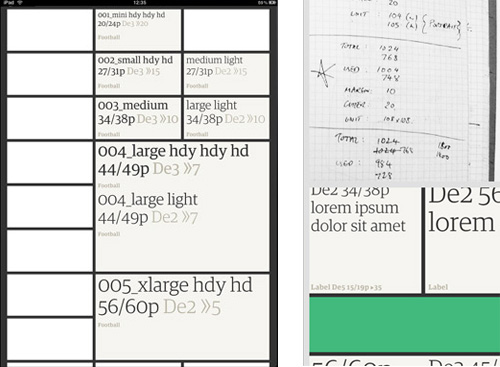
It’s quite clear from reading the app that a great deal of thought and effort has gone into the typography, making it work perfectly on the iPad (which isn’t a perfect medium for great typography in itself). Looking through the images detailing the design process shows just how many iterations of type and layout were tried. I must admit to feeling a bit envious of them to have such time and resources to spend on it.
The details of the typography are often subtle - body text is perfectly readable, sidebars with links to related articles don’t intrude, colours are carefully used to illuminate interactive elements and bring variety to front pages, and headline styles change depending on the type of article. Most articles get a regular weight headline, so that when you get to one with a lighter weight, you know it’s a different kind of content, comment, editorial, obituaries and so on. Features and very long articles get a big screen-filling photo with text overlaid on it, with the article starting below.
It all creates a beautiful effect, inviting you into the content, and letting you read it without intrusion or obstruction.
The treatment of adverts is interesting, and welcome. They do exist in the app, but are restricted to interstitials and section front pages. So by design, while reading an article you don’t see adverts. By design! No hacks, no reformatters, no plugins, no extra services, this is how the content is presented, by the Guardian. Only a few other news apps (like the Channel 4 News one) do anything similar.
Strength of the form (of device)
The iPad is a determinedly multifunctional thing, but it relies on the two universal gestures we can do with our fingers, the stroke and the tap. Stroke vertically to scroll, horizontally to swipe. Stroke with more than one finger - more functions. Tap to select, to activate things and to type. Tap and hold for a contextual functions. But how to design and build an app that responds to these things in a natural way? Apple apps provide clues, but obviously didn’t solve all the problems - there never was an Apple app with loads of content that updates frequently, unless you count the browser itself. But that web/app debate is a whole other kettle of worms, and I’m not going there.
The Guardian app solves this simply, in a way that we’ve come to learn feels natural for the device. There are very few interactions possible; Text scrolls vertically, and you swipe sideways to change articles or sections. You can tap on links to other articles and sections. There are a couple of settings and you can share some articles, but that’s it. Which leads to:
We can’t do everything
What’s interesting is what’s missing. There’s no double-tap to expand the text. You can’t tap and hold to select (and copy) text. Many articles can’t be shared - only the ones that are also on the website can be. There’s no pinch zoom. Navigation is pared-down to just a few common functions and links.
There’s no option to have larger text sizes, accessibility support (such as VoiceOver) is OK, but fails on the front pages (where it reads out the ID for that type of headline).
Some of these things could certainly be added, and the accessibility could be improved, but I know from experience that the desire to get all features into the shipped product usually leads to the product not shipping at all. This is version one of an exceptionally solid app, and I’m glad they’ve polished it as they have. They may not be able to do everything, but what they’ve done is very well done.
Design for the majority
And this leads nicely onto the features the app does have. I strongly suspect it’s aimed at readers of the paper who are looking for something more convenient than the print edition but find the website content lacking and maybe the small form-factor of the phone apps constraining, i.e., commuters. Commuters on trains, specifically. Phone signal on trains is notoriously variable, and train operators often charge stupid money for Wi-Fi, even when it works, so the Guardian app pre-downloads its content in the background in the very, very early morning.
But aha, you say, what if something newsworthy happens at 7AM? The app is out of date! Martin Belam nails it:
“To me, that is like arguing that there is no point the BBC broadcasting the Today programme or putting Newsnight on iPlayer, because the news might be “out of date” the instant the programme is finished.” Martin Belam
To my mind that’s where newspapers still have a unique and valuable offering. You can get live feeds of news from multiple sources, but it’s newspapers, books and documentaries that (on their different timescales) tie the stories together and provide context and meaning. As a result it actually doesn’t matter if a newspaper is a little out of date, provided the journalists have done their jobs properly.
I suspect that the majority of the app’s users want a better, more convenient newspaper, not a prettier newsfeed. It sounds like that’s what the Guardian thinks they want, too. I know I do.
Design simple journeys
Printed newspapers offer very simple user journeys. There are articles on pages, and the paper is divided into broad subject categories, as sections, and you simply flip through them, stopping to read whatever catches your eye. The app uses the same scheme, but also creates a front page for each section. The design of a front page like this isn’t a trivial matter, and it’s particularly interesting the technology the Guardian uses to build these from the content of the newspaper automatically. When I read about it I was amazed at what they’d done.
“This was to be the world’s most beautiful, elegant, interpretation of the print experience - with a few digital twists. It was also to be tied intelligently into our print production systems. That was big task – a task that we underestimated. From get-go.” Jonathon Moore
That’s an enormous task, and I bet immensely satisfying to work on. Looking again at the design evolution Andy Brockie presents, I wonder how the system works out where to put everything. I’m slightly relieved that there is some human input to fine tune things, because if all of that was automatically generated we’d better get ready for welcoming our new robotic overlords.
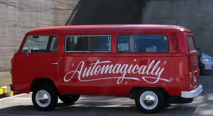
“Unlike the iPhone and Android apps, which are built on feeds from the website, this one actually recycles the already-formatted newspaper pages. A script analyses the InDesign files from the printed paper and uses various parameters (page number, physical area and position that a story occupies, headline size, image size etc) to assign a value to the story. The content is then automatically rebuilt according to those values in a new InDesign template for the app.” Mark Porter
And then from InDesign to HTML. Automagically. That’s the future right there.
Appreciate simple is best
The simplicity and straightforwardness of the Guardian app is (like its iPhone version before it) going to stand for quite a while as the acme of how these things should be done. It’s also a good reminder that simplicity is actually quite hard.
A note on the business model
Much has been said (by oh so many people) claiming that ‘print is dead’ and that newspapers are whipping a dead horse of a business model. If you look at the distribution of printed newspapers people pay for with money, vs. the assumed-free access to news on websites, you’d be right. There’s more to the story than that though. As I pointed out, there’s a special type of content that newspapers have, and despite everything, not much of that content is actually available online. The few newspapers that have made a success of paywalls, such as the Financial Times, do put their analytical and editorial content online, and it shows that plenty of people are willing to pay for it.
For a more general audience the received wisdom has been that people are highly resistant to paying for news, and the Guardian’s own survey showed that many people are. However, not all are, and many people (I include myself in this) actually want to if it means getting a higher quality product. I can’t put it better than Martin Belam, again:
“It strikes me that it is considered quite normal for car manufacturers to have a range of products that are designed and priced to suit different sectors of the market. When a news provider does it, from some sections of the web community there is an almost instant knee-jerk reaction that this proves news organisations “don’t get” digital.
Just because you can have an always on app that crams in updates and breathlessly fast breaking news from live blogs, doesn’t necessarily mean that you have to.” Martin Belam
There’s no doubt that the business models of delivering news to people are changing, but it’s quite clear that people still want news, and people still want journalism. I doubt the constantly-updating feeds of largely analysis-free news updates will provide much of a business model to anyone (except in aggregate) but actual journalism, that is most definitely worth something. Whether this app is what nails it we don’t know yet, but I think it’s got a damn good chance at making that breakthrough.
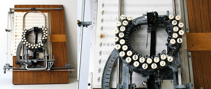
I’ve never seen one of these before, and I’ve never even heard of such a thing. A typewriter for music! I must admit it does seem like an obvious idea, but I’d had in mind the scene of a composer in some drafty garret, gripped by an urgent muse, scratching out notes on parchment with a tattered quill by feeble candlelight. Or is that just poets? The Etsy description for this is pretty interesting, and there’s a link to a PDF with more information on the device, and of course if you’ve got six grand spare you can actually buy it. No more feeble candlelight for you.
So yes, I’ve been away from the site for, er, way too long. To say, “I’ve been busy” would be a cop-out. I’ve been busy on a few personal projects that have taken up most of my ‘spare’ time and energy, and while they’ve been great fun I’ve definitely missed writing here. I’ve got so many starred “must blog” entries in my RSS reader I’m not sure a lot of them are even relevant anymore. Ho hum.
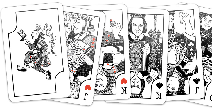
Anyway, those of you who follow my (rather ranty, sweary) personal Twitter account might have already seen these, but the big, huge personal project is nearly done – a set of playing cards. Each of the court cards represents an obsession, with a theme per-suit connecting them, Wealth, Science, Dogma and Pleasure. The joker represents Time and Death, the end of any and all obsessions. I’ve still to design the packaging and (of course) get them printed but when they’re ready I’ll be selling them, probably as some kind of limited edition type affair. They’ve been absolutely enormous fun to do, so here’s a little sneak peek:
Another thing I marked as “to look at later”, merely because of the big beautiful lettering. I was wondering what on earth it was all about and only managed to find a few pictures of it from this year’s Macworld and a reference to an iTunes plugin, which may or may not be this (the site doesn’t feature anything with this lettering on it, sadly). Whatever it’s for, it’s lovely. If you know more, let me know. I found it here.
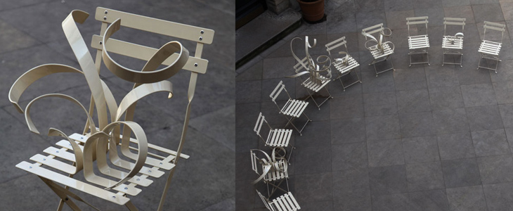
I’ve been buried in bezier-land for the past few weeks these chairs by Suzy Lelièvre, though they’re not type, illustration or lettering, appeal to my appreciation of curves; a physical world instance of beziers. They look like what you get when you try and drag a point in Illustrator and miss, dragging the line itself into some crazed loopy explosion. So yes, noted here for their appeal to all vector designers, and of course their wit.