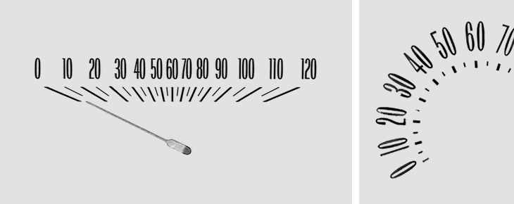
I was taken by this collection of Chevy speedometer designs brought together by Christian Annyas. As I’m always a passenger (I don’t drive) I’ve had plenty of time to study the details of the dashboard and to note the little typographic touches there. Purely graphically I much prefer the horizontal kind of indicator, but in terms of function the dial has an advantage in that the numbers are spaced evenly. The horizontal kind means it’s harder to differentiate at a glance between speeds in the centre of the speedometer, simply because they’re bunched together. It’s also just the range where most speed limits are. Just in writing this article I’ve wondered whether a logarithmic scale might work better for speedos – giving you greater read accuracy at lower speeds, and less at higher ones. The odds of killing someone in an accident change dramatically between 10 and 40 miles an hour, but don’t change much at all above that (i.e. it’s pure chance whether they die or not), so if you’re going fast the only practical awareness of your speed is whether you’re near the limit or not. I’m not entirely convinced by my own argument, but I’m not exactly a fan of going fast in cars and generally grumpily mutter about people going too fast on the roads anyway. Anyway, go and take a look at the full collection, here.