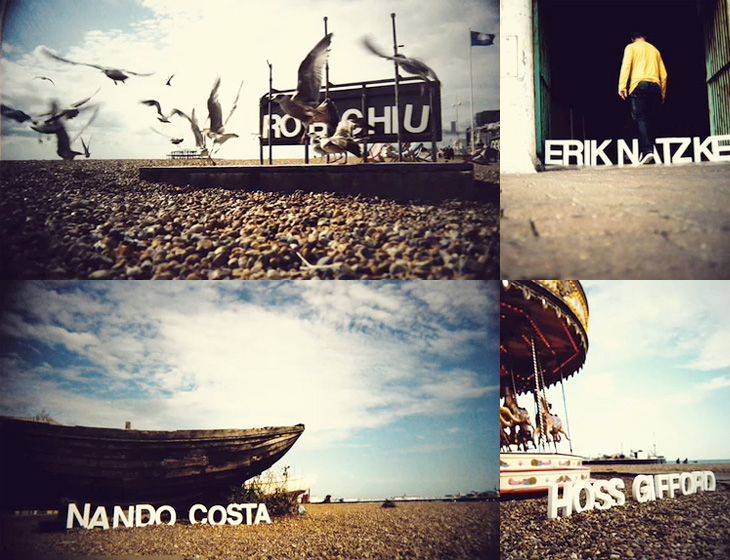
Monoscope linked to the showreel of Rob Chiu the other day, it’s definitely worth a look, but one thing that particularly caught my eye was this piece for Flash on the Beach. It’s a conference that happens every year in Brighton, and these days is more about everything Adobe and everything design than Flash specifically. I think a big part of the appeal is seeing the nicely composed shots of the Brighton seafront with the letters arranged in the scene (and frequently getting blown over). It’s nice to see some of the reactions of people walking past too. That’s it really. It’s nice. Go and look.
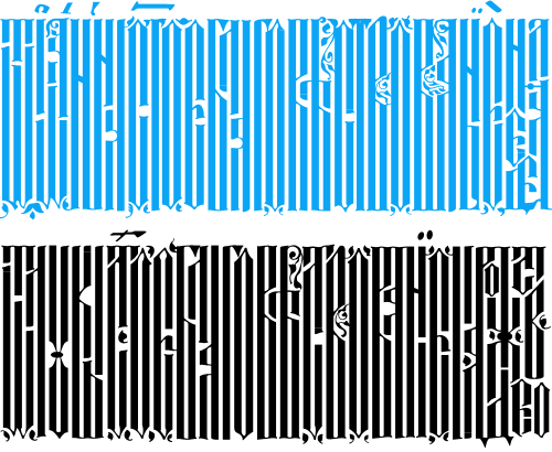
Well that was fun. BibliOdyssey posted these images of manuscripts from the National Library of Serbia last week, and I wasn’t sure if I wanted to trace vyaz script lettering, or redraw it. The urge to redraw won out, and as I was doing it I remembered this post from Tiffany on Flickr, which led me to this thread on Typophile, where Ivan Gulkov shows some virtuoso skills with the style. I can understand the decision not to create a font and instead create a vector file of parts - I ended up creating a set of parts myself for my redrawing below. Creating a font would be a mammoth task, and besides, creating lettering like this is fun. You can see more of Ivan’s work and his portfolio on his personal site. Go take a look.
Top, redrawn from this. Bottom, redrawn from this.
The lettering I’ve redrawn differs a bit from the vyaz script in the Typophile thread, which makes me wonder how much regional variation there was in the script, or whether it was just down to the styles and whims of the individual scribes. In my redrawing I’ve tried to keep to the original lettering, but have straightened the verticals and made the spacing more regular, which I think still keeps to the spirit of the original. I’m also interested in this one, which seems to have some kind of transitional form going on. As the style appears to be more about creating an image rather than being easy to read, it reminds me of the patterning and illustration possible with Arabic calligraphy, which I’ve posted about before.
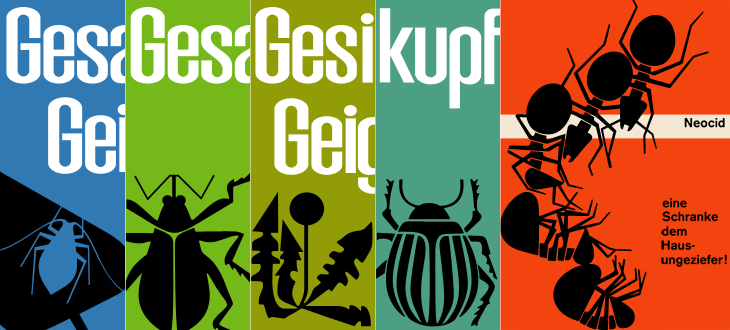
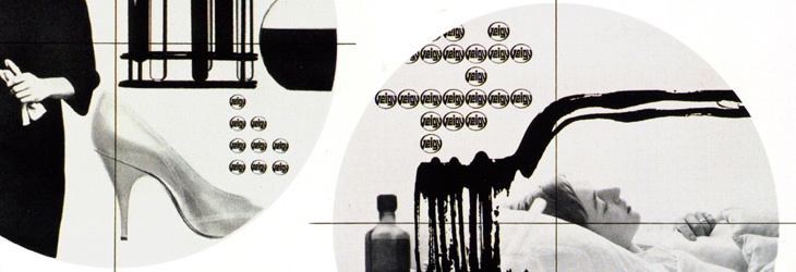
While browsing Ffffound I, er, found a few of the images from this article on Things To Look At on a new book about Geigy’s design and advertising. Some of the examples just call out to be traced - especially the bugs on the pesticide packaging. The illustration for Neocid is quite gloriously morbid - there’s no doubt at all what this stuff is designed to do, even without reading the tagline, “A barrier to house vermin”. The thin white barrier - of death.
Organic this isn’t. I have of course re-composed the elements for the four left-most tracings.
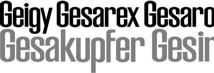
The examples make pretty consistent use of (I would guess) Berthold’s Akzidenz Grotesk, with a few other bits of interesting lettering on things like the herbicide and pesticide packaging above. I traced as best I could the letters from the photos, and though I’m not sure what typeface it is (if it is even a typeface) because of the flat curves and how closed the letterforms are, it reminds me just a little bit of House Gothic 23.
One thing that interests me on some of the examples is the Geigy roundel logo (at right). It’s so at odds with the simple wordmark used elsewhere, and with this other logo on Grain Edit, that I’m wondering where it came from - and where it went. I’m not saying it’s any great loss - I find it rather ugly - but it is very curious, and I will admit the treatment of it in one of the examples (detail below) is rather appealing. Does it have historical relevance I wonder?
The roundel works better as a design element than as a logo.
It’s a logo that works best in multiples, which might explain why it went. Perhaps the book has the answer. And on that note, I would link directly to the book on the publisher’s site, but they don’t have individual pages for them so I can’t. It’s in this list. Look for dolphins.
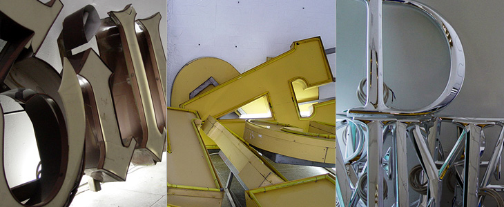
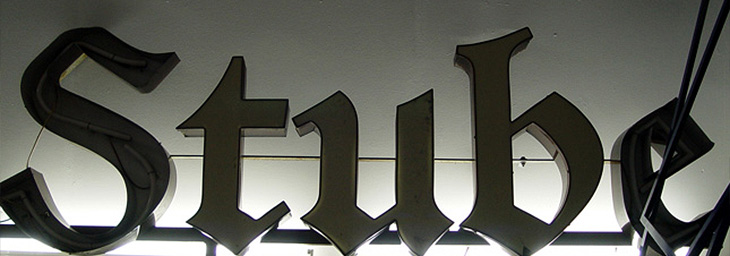
Coincidentally, not long after coming across Character, I found this article about the Berlin Museum of Letters on Core77 (via NOTCOT). Obviously enough it’s a museum devoted to letters, big ones created for building signage and wayfinding in wood, metal, glass and plastic. Core77 has some beautiful photographs and a bit of background info on each one. I really, really, want the DaimlerChrysler ones; so shiny! Lovely stuff, go and take a look.
Some of the letters, and the DaimlerChrysler ones on the right. Lovely.
I love this image. This and the other photos in the article are by Aart van Bezooyen.
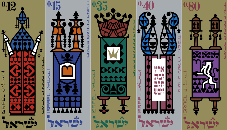
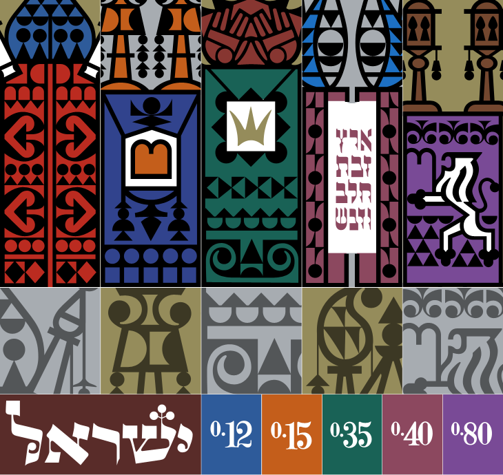
Ffffound is a dangerous site. I try not to visit unless I’ve got a couple of hours to spare as before I know it it’s dark outside and I’ve got a couple of hundred tabs open all with amazing things in. On my last bout of browsing the site I found a couple of links to So Much Pileup, specifically these two posts, Philately Fridays: Israel 1967 and Israel 1976. I’ve traced both, but I’m just going to post the one set for now as I’m not entirely satisfied with how the 1976 ones came out. Some things just need gold ink.
The set of stamps was called “Joyous Festivals 5728”, released in that year (1967) and commemorate five festivals with illustrations of decorated Torah scrolls. Each of the stamps originally had a tab showing an illustration of an open scroll and a biblical sentence, which unfortunately I don’t have decent pictures of. There’s a tiny bit of information here, courtesy of Israel Philatelic Federation’s stamp catalogue (another strangely hard to use website). I’ve included my tracing here. The patterns are beautiful:
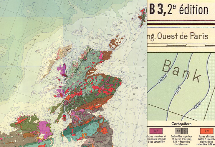
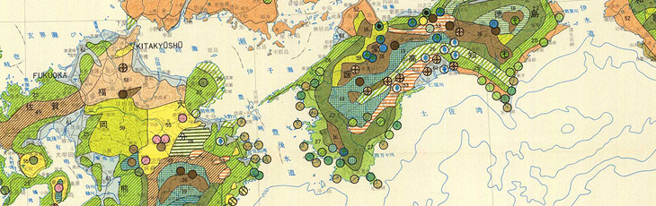
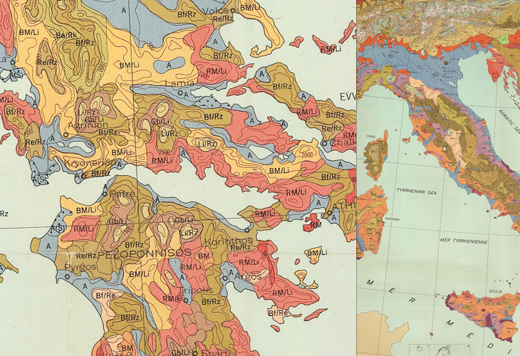
I found some maps from this site in a Google Images search quite some time ago, and kept a few links to some of the prettier ones. The maps show a variety of things, mostly soil types, but some show other environmental information such as bioclimates, soil erosion and watersheds, all in bright colours and fantastic textures and patterns. Some of the compositions are quite beautiful; bright splashes of colour for the regions of interest and stark outlines and clean white paper for everything else - a nice source of inspiration for graphic and information designers.
If you’re interested in site usability, then this might be a (another) good example of a site with great content but bizarrely inconsistent and difficult information architecture and user journeys. The home page is (I think) here, but to save you a few clicks on mostly pointless splash screens, here are the pages for Europe, Africa, Central and South America, Asia, The United States and Canada. Australia, New Zealand and the Pacific Islands don’t appear for some reason, unless I’m missing a link somewhere.
Mostly Scotland, and a nice big chunk of Atlantic Ocean.The forests of southern JapanTwo crops from the same map of a large swathe of Europe.
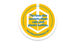
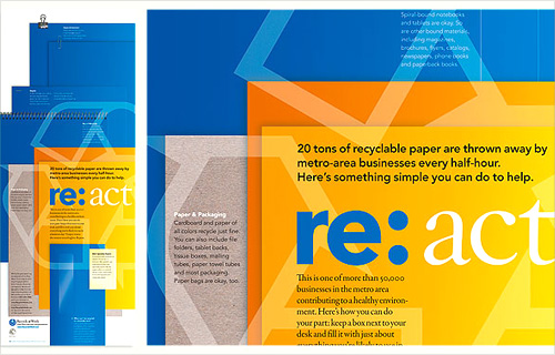
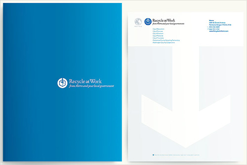
Another one I’ve had open in my browser for a while. I may have got it from a link in Twitter, possibly from Typegirl or (probably) Pinch themselves. I like the basic idea of the re:[word] brand identity, but the implementation is rather nice too. I wanted to keep a note of the two images below in particular because I like the effect of the overlaid print presentations and the super simple white on blue brochure cover.
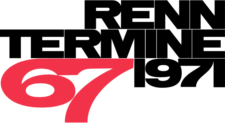
Grain Edit found a great collection of vintage Porsche posters for sale. Well, some of them are for sale because a lot are already sold, buy they can be seen in the VP Racing poster archive. I’ve had a good look through them and I love the ones by Atelier Strenger - to me they make the 60s and 70s the golden age of Porsche posters - such tight composition, typesetting and use of photography! I’ve traced a couple of examples of type from this Strenger one and the numbers from this Holz one. Lovely stuff.
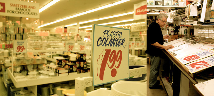
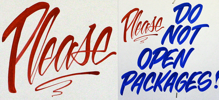
Ah, the things you see on Twitter. Just now @Elianneke linked to this Torontoist article about the hand-painted signs at Honest Ed’s. Yes, they’re hand-painted, in one department at least, by Wayne Reuben and a colleague called Douglas. I bet Honest Ed’s could do a good sideline in selling used signs online - I’d buy some.
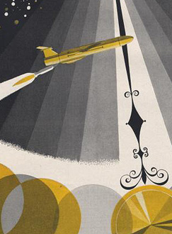
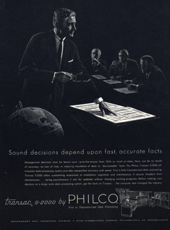
Here’s a great collection of science and techology adverts from the 50s and 60s, full of wonderful illustration, type treatments, vintage logos and some pretty inspirational layouts. I’ve got a few details of some of my favourites below, but be sure to have a good look through the set as there’s a load more in there that are great, such as this, and this. There are a few other interesting Flickr sets by bustbright too, including this collection of Bebrauchsgraphik covers which I’m going to have a look through. This one is great.
Click each image to go to the Flickr page for it.
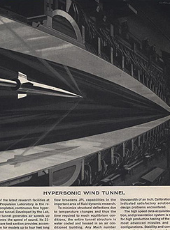
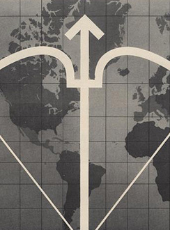
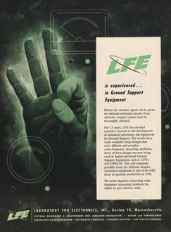
So there are some of my favourites. The top row is that combination of rough-textured painting and precise drawing that characterises mid-century graphic design. I love it. Below those are some nice type and logo treatments: that ampersand, for example, is made from an orbiting particle, yet sits halfway between the classic and commercial ampersands. Interesting! After that there’s six illustration styles: a dramatic JPL illustration which looks like a Victorian steampunk device for testing space-age technology; a cold-war classic world map with presumably The Crossbow of Progress overlaid on it; then a ghostly green hand of A-OK (don’t try this gesture in Turkey)
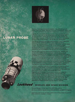
; a lovely space scene which I think could do without the little globe inset above the text; a spare and sharp layout and illustration for Philco - though the outline drawing of the computer looks like something demanded by the client rather than part of the original design; then an advert promising a level of defence from incoming missiles that even today we don’t have. Old adverts are great.