Converting to IBM System/360

IBM have produced and commissioned some lovely stuff over the years, and their mid-century brochures and advertising are well-admired today. It’s the kind of quality they’re clearly aiming to recapture with their recent hiring and investment in design. There’s some gorgeous photography in this late ’60s brochure of theirs for the System/360 I found via Dinosaur’s Pen (which is a fantastic site for historical UI and product design).

I took these images from the PDF linked here and below

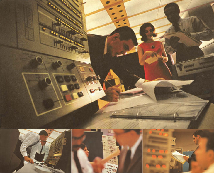
The warm lighting and careful use of a shallow depth of field is more used today for domestic products and holiday advertising, to see it used for a corporate context feels fresh and inviting. Odd, I know, given the age of it. There’s a bit much of the blue-toned high-key stuff around for ‘business’ imagery and I’m wondering whether we’ll see a retro fashion here too.

There’s a bit more info available on IBM’s promotion of the System/360 too. Following the trail of links finds this Flickr set by Colorcubic. They don’t want you downloading the photos they scanned in, but a quick search not only finds a PDF of the brochure but IBM’s own history of the system with more info and photos. To answer Shelby White’s question here, IBM’s designers didn’t overlay the photos with text, the design is quite reserved.

Buried Type

I was going through some old photos I found in a folder and came across this one. I took it in Brighton several years ago, there were some roadworks in the North Laine and I must have wondered at the tape and signage buried in it. I found it amusing when I saw it again and rather like the effect, so I’m putting it up here.

LIFE Magazine

I’ve been browsing through some of the copies of LIFE magazine in this wonderful archive on Google Books, and as well as the photography and journalism I’ve found some real type treasures, especially in the advertisments. Some of the slogans and phrases read just like bits of pangrams or the beautiful mini-stories that Font Bureau create for their type samplers, and some of the type and lettering is quite lovely. The ones below are mostly from this issue from May 1945. A few are also from this one, which also has a short article and some photos (from page 43) of the first Lewes Bonfire night after the end of World War Ⅱ - something of local interest at least to me (and other Sussex people).

I’m sure you could make many amusing stories with a bit of patient searching through the archive.

Waggon and Horses

I thought I’d mentioned pub signs before here, but clearly not. For anyone interested in typography and lettering, pub signs are a great source of inspiration and ideas. I remember noticing the lettering on the side of the Waggon and Horses back in 2003 or so - the picture at the bottom was taken about then at least - and thinking how nice it was. Since then we’ve had a smoking ban in the UK, meaning outside seating is a pretty good thing for a pub to have, and there’ve been some great pedestrian-friendly developments here in Brighton, so any pub with one and near the other should be doing quite well. I hope.

So anyway, the Waggon and Horses has recently spruced up their seating area and repainted the outside and the fascia boards, which means new lettering, which I like very much, and which is why I’m putting a picture of it here. I was struggling a little bit to remember what it looked like before but Flickr came to the rescue; this one is probably the prettiest (nicely showing the front of the Brighton Dome there) but this one is probably the clearest. That café in the second Flickr pic is now a Japanese restaurant. Times change…

And no, that’s not a misspelling. Waggon is an older British spelling, but still perfectly fine.

Third and Seventh

This has nothing to do with type (well, not much) but I found it so remarkable I want to post about it anyway. Alex Roman has created a series of CG images and short films, based on real places, with a remarkable level of realism and beauty. At first I thought they’d been filmed and photographed with some high quality HD SLR, and wondered at the air of hyper-realism some of them have, especially the second one in this set. The sound design and visuals are great, but the use of type in the videos is rather odd and to my eye adds a small, if jarring, discordant note to the whole project: I’ve come across people mixing upper- and lower-case and using extreme kerning before (not so much kerning as tangling in this case) and it’s rarely successful. Still, to harp on about that would seem churlish as the rest of the project is so good. Some stills below to whet your appetite, and the project website is here.

Carnivalesque

Whenever I’ve seen this car around Brighton it’s either been very dark or I’ve not had a (decent) camera with me, so it was good the other day to see it sat there in full sunshine, and me with a proper camera too. Too few people decorate their cars, fearing perhaps for the resale value, but seeing this car I can’t help but wish more people would have a go. Whoever you are who did this, thanks!

Royal Mail՚s Royal Insignia

I love projects like this, a Flickr group purely for Royal Mail postboxes identified by postcode. There are currently 5679 photos in the group, so is getting to be a pretty good catalogue of the postboxes in the UK - though with 115,000 in total there’s still a way to go. One of the first ones I clicked was pretty close to where I’m from, and lo, a quick search reveals the one very close to where I grew up. Ah, memories.

One of the interesting things about all these postboxes is the variety in the emblems of the reigning monarch - from Victoria to Elizabeth, they range from the florid and calligraphic to the frankly rather austere. Naturally, I’ve had a play around recreating some of the emblems, below. I wonder at the unnumbered George ones though; I’d guess they must be from during the Second World War, or directly afterwards - they suggest the Austerity period to me, but why no number? The extra metal and work required would be minimal, after all. As for the other later ones, the lettering looks to be inspired by Caslon types, though with plenty of variation from the hand-carved moulds, which has given them various profile styles from soft to sharp-edged, strengthening and highlighting the symbols - a kind of 3D hinting, if you like. I hope the effect was intentional, as it’s rather nice.

Some of the emblems - which I rather freely recreated rather than tracing them accurately. Show here are the rare Edward VII, variants on George VI, Elizabeth II and my very own wild speculation at Charles III (if that is indeed what he takes as his regnal name).

Perhaps controversially, I also had a bit of a play at creating a symbol for Prince Charles when (or if?) he becomes king. He may choose to reign as George VII, though from a design point of view I hope not - if he keeps his current first name he can have that ‘III’ fitting into the counter of the C, which I rather like the look of.

Some details of photos from the set. Clockwise from top, they are Ponthir NP18 123, Edinburgh EH1 585, Haywards Heath RH17 79, Garstang Road PR3 215, Whitley Bay NE26 294, Beamish DH9, Hawkesbury Upton GL9 213, Lancaster LA1 122, Northleach GL54 244, Potters Bar EN6 1NR

Calligraphy and Illustration in Light

While browsing NOTCOT earlier, I came across this post linking to this frankly quite amazing set of light writing photos by Julien Breton (also via this post). You know the idea; set the camera up in a dark place on a very long exposure, and use something like a flashlight or LED penlight to draw shapes. I’ve seen some beautiful examples before (bottom), but nothing as intricate and detailed as these. These are quite close crops; you can view the full images and get more information on Breton’s site.

I thought I’d already posted about these images from LAPP - Light Art Performance Photography. I can’t remember when I first saw them but they fascinate me, I’d love to watch some of these being made. The site has added a load of new photos since I last looked so it looks like they’re pretty active in creating new works too. Great stuff: