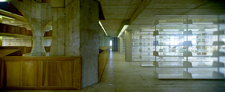
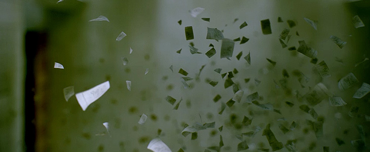
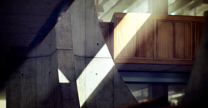
This has nothing to do with type (well, not much) but I found it so remarkable I want to post about it anyway. Alex Roman has created a series of CG images and short films, based on real places, with a remarkable level of realism and beauty. At first I thought they’d been filmed and photographed with some high quality HD SLR, and wondered at the air of hyper-realism some of them have, especially the second one in this set. The sound design and visuals are great, but the use of type in the videos is rather odd and to my eye adds a small, if jarring, discordant note to the whole project: I’ve come across people mixing upper- and lower-case and using extreme kerning before (not so much kerning as tangling in this case) and it’s rarely successful. Still, to harp on about that would seem churlish as the rest of the project is so good. Some stills below to whet your appetite, and the project website is here.