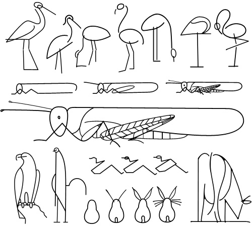
This is a great little instruction book on drawing animals - Les Animaux Tels Qu’ils Sont, full of beautiful little illustrations and diagrams - you can see it on this Flickr set, posted by Agence Eureka. The illustrations are all great, but I find that for most of them I prefer the intermediate stages in the instructions, they’re constructed from spare, sinuous lines and create a beautiful abstraction of the animal - capturing something of the spirit of it rather than an explicit diagram of what it looks like. The ‘final’ drawings seem a bit too obvious, perhaps. So once I’d drawn copies of my favourites, I noticed that they reminded me of hieroglyphs, hence my choice of title - judge for yourself below.
How to draw a cricket, or modern hieroglyphs?
As an aside, I was interested by the authors listed on the book, R & L Lambry. The ‘R’ would be Robert Lambry and, well, there’s nothing definitive on who the ‘L’ is, but I suspect it might be Leon Lambry. That’s the only ‘L Lambry’ that I could find involved with illustration from around the right time. Anyone know for sure?
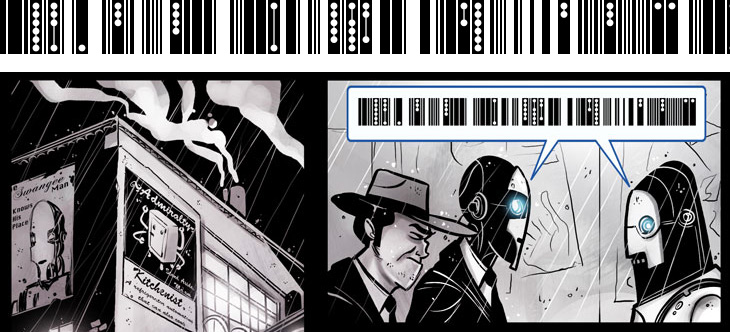
I’ve been following Penny Arcade for quite some time now - they run commentary and opinion on games with short articles and webcomics, expertly written and drawn by Gabe and Tycho. They’ve recently been running a series of webcomics exploring various short stories (not strictly on gaming, but perhaps in universes shared with many games), one of which is Automata. It’s all rather good and worth following (part 1 here, 2 onwards from here), but one thing that got my attention was the representation of speech between the automata characters, shown below.
I like the addition of the dots to the barcode pattern, hinting at multiple tones and levels of sound - something interesting to add to a script - and as the character in the comic refers to it as ‘clickwise’ I got to wondering how languages with clicks were transcribed in the real world. Unsurprisingly, there are various forms of dots, circles and exclamation points, forming a kind of visual onomatopœia for clicks, ‘tsks’ and ‘tuts’.
Comics of course have a rich vocabulary of such things, and I find myself sometimes wishing for a bit more symbolic depth to the Latin alphabet - new forms of punctuation perhaps, maybe even a whole new script, or scripts. To illustrate and explain further, I think everyone has come across the problem of misinterpreting or being misinterpreted when using email - you thought you were making an oh-so-clever dry witticism and it comes across as scouring contemptuous sarcasm (say), so usually the only recourse is to pick up the phone so that your tone of voice can be heard. However, since we’re increasingly using text to communicate, especially in the social, rather than business or technical, arena, and even more importantly in the plain text and short form media such as SMS, we may need to expand our symbolic vocabulary to indicate things such as tone of voice, humour, sarcasm and sincerity. We have emoticons of course, and in time some of them (beyond 263A, 263B and so on) may find their way into Unicode, but they’re pretty blunt things and as it’s subtlety we need, we’ll need something a bit more flexible and, well, more like language.
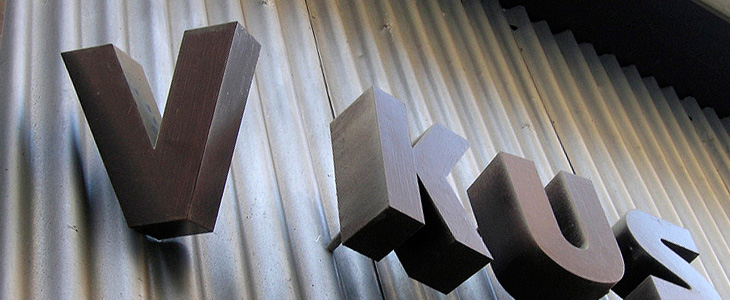
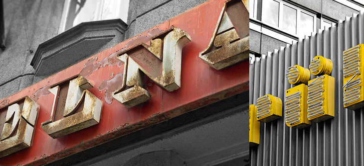
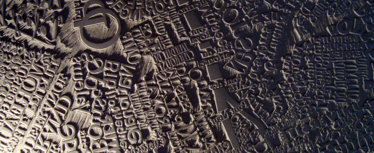
I’m loving these examples of signage and lettering in this Flickr set, linked from City of Sound. Most of them seem to be from Prague, but there are a fair few from various other places in Central and Eastern Europe, and as far as I can tell a lot of them are fading or at risk of being scrapped in gentrification projects. Well, I say scrapped, but since you can expect to pay as much as £50 per letter for old signs just here in Brighton, I expect there’ll be lots of architectural salvage types schlepping round the old Warsaw Pact countries buying up this stuff as we speak.
I hope some of them are kept though - I was reminded of this shop in Paris that has been left empty since the 1980s and has been opened as a new Paul Smith store, with all its original signage and internal fittings intact. I read about it on It’s Nice That, and the history of the place is interesting:
The walls are unpainted for many years, the floor tiles are the original, 80 year old shelves, everything dates back to the 1930’s when La Tourrette was opened by Monsieur Tourrette as a ‘Bougnat’; the left side of the shop selling coal, the right side selling wine.It’s Nice That
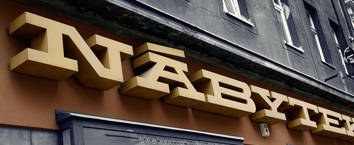
I love the Nábytek one above - it’s such a powerful block of lettering, so monumental and such a strong sense of horizontal motion, it’s like a freight train of type. It did remind me of a few things I’ve seen - this t-shirt for example, or Dispatch Extended Bold, but none really have that strength and density, nor some of the nice features the sign has. The A on the sign has those serifs and that incredible accent - why you wouldn’t want to include diacritics like that in your display face I don’t know - the offset diagonal on the N is just great too.
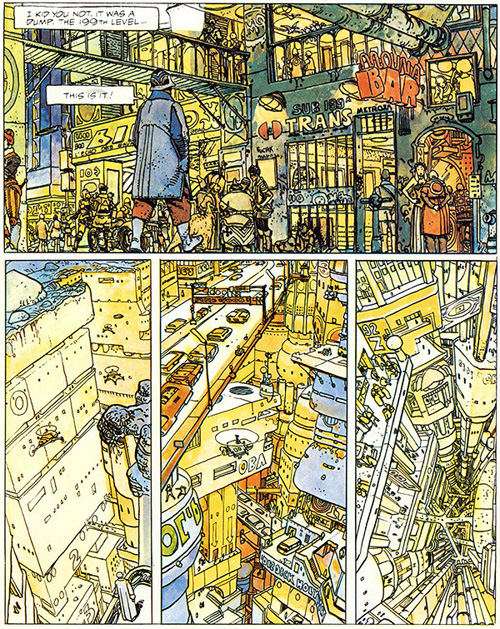
This has been hanging around in my browser tabs for a little while - it’s right up my street too, The Top 10 Comic Book Cities on the Architect’s Journal. A few people have linked to it (I have no idea where I first found it), so you may have already seen it, or even have the books listed. I’ve got a couple, and I think I’ve tracked down a copy of The Long Tomorrow, with Moebius’ fantastic visualisations. I’m quite fond of the idea of megacities, maps (especially of the builtenvironments) and really crowded, dense architecture. It’s not type related, but I imagine such things tend to appeal to the typographically-inclined, if only for the recognition of the similarly detail-obsessed personalities that created them. Anyway, I got the picture below from a regular read of mine, Sci-Fi-O-Rama, which feeatures sci-fi related art and book covers:
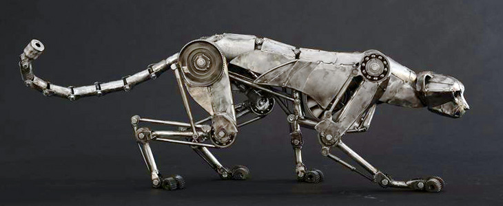
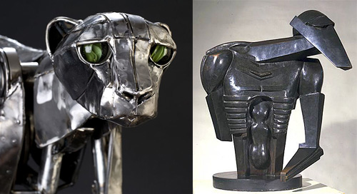
Nothing type related, this, but it’s still lovely. Andrew Chase is a photographer and all-round multi-skilled artist. I came across some pictures of his mechanical cheetah on NOTCOT, which linked to bookofjoe. There are more images of his sculptures on his own portfolio site, including a fantastic giraffe. The cheetah reminded me instantly of Jacob Epstein’s Rock Drill, perhaps not the current form of it so much, but a replica of it in its original state I saw years ago at Tate Liverpool. There’s a picture here (from this page on Art New Zealand) of it before Epstein modified it. It’s the upper part of the face that does it, I think.
Such a beautiful sculpture
Something about the eyes… this links to the original page about The Rock Drill on the Tate site. Go and take a look for more information and pictures.
Adrian Giddings just linked to this on Twitter, a linocut map of Paris by Mark Andrew Webber. It reminds me a little bit of these typographic maps of London and Portsmouth, and of course the ORK ones of various places, but because it’s hand-done (and a linocut at that) when it’s printed it’ll have a very different effect. There’s one of Amsterdam (and London, and New York) on Webber’s site which shows how it might look.
The Paris one looks to be made of a combination of face and lettering styles, I assume to reflect the character of each place being represented, and from that I was wondering at the idea of doing that for whole cities, if you could. It could never be a perfect representation for everyone - I’m sure that for many people a typographic representation of London would involve Johnston Sans, whereas I tend to think of Caslon types. For others, who knows?
The linocut itself has a gorgeous sculptural quality, shown up beautifully in Webber’s photos; I would quite fancy a copy of that rather than a print (oh, OK, as well as a print) - to run your fingers over it would be a real pleasure. Lovely stuff:
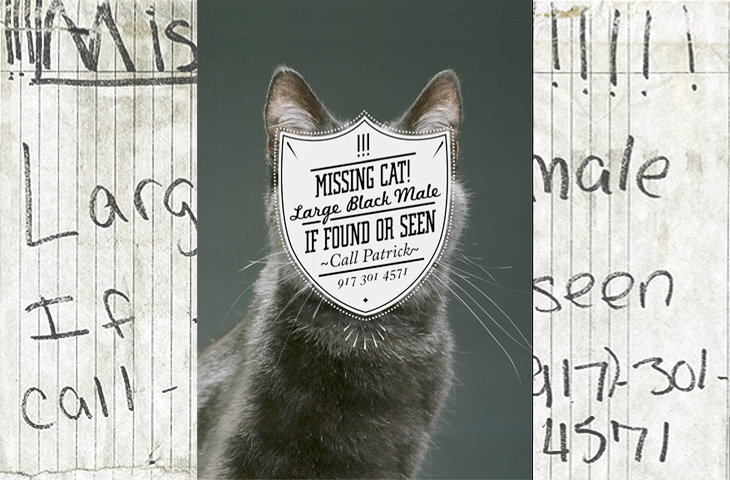
One for the ‘what a nice idea’ pile, this. Cardon Webb goes round upgrading notices pinned up in the streets - you know the ones, ‘Lost Cat’ and the like. There’s one I saw the other day near me that was pleading for the return of a lost plush bunny. I hope they found it; the tone of desperation told a whole story in itself, a wailing inconsolable child, pushchair left unfolded in the hall, coat fallen to the floor, scattered attempts to make-it-all-better: a melted bowl of ice cream, other toys, the Teletubbies DVD and so on, and still the sobbing.
Anyway, back to the nice things. I found this on idsgn, who had created a nice header graphic out of the ‘before’ and ‘after’ images of one of them, and I found that such an appealing presentation I’ve recreated it myself. Still, the original works are the stars of the show, so have a look round on Cardon Copy at the others. I initially thought that the idea was to simply improve the original notices but found a few of them rather hard to read, reading the Cardon Mission reveals all:
Cardon copy takes the vernacular of self-distributed fliers and tear-offs we have all seen in our neighborhoods. It involves hijacking these unconsidered fliers and redesigning them, overpowering their message with a new visual language. I then replace the original with the redesign in its authentic environment.Cardon Copy
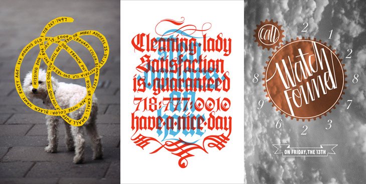
So there you go, the key phrase is ‘overpowering their message’. Explains some of them. The others, like the one below, are far more appealing. You’d keep an eye out for that cat:
This is my favourite one.Harder to read at a glance, but probably more likely to make you stop and look than the originals.
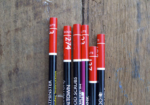
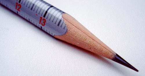
Richard of AceJet 170 posted some great pictures of Pencil Talk’s collection of Routemaster-inspired pencils. I’ve nabbed one of them below, but go and have a look at the article for more, and a link to the source - for the real pencil lover.
Routemaster pencils! Could you ever bear to sharpen them?An Eberhard Faber Scale pencil, picture from Pencil Talk
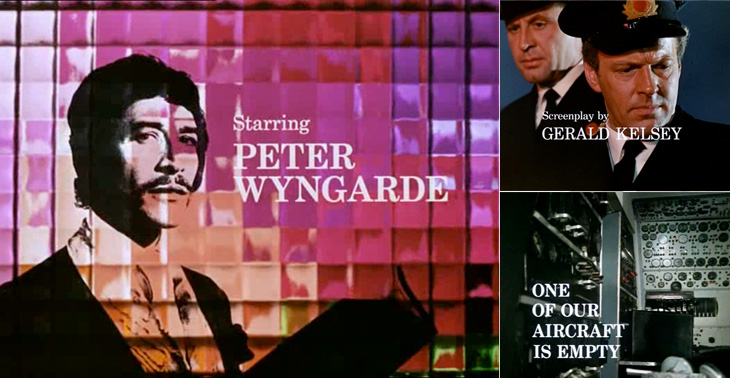
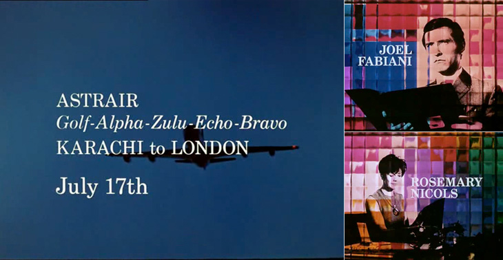
I first watched some episodes of Department S on the UK channel Bravo a few years ago, and I remember thinking at the time how great it was - the Jason King character is ace (there was a spinoff series based just on him). However, what really got my attention and had me making screenshots from the DVDs is the typography of the titles and scene-setting panels. They’re very nicely done, and highly unusually are set in a fairly fine and delicate (for low-resolution TV!) serif face - in this case Century Schoolbook. The titles were done by Chambers and Partners, who did a lot of the titles for TV series in the 1960s, and I wonder whether this was a bit of an experiment for them, an attempt to break the mould somewhat. Their experience shows though; it’s all very well done and brings a lovely printerly quality to the screen. I’m glad they did it.
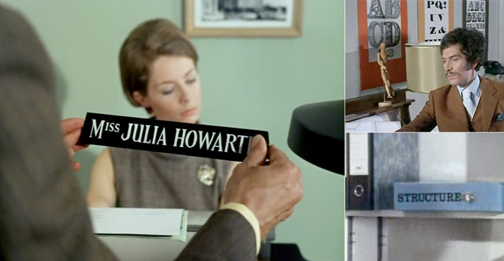
There are other nice bits of lettering in the series too - lots of traditional signwriting, some big typeface samplers used as decoration, and the odd bit of Letraset. Overall the show seems designed, there’s a real touch of quality to the whole thing - I guess that’s why it’s one of those cult classics. If you ever see any of it, pay attention to the cuts between scenes, there’s a very nice alternating set in Six Days especially (the bit with the phone calls and the photos being taken of secret documents, if you want to know). Very nice.
Some of the titles and scene-setting panels.A few other bits of lettering and type in the show.
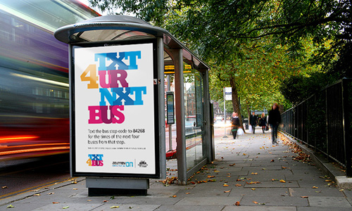
Here’s something I’ve been meaning to post about for a while, and happily it’s a local project, right here in Brighton and Hove. There’s a new service, just launched, which lets you text a code for a particular bus stop to a number and get an SMS back telling you the next five buses to go from that stop. It’s quite a neat idea and pretty fast (I tried it), and a nice complement to the other ways of getting bus information*.
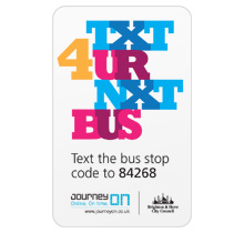
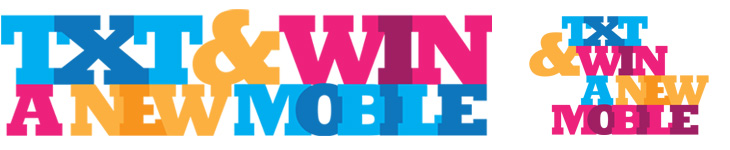
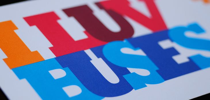
So that’s the back-story. What is good, and particularly appealing to me, is the advertising campaign and the various materials to help people keep a track of the bus stop codes, designed by David Earls of Typographer.org, for Brighton & Hove City Council. I saw a fair bit of the development work on this and I’m glad that this design was chosen and made it through to print unscathed. It’s a beautiful arrangement of type and colour, designed to appeal mainly to teenagers and young adults (and, incidentally, typographers) and adapts well to a wide variety of applications. The typeface (Rockwell Extra Bold) lends itself well to this kind of extreme kerning, with the nicely balanced word shapes the alternating colours and tones ensuring the message remains perfectly readable. The campaign included billboards, bus-stop adshels, A4 posters, information stickers, leaflets with punch-out cards, and a competition to win a new mobile phone:
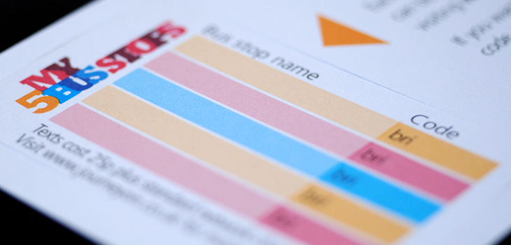
Available for pick up from buses, local ticket and travel agencies and council offices, these cardstock leaflets publicised the scheme, and……they have a wallet-sized card you can pop out for you to record bus stop codes on. The card stock is only glossy on one side to make it easier to write on the reverse.A mockup of the bus stop adverts.