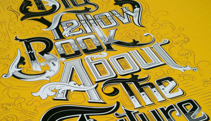
This caught my eye on the Lovely Ligatures Flickr group — it’s a piece of client work by the talented bunch at Like Minded Studio. So much of their work is just the kind of thing that has me looking closer, perhaps with a touch of chagrin that it wasn’t me that did it, there’s so much incredibly detailed work going on there. Go and take a look at their site to see more of their work.
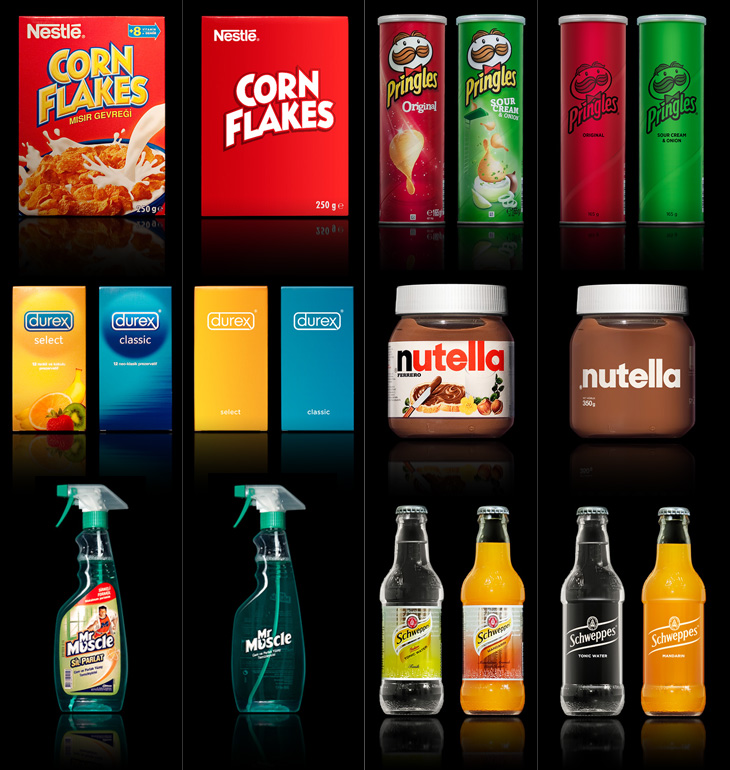
A few people tweeted links to this brilliant collection of packaging redesigns by Antrepo — they’re done as an exercise to illustrate the idea of reducing the design of the labelling to its simplest form, while also showing an intermediary step of a ‘partially simplified’ design. It’s interesting the effect it has on the different products. Some gain a sense of being a premium, high-value product, while others start to resemble economy, basic versions. The Pringles packs look pretty basic; with the full-colour printing gone, the basic nature of the cardboard tube stands out, and with the simple black printing it looks like a supermarket own-brand or something bulk-bought by caterers. On the other end of the scale you have Nutella and the Schweppes drinks — both of them look like the kind of ‘artisanal’ packaging you’d see featured on the Dieline or similar targeted at people who want the same old stuff but to feel a bit special about buying it. And having said that, the Corn Flakes one is just great. It’s absolutely perfect — if I ate cereal then packaging like that would definitely have shelf appeal with that beautifully simple and stark lettering, and how. It reminds me a little of the General Mills Kix packaging, which I also like a lot.
Visit Antrepo’s site for more info and links to the full set.
Of course, packaging for most fast moving consumer goods is brightly coloured and covered in imagery for a reason — it’s to draw the eye and make its purpose, contents or intended use immediately obvious to the shopper. Without going into some kind of pop-psychology analysis of consumer habits, it’s interesting to think what the manufacturers are intending with each package. The simplified Mr Muscle one looks great, but on the original you can easily tell it’s for windows and tiles even without reading any of the words. Similarly for the Durex boxes, I’d hazard a guess and say the orange box contains flavoured ones — the word ‘select’ hardly makes that clear — again, the original packaging wins out.
The food ones all have some kind of serving suggestion (albeit a ridiculous one in the case of the Corn Flakes, I mean, that’s quite a tempest going in the bowl) designed to put the image of the food in your mind, a simple association that makes you more likely to buy it. The only one I think where that doesn’t happen is with the Schweppes bottles. The type is pretty small on the simplified one, but it’s a hell of a lot more legible than the original. Given that you’re likely to see bottles like these in a fridge behind a bar, you’re going to be hard-pressed to read the label and form an idea in your mind that maybe you’d want mandarin as the mixer in your drink, as opposed to orange juice, say. You’re going to look and see confusing labels all done up with sparkles and images of bubbles, and not know if it’s soda and plain old OJ in them or something more special. You’d just end up asking for something generic, and end up (in a lot of British pubs at least) with some rank pre-mix out of a tap on the bar. I could mention at this point that Red Bull might be considered drinkable by some, and therefore a food. It’s not, but it is easily recognisable in a behind-the-bar fridge, which tells you something about British pubs and the drinking culture they encourage, but that’s an entirely different rant.
So yes, beautifully simple packaging is a wonderful idea, but I doubt we’ll see many big manufacturers opting for it, sadly.
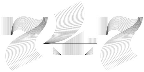
I’ve had these lined numerals by Steven Jockisch bookmarked for a while — too busy tweeting and working to get a decent post up here I guess. They remind me of a few things I’ve seen, which made me wonder whether I’d posted about them (or a similar project) before, but it seems not. Noted for inspiration.
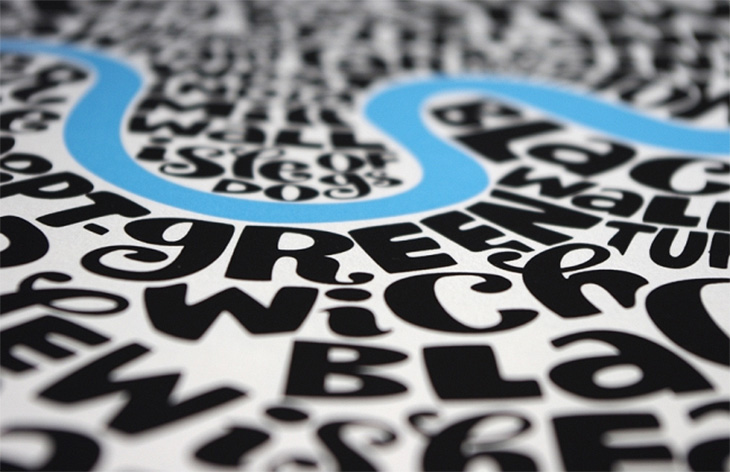
The last time I posted about a set of maps made of words I was a bit hesitant about it. The map itself was attractive, and I liked a lot of things about it (I wouldn’t have posted it otherwise) but I did wonder how much of it was automatically generated, and how much of it was done by hand.
Not that there’s any problem with generating things automatically, as it takes just as much (if not more, sometimes) craft and creative energy to design, program and build something to do that, but sometimes with the computer generated stuff there’s a question of, “How much of this did you do?” Is it a plugin or script you downloaded? Should we be crediting someone else with the creativity and diligence to program the thing, and you with the idea to use it like this? Does it actually matter? It’s not like effort is ever any measure of quality, but of course we naturally associate a premium with something made in a way that doesn’t scale (through difficulty, moods, inspiration, randomness and so on), so that it becomes a unique object, or at least a rare one — this is the premium of the handmade, the crafted object. So this is what I was wondering about when I saw these maps by Seagull’s Hut, not made of type but hand-lettered, and then printed as limited editions:
It’s not like you can buy the original artwork, but it is in itself is unique, and the prints from it can only be copies of it; you can’t make new originals, which is something you can’t say for anything algorithmically produced. Well, unless you create AIs and they become conscious and develop an artistic sensibility that is. I’ve raised that issue before and had quite the flood of crazy comments from the internet’s vibrant and vocal apocalyptic tendency, including the gloriously and perhaps unwittingly eloquent, “humans will be instinct”.
So yes, don’t get me wrong, I do like the maps from Seagull’s Hut. Shame I can’t link to them directly, but go and take a look at their store. I don’t think I’ll be posting about any more maps made from lettering or type though. The inspiration has become a meme, and is ever more dulled by the transformation.
I’m fascinated and delighted by the idea of word harvesting, a term invented by local Brighton copywriter Ellen de Vries and described on her blog, here. I love the collection of phrases she’s listed, especially Carefully Selected Feathers, which I’ve nabbed as the name of my laptop. Stripped of their original context they remind me of the pangrams we use for type samplers, and they do work rather well:
Folio Medium, Light, Extra Bold, Condensed Light, Condensed Bold and Extra Condensed Bold.
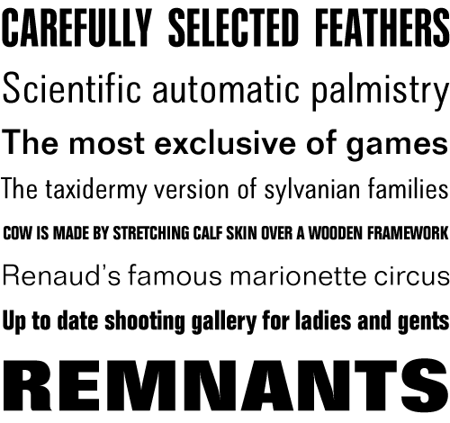
This has been around for a while, but I’ve only just seen it. Niels Meulman of Calligraffiti (AKA Shoe) was commissioned to customise a Mercedes-Benz B-Class by the Pink Ribbon Foundation in the Netherlands. The work consists of hundreds of women’s names, representing the Dutch women the foundation works to help, and is a product of Mercedes’ sponsorship of the foundation. Whatever you think of corporate sponsorship, the end result is pretty spectacular. I especially like the excess ink running down the side of the car, it enriches the flamboyance of the hand lettering and is a welcome contrast to the usual corporate image of Mercedes — and is a badge of honour to confound the cynics, that yes, this was done by hand, live, as it were. Go and look at the video, but I warn you, this is YouTube, so the usual vile trolls have infested the comments.
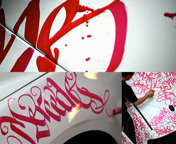
I’ve noticed a fair bit of interest on Twitter and the like recently on the subject of Armenian script, perhaps inspired by Carolyn Puzzovio’s talk on the subject at ATypI 2010. I’ve been meaning to have a look into the subject since then, so I’m glad Nina Stössinger and Hrant Papazian have created armenotype.com, a great new site devoted to the subject of the Armenian script and alphabet. It was only launched a few hours ago and the content is still being added to. In the words of Hrant:
We’d love to see anybody and everybody with even a remote curiosity about the Armenian script check it out, register for the mailing list, and post comments.Hrant on Typophile
It’s a beautiful alphabet. Look on the site for the full gallery, but here are a couple of my favourites so far:
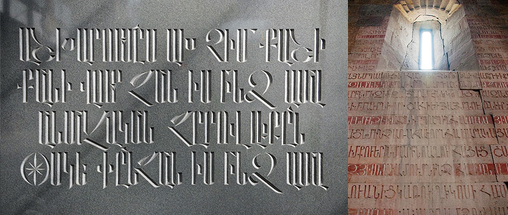
I’ve posted about Martin Schröder’s blog before, but with the images he’s been posting of his recent work I think it’s worth another link. I love the ‘making of’ pictures he puts up, showing how he builds the type in the forms, all that gleaming metal is quite something special:
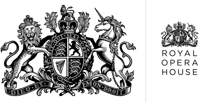
Definitely catching up with old news with this one; I’ve had this Brand New article on the new Royal Opera House identity by Someone bookmarked for a while. If you’ve not seen it already, the new identity centres on a fantastic new cut of the royal crest by Christopher Wormell and is supported by new type and image guidelines. The new typeface is Gotham Light, which is lovely and works wonderfully with the new brand, but I can’t help but feel a little sad to see the Caslon-esque old wordmark go. Still, if it had to go, it had to go, and given how Covent Garden looks and feels nowadays Gotham is a good choice — it’s a fresh clean and light companion to the dense complexity of the crest, and works perfectly with the more modern layouts and imagery they’re using, but was Gill really just too much of a cliché?
The new crest and logo
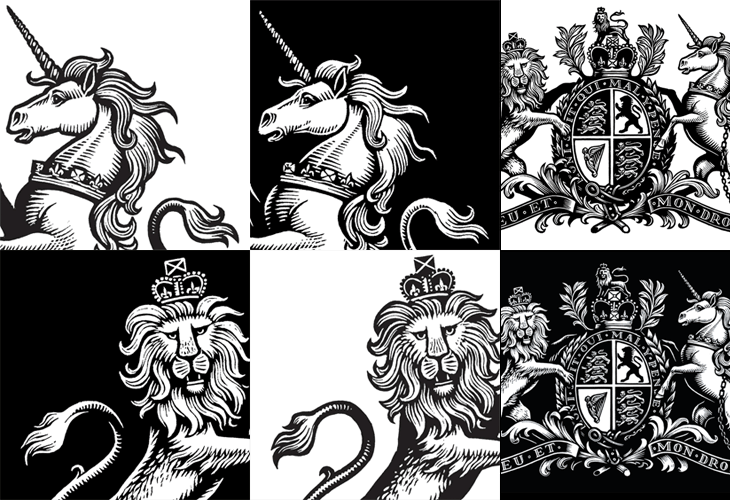
The new crest itself is wonderful. The old one had a certain old-time charm to it, but next to the new one it looks distinctly shabby. Like Armin Vit, I’m especially impressed that they produced two versions for use on light and dark backgrounds, rather than simply inverting the image. The work is so well done that it’s hard to work out what’s actually different between the two images — they’re not just outlined or trimmed, the thickness, detail and density of each image is different, but designed to give the impression they’re the same. Clever and skillful work by a true master of engraving:
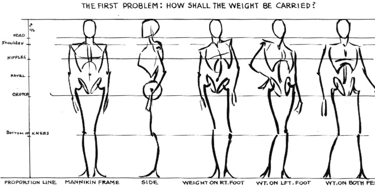
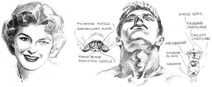
Escape from Illustration Island has put together a set of links to download Andrew Loomis books on illustration and drawing. The books are all out of print and free to distribute because they’re now in the public domain, though for the illustrator and artist they’re as relevant as ever. I realised I’d not seen these books since school — I think we had a copy of The Eye of the Painter and a very tattered Figure Drawing For All It’s Worth (I notice even on these scans that this one doesn’t have a cover) and thinking of other useful books on the subject, I found a few links to Stephen Rogers Peck’s Atlas of Human Anatomy for the Artist. Pretty much everything I learned about anatomy I learned from this book (and much of the rest from this one) so I can wholeheartedly recommend it — it’s not so good for posing and whole-figure drawing, but it’s great for adding detail and character to your figures.
From Figure Drawing For All It’s Worth, I love these mannequin sketches. They remind me of this.
A detail from Drawing the Head and Hands by Loomis, and one from Atlas of Human Anatomy for the Artist by Stephen Rogers Peck, available here.