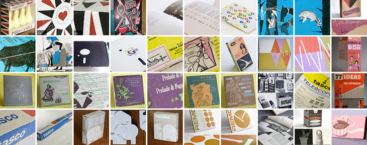
Found via Drawn, this post by Javier Garcia on his blog about the 1961 Sports Illustrated Book of Bridge. The book is illustrated with work by Jerome Snyder, whose work I’ve apparently often admired in the past, even though I didn’t know they were his. His pieces are dense with detail and (when printing allows) rich with colour — that he illustrated a book about bridge with playing-card inspired designs is pretty exciting; how did I not know about this before? I’ve managed to order a copy, so hopefully that’ll arrive soon in all its inspirational splendour and I’ll be able to take my own pictures — these I’ve nabbed from Garcia’s blog post:
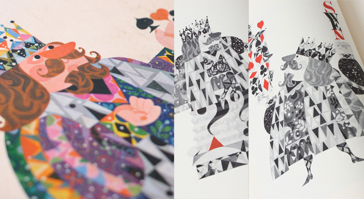
Interestingly, Garcia has also featured a set of cards designed by the ceramicist Stig Lindberg that’s worth a look at, and also links to the Grain Edit article about those Jean David El Al cards (which inspired me to buy a set and post about it here).
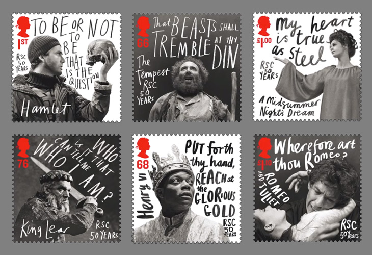
Creative Review highlighted this new issue of stamps from the Royal Mail by Hat-Trick, celebrating the 50 year anniversary of the Royal Shakespeare Company. The stamps feature images of David Tennant as Hamlet, Anthony Sher as Prospero, Chuk Iwuji as Henry VI, Paul Schofield as King Lear, Sara Kestleman as Titania, Ian McKellen and Francesca Annis as Romeo and Juliet accompanied by a line from a play rendered in gorgeous expressive lettering. I know that lettering has been applied to portraits for centuries, but these have a particularly graphic novel feel about them — the expressiveness, the iconic phrases used, the packing of text into white space, these are all ideas best known (to me at least) from the world of comics. Makes a lovely change from your usual setting of Shakespeare for stuff like this in an antique revival type — and is perfect for a company like the RSC. Get them from Royal Mail here.
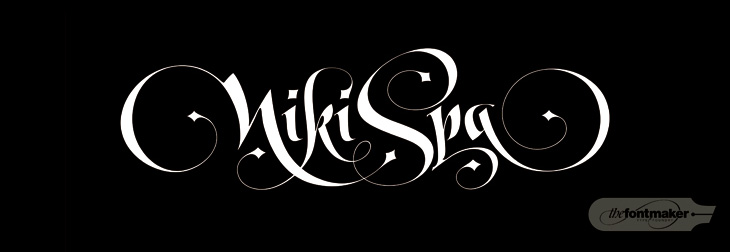
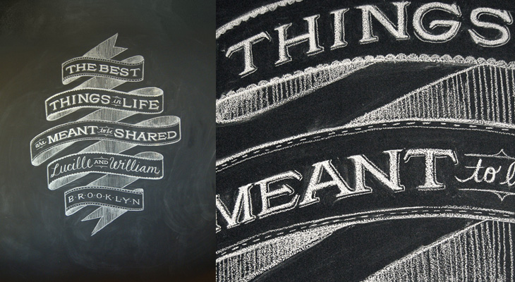
Lettercult has posted an incredible collection of custom lettering projects by hundreds of lettering artists, all completed in 2010. There are so many projects that they’ve split the post across two days, and there are 33 (quite long) pages in each post. I’ve not had a chance to go through all of them yet, but the variety and the quality is remarkable — so much to look at! I’ve posted a few favourites below, one by David Croy, another by Jordan Jelev of The Fontmaker, and I’d be surprised if you’ve not seen her work already (but very worthwhile admiring again), a piece by Dana Tanamachi.
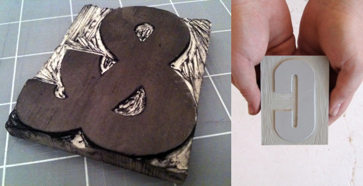
Brooklyn-based designer Aymie Spitzer is carving a linocut letter every day throughout March, and blogging about the process (and the results) on a project site. It’s a nice idea (I like these A Thing A Day/Week/Month things anyway), with aims best put by Aymie herself:
This project is purely an experiment of learning how to carve letter forms. It’s about developing my hand skills, technique through repetition, focus, and dedication. Most importantly, this is about having loads of fun because using my hands to create is what I live for.
What’s more, she’s basing her letters on Champion Gothic by Hoefler & Frere-Jones, because of its beautiful ampersand. Nice.
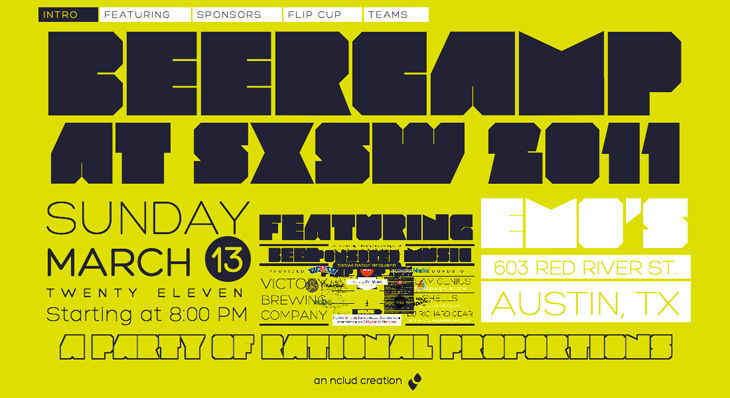
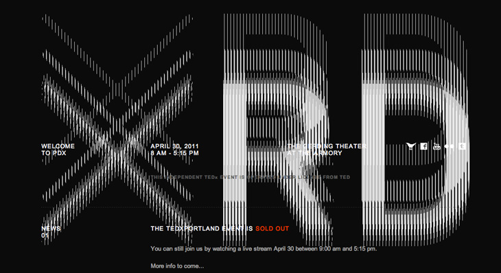
These two sites each transform the common, straightforward act of scrolling into amusing visual effects. The Beercamp one uses a page-within-a-page idea, with a smart little in-joke right at the lowest level, instantly recognisable to anyone who’s seen that film. The zooming effect works really rather well and seems perfect for a small site like this. The TEDx Portland site is interesting in that the broken-CRT visual effect actually interferes with the text somewhat — you have to scroll more than you might do normally before the text (ahem) ‘below the fold’ is readable. That might be irritating, but it’s well done enough that it leaves you with more of a, “oh, that’s fun” feeling instead. Well, it does for me. Your mileage may vary.
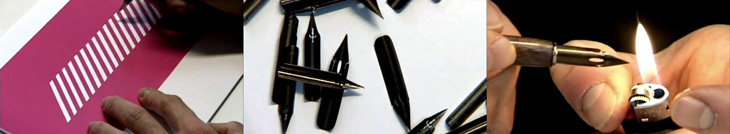
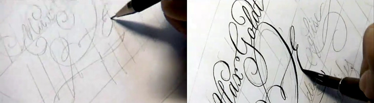
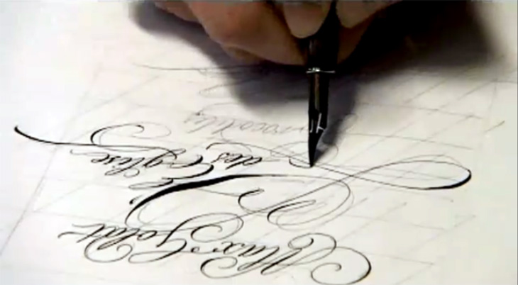
Continuing the process theme of my last post, Jan Middendorp posted a link to this (mostly) non-digital handwriting and lettering process by Frank Ortmann of Freies Grafik Design. I’ve done a few screenshots from the video to give you an idea of it, but nothing beats watching an expert directly. I particularly enjoyed the practice work — this time spent ‘loosening up’ is (I think) a key part of any creative process, digital or not. Go and watch the whole thing, it’s good.
I’m endlessly fascinated by seeing how people work. Everyone who perseveres and creates something will find their own way of doing it, but seeing how other people work is extraordinarily helpful for getting started, overcoming creative block or frustration at the amount of grunt work something takes, or just for gaining the confidence to just get the job done. Sharing techniques doesn’t mean you lose your ‘edge’ or some kind of competitive advantage — if your success relies on something like that it’ll be a short-lived kind of thing anyway, as no matter how good the technique someone, somewhere, will find a better way of doing it. What you actually create is unique to you. If someone wanted to rip you off they wouldn’t copy your technique, they’d use something far easier to master, like a photocopier.
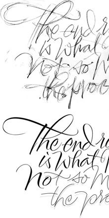
So yes, sermon over. I was thinking of this while reading this post by Alan Ariail on his site The Art of Hand Lettering. In it he describes the results of a discussion with Yves Leterme during one of his workshops, namely the idea that, “The end result is what matters not so much the process”, and goes on to show some of his own processes. I was surprised to see how he goes from sketches to digital monoline ‘skeletons’ of letters, building them up to a calligraphic result. I’ve done a fair bit of stuff like that and always had a niggling doubt, the idea that of course, real letterers wouldn’t do this. Well it turns out that they do. Marvellous!
I would make one personal comment on the whole result/process thing though. I do think that process matters — not in any professional or even moral sense (I use the term loosely) — but in a personal, artistic one. The process is what you spend your time doing so it matters in that it should be enjoyable, satisfying and inspiring. It’s a shame that with many of the digital tools available there’s a distinct lack of joy in using them. But if you do find something that’s good, let the developer know you like it, and just as importantly, tell everyone else. But that’s my original point again.
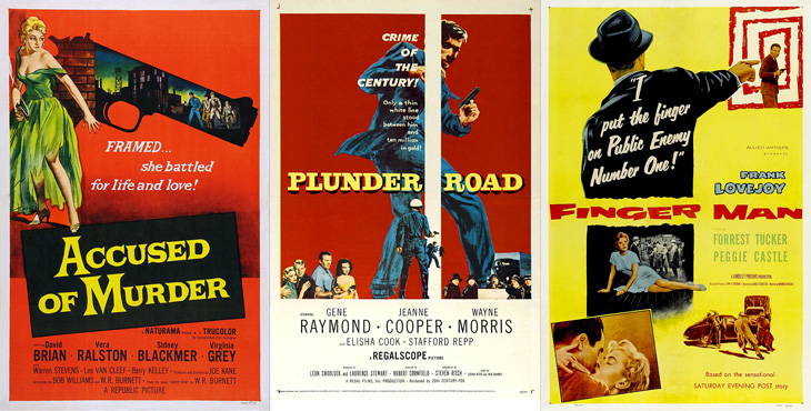
Andy Clarke (aka @malarkey) tweeted a couple of links to Where The Danger Lives, a site on crime films, which has reviews and in-depth info on classic crime and noir films, studios, and recently, a countdown of the best posters used to advertise the films. Each poster has been restored and cleaned up so you can see it clearly (with links to a decent size larger version to look at) and an illuminating analysis of the design and how it fits the film. It’s all pretty impressive stuff so far (I’ve only read a few of the posts as of writing this), so go and take a look.
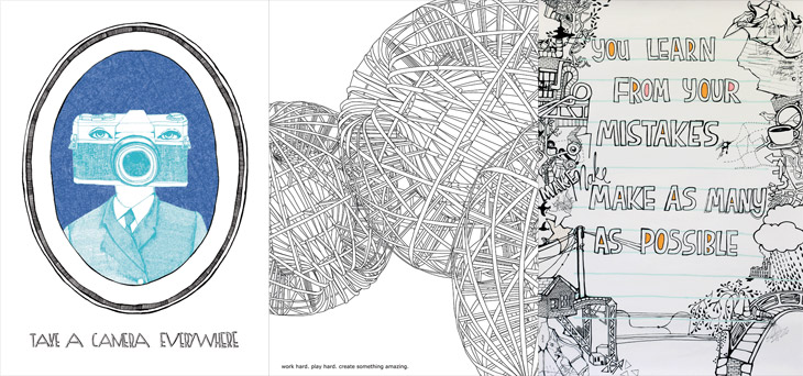
Advice To Sink In Slowly is a project set up in 2006 for graduates to pass on advice to first-year students when they arrive at university. Graduates design posters to illustrate their piece of advice, and each new student is given one at random — the idea being that each graduate now knows something they wish they’d known when they started, and that this is how to pass on that advice in a creative and welcoming way. It’s a great idea, there are some really good bits of advice in there — even the more obvious ones are cleverly illustrated so are made fresh and new. I wish I’d had some of these when I arrived at university.